8 ways to get your work noticed on Dribbble
Cub Studio offer some pro tips for getting the most out of the design-sharing site.
As an award-winning animation and motion graphics agency Cub Studio has made good use of Dribbble to promote its work and engage with the wider design community. Here, Ben Skinner offers the benefit of his experience and explains how you can make the most of the work-sharing website...
01. Post on the right day

Who really works on Friday afternoon? You may have noticed that while 80-90 likes might get you on the front page on a slow Tuesday, it's going to take closer to 200 on a Friday afternoon. This isn't a coincidence – quite simply more people are looking at Dribbble. So for the greatest exposure, Friday is the best day to post your best work. It also gives you the chance to pick an element from your previous week's work.
02. Don't just showboat
Whilst we like to showcase our best work, we also use Dribbble to test upcoming projects – collate feedback and see which GIFs people like the most and why. In other words, use the Dribbble community as a tool as well as a wonderful place to buff your ego to a high gloss.
03. Mix things up

Whether it's an iPhone icon or a new character, anything can make it on Dribbble. You may work in a specific field but variety is the spice of life and you never know what new avenues might open up if you mix up the type of work you post online. Dribbble is a sketchbook as much as it can be a portfolio.
04. Explain your work
Dribbble is as much about the process of creating work as it is about the finished product. So leave a quick comment explaining your work or why you created it – give it context. Asking for advice or help will also help ensure you get any feedback you need. Asking yourself: "Why am I posting this?" can help you get the most out of your shot.
05. Attend Dribbble MeetUps

The best communities aren't just virtual. So meet and share a drink with like minded designers who use Dribbble – chat and learn. Keep an eye on meetup.com/dribbble or on Twitter #dribbblemeetup for events in your area.
MeetUps are generally casual affairs with perhaps a couple of brief talks, a few drinks and free swag. More importantly they're a great opportunity to meet like minded people in your area – useful if you need to moan about a client or find new work.
Get the Creative Bloq Newsletter
Daily design news, reviews, how-tos and more, as picked by the editors.
06. Show the process
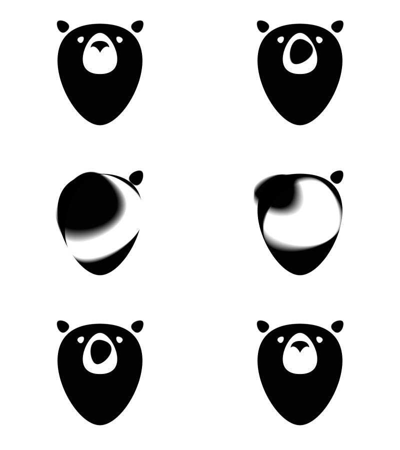
Even better than explaining your work (point 04), adopt the maxim 'Show, don't tell'. For example, Photoshop allows you to create fades and cuts to show a progression from initial sketches through to application.
07. Get attention with GIFs

What's better than animation? That's right, looping animation! If you have a nice transitional icon or some nice character animation, spend an extra 10 minutes making a seamless, self contained loop. We're pretty confident GIFs get a higher click-through rate on Dribbble as people want to see the rest of the shot.
Pro tip: Dribbble uses the first frame of your GIFs as the thumbnail image. If you start on a blank screen, thats what you'll see as your thumbnail image. If your composition loops, you can realistically make it start on any frame, so start it on your best frame to catch people's attention.
08. Create a GIF rebound
If you see something you like that doesn't move, why not create a GIF rebound? We love the work of the likes of Bill S Kenny of Focus, and when we saw this piece, felt we could add something to it (which we did here).
Having said that, while it's easier to beg forgiveness than ask permission, we were lucky that Bill was good humoured about us doing this. It's normally best to ask permission first.
Words: Ben Skinner
Ben Skinner has more than 10 years experience in online marketing focusing on SEO, performance and UX within design related fields. He and Fraser Davidson are Bafta award-winning animation and motion graphic agency Cub Studio.

Thank you for reading 5 articles this month* Join now for unlimited access
Enjoy your first month for just £1 / $1 / €1
*Read 5 free articles per month without a subscription

Join now for unlimited access
Try first month for just £1 / $1 / €1
The Creative Bloq team is made up of a group of design fans, and has changed and evolved since Creative Bloq began back in 2012. The current website team consists of eight full-time members of staff: Editor Georgia Coggan, Deputy Editor Rosie Hilder, Ecommerce Editor Beren Neale, Senior News Editor Daniel Piper, Editor, Digital Art and 3D Ian Dean, Tech Reviews Editor Erlingur Einarsson and Ecommerce Writer Beth Nicholls and Staff Writer Natalie Fear, as well as a roster of freelancers from around the world. The 3D World and ImagineFX magazine teams also pitch in, ensuring that content from 3D World and ImagineFX is represented on Creative Bloq.
