Design a portfolio that packs a punch
We reveal how to make your portfolio stand out from the crowd.
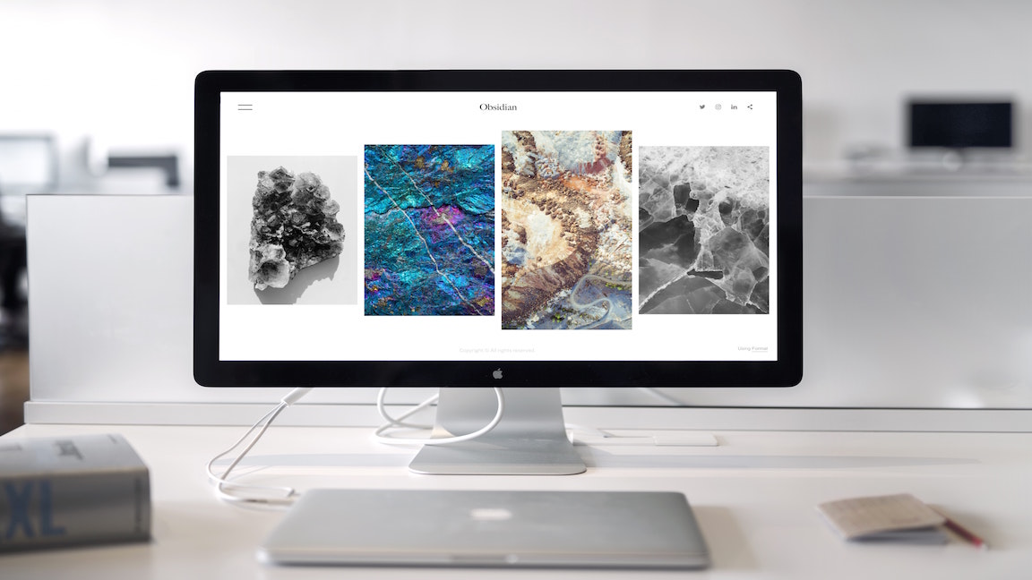
I look at many creative resumes and portfolios every day in my job at Fantasy, spanning a wide range of disciplines and talents. Because there's so many, I've had to develop a strategy to enable me to quickly tell whether a designer has both the visual talent and user experience thinking to thrive with us. In short, a way of separating good work from work that simply looks good.
There are plenty of great platforms and tools out there to help designers display their work beautifully. Check out our post on wordpress portfolio themes for a round up.
The problem is that these platforms look so great out of the box that they can easily mask the true talent level of the designers using them. Grabbing a nice photograph of a car might make for an arresting project marquee, but if the work that follows isn't as interesting, it'll be clear to me that the designer has put more effort into making a portfolio than they put into the work featured in that portfolio.
What follows is a how-to version of the mental checklist of elements I look for in a great portfolio. Not every single one of these is required, but the best portfolios I see include the majority of the these ingredients.
01. Select your projects
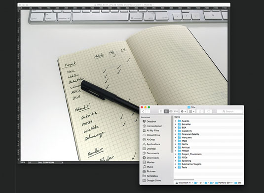
The first step is to select projects that you think are the best indication of your talent. A well-curated body of work is the first indicator that an individual can decipher good from bad. We have all taken on projects that didn't have a favourable outcome, but guess what? You don't have to advertise them! A single piece of bad work can undermine an entire portfolio. It demonstrates a lack of taste for only the best quality.
02. Look to the future
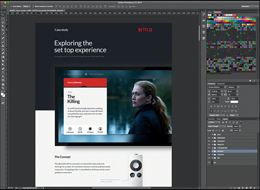
Choose pieces that hint at work you'd like to do in the future. Many designers believe their portfolio is an archive of the work they have completed in the past. While this is true, it should also be a springboard from which to win future opportunities.
I often hear from potential clients who like pieces in my portfolio and want to talk about related projects, proving that it's advantageous to show the kind of work you'd be happy to do more of moving forward.
03. Showcase personal projects
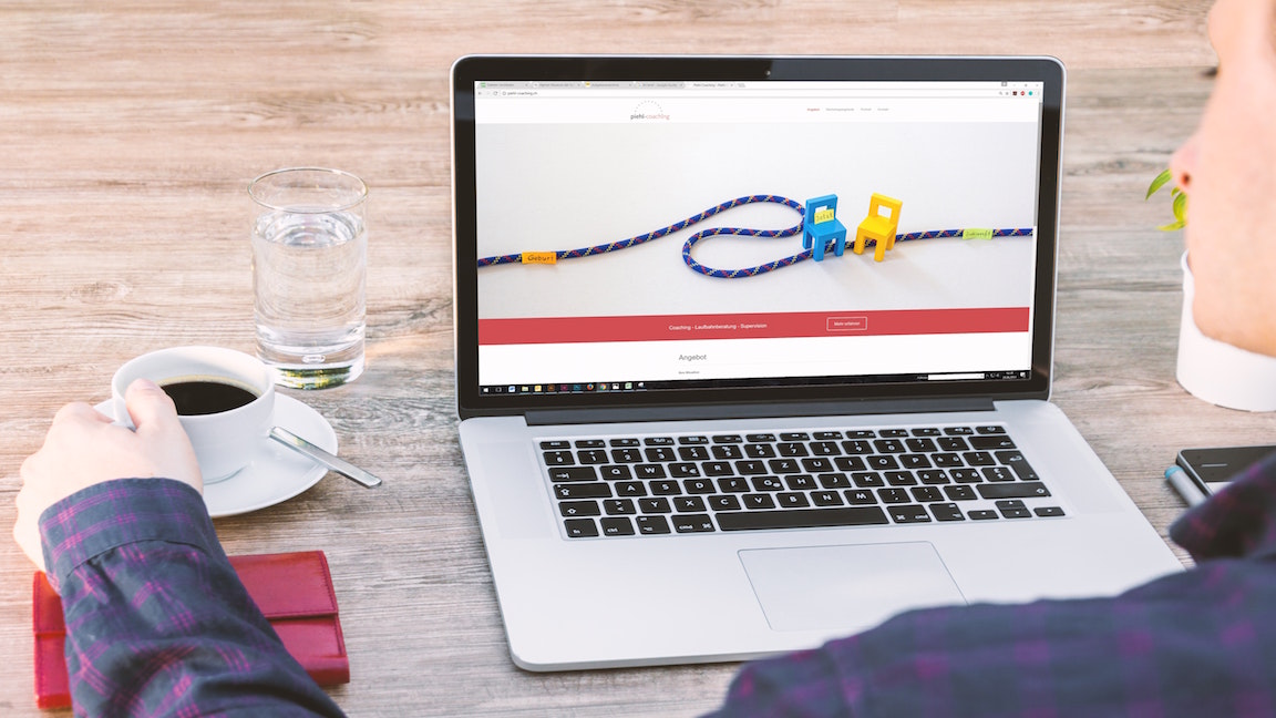
A great way to show your abilities is to develop a personal project showcasing how you might approach design for an existing product or brand. I love looking at personal projects because they demonstrate a designer's talent when they're free from the constraints of demanding clients and business needs.
However, because this work is created in a bubble, it should be clear to your audience that it is not client-driven, and is not an indication of your ability to solve problems stemming from client feedback.
04. Choose wisely
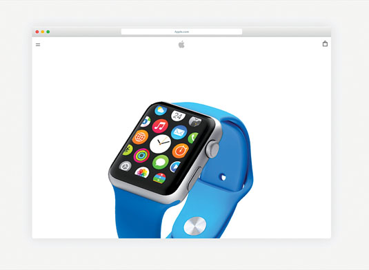
If you include personal projects, avoid redesigns for brands with a strong design presence. Nike, Apple, Burton: these are all brands with a strong heritage and even stronger design language. They have already set the tone and style for any work created for them, and anything unsolicited would blend in with their current work regardless of how innovative it may seem. Instead, either focus on solving a usability problem with an existing product, or select a brand that is not as ubiquitous.
05. Demonstrate critical thinking
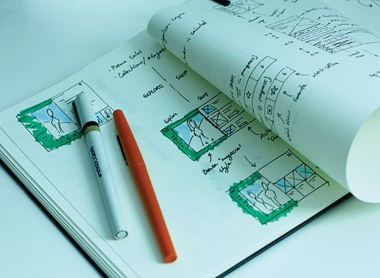
Before even approaching the computer, determine how you are going to talk about each piece of work. Where did this piece start? How did you embark on the process? Where did you look for inspiration? How did the design take shape? Were there any hurdles along the way? What were the results? These are all questions that should be answered in order to demonstrate critical thinking in your creative process.
06. Structure matters
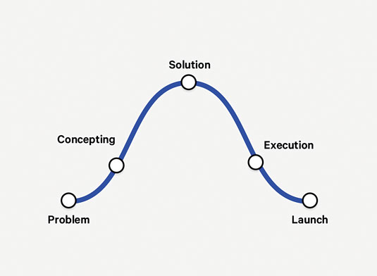
Each piece within your portfolio is a story and should be laid out in a proper arc. Where did the project begin? How did you respond to the task? What was the solution? How and where was your solution carried out? All of these questions need to be answered in the proper order for easy consumption, so your viewer can get a sense of the wider scope of your involvement and expertise.
07. Show your workings

Gather artefacts from your process. I love seeing and hearing about the creative process of other designers and geeking out over sketches. In addition to collecting pixel-perfect final artwork, consider including any work you did along the way. Any colour explorations, photographs and so on, tell me that you look for inspiration outside of Photoshop and work through various problems or roadblocks to get to a final solution.
08. Explain your decisions
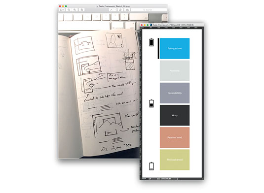
Think of your audience as a client in a design presentation. How did you get to typographic decisions or colour choices? Did you thoughtfully approach the use of a grid? How does your framework scale to multiple devices or increased amounts of content? Including these steps helps justify your final design choices and gives depth to the work overall.
09. Describe any interactions
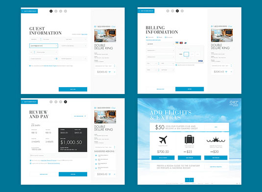
If your portfolio contains interactive work, show your thinking behind how elements on screen behave when the user is present. This will transform your design from simply a nice layout to an immersive experience. Think too about how your interactions are unique to each project, and go above and beyond the work others have seen before. This will help your audience see how the piece functions overall, even without having to experience a live demonstration.
10. Use thoughtful animations
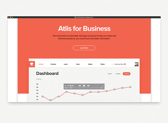
Simple prototype animations or animated demo videos add a tremendous amount of value to your projects. These should not take the place of a well thought-out story told through design, but they go a long way in conveying the interactions, interesting movement, and spacial relationships that flat comps just can't. These should be used sparingly and placed thoughtfully so as not to interfere with the project story's flow.
11. Explain your process
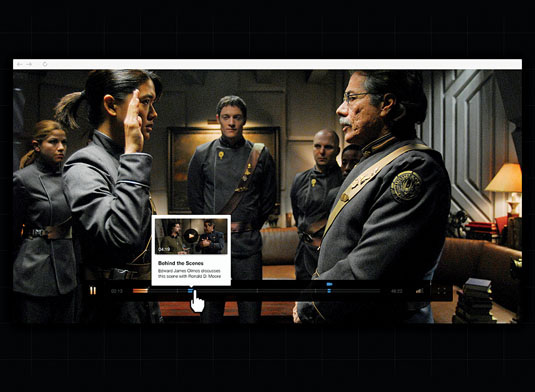
Interactive projects are often in-depth explorations of complicated processes and interactions. When selecting which elements of your projects to focus on, be sure to show any processes, even if they aren't the flashiest elements. They will help your audience see how you think through complex design and interaction problems while still working to maintain a quality product.
12. Keep it tight
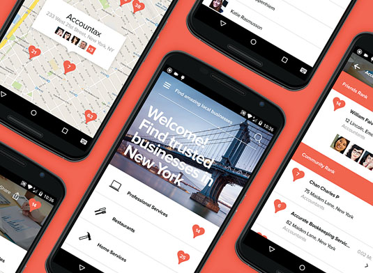
While I've discussed including a number of visuals for process and function, it is important to consider the presence of each visual you select. A tight portfolio has very little fluff and doesn't try to distract the viewer.
A good example is the ubiquitous 'grid of devices'. Sometimes it may be relevant to demonstrate that a product works on multiple platforms or screen sizes, but more often than not this is unnecessary visual candy. I suggest avoiding it unless you have a strong argument to the contrary.
13. Visual tricks date quickly
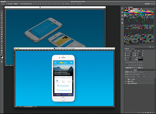
Do the work justice, don't hide it behind flashy imagery. Just as images of designers holding posters were popular years ago, now it has become popular to show design work angled in three dimensions. This serves no purpose other than to distract your viewer from how good the work really is. Reserve angles to show frameworks and how elements sit in relation to each other within the context of the overall design.
14. Use context
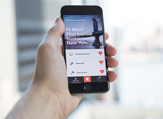
Give context to each piece. This is a tricky one, and should be considered on a case-by-case basis. Interactive design always exists within the context of a browser, television, or mobile device. Consider showing at least one design within the context of the key device it would live in to give an indication of the scale of the elements and their relationship with the edge of the screen.
15. Perfect your portfolio's design
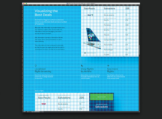
Labour over the creation of each asset in the same way you laboured over the work to begin with. This is the most tedious part of creating any portfolio, but by far the most important! As much as a portfolio shouldn't get in the way of the designs within, any design elements applied to the portfolio itself should be considered with the same attention to detail that you give all of your projects. That goes for typography, imagery, colour choices and so on.
16. Choose the right platform
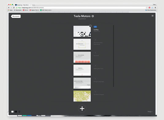
Consider the platform where you will showcase your work. Will it properly convey each piece's story? Will it easily scale with additional projects? There are several to choose from these days – Squarespace, Semplice and Readymag to name a few – and each have their pros and cons. Before committing to a platform be sure to test each option and look at examples to ensure you are moving forward with the best solution for you and your work.
17. Expand your horizons
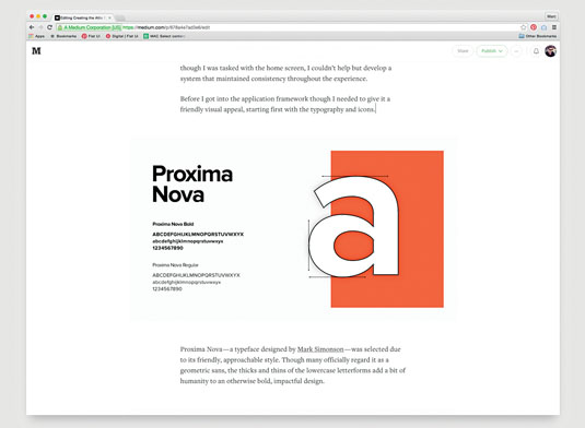
Look for additional outlets to show off your projects and point of view. If you've created work that has an interesting story behind it, consider writing a Medium article about your process and approach. There you can give an account of your work in greater detail, and increase your presence to a broader audience. You never know, this might create leads you hadn't been exposed to previously.
18. Get feedback
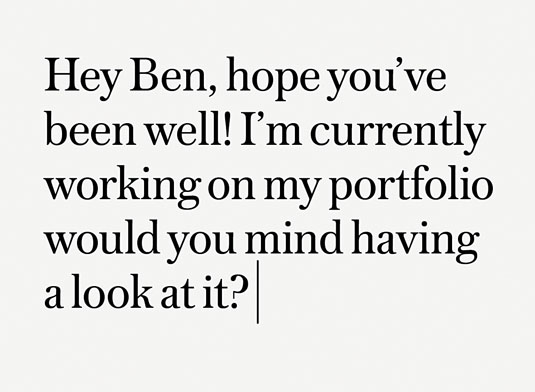
Solicit friends and colleagues for feedback. As many of us consider our work extremely personal, this step is frequently overlooked. However, asking an objective outsider to cast an eye over your portfolio can be incredibly useful. Just like with professional career criticism, it can help you push your work to the next level. It will also help you gauge if your project stories are understandable and clear to outsiders, which is key if you want others to reach out to you once it has launched.
19. Include a bio
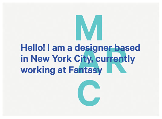
Don't forget to tell your own story as a designer! This is a hotly contested aspect of every portfolio: just how much personality should you show? I lean towards liking less 'quirkiness' or forced creativity, and instead look for a quick summary of the creative's professional background.
This element is often an afterthought; just a paragraph of text or a link to LinkedIn. You might try putting together a simple case study about you, highlighting work experience and clients, presented in an easily digestible, strongly typographic way.
20. Get it out there
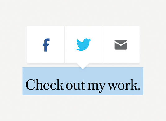
Share it everywhere! After all that hard work you deserve to be a little obnoxious. There are all the usual outlets for creatives, but design is inherently about solving problems for businesses outside the design community. Find people and places to share your work with who don't work in your industry. Do they understand your approach? Are they interested in your work? It just might lead to another great project and ultimately an addition to your portfolio.
Related articles:

Thank you for reading 5 articles this month* Join now for unlimited access
Enjoy your first month for just £1 / $1 / €1
*Read 5 free articles per month without a subscription

Join now for unlimited access
Try first month for just £1 / $1 / €1
Get the Creative Bloq Newsletter
Daily design news, reviews, how-tos and more, as picked by the editors.
