Creative resumés: does less equal more?
This student showcases his skills with a simple black and white effort.
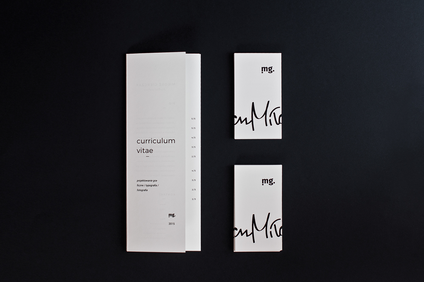
Breaking into the design industry is no mean feat, with plenty of talented folks out there doing everything they can to bag that entry-level job or that new client. We've seen a wide range of creative resumés from chocolate bars and boxes to an in-your-face effort.
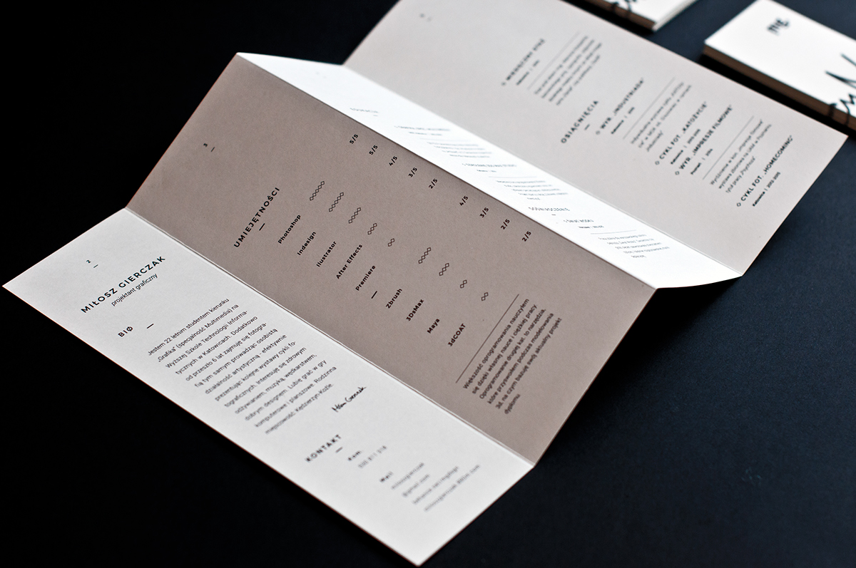
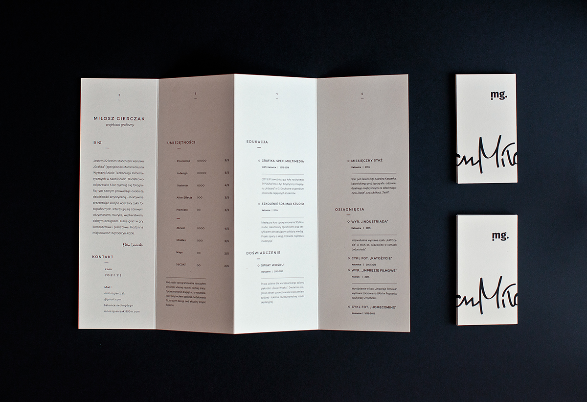
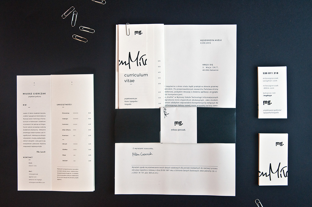
However, are employers and agencies tiring of these out-of-the-box ideas? Should you be going back to basics when it comes to your CV? Polish design student Miłosz Gierczak has done just that, with this minimalist brochure offering – showcasing his skills with a simple black and white effort.
"The black and white colour pallete belongs to every point in design. Black for basic forms in graphic design, white for space, black for typography, white for spacing between letters, black and white for b&w photography," Gierczak said of the design.
[via Design Taxi]
Like this? Read these!

Thank you for reading 5 articles this month* Join now for unlimited access
Enjoy your first month for just £1 / $1 / €1
*Read 5 free articles per month without a subscription

Join now for unlimited access
Try first month for just £1 / $1 / €1
Get the Creative Bloq Newsletter
Daily design news, reviews, how-tos and more, as picked by the editors.

Sammy Maine was a founding member of the Creative Bloq team way back in the early 2010s, working as a Commissioning Editor. Her interests cover graphic design in music and film, illustration and animation. Since departing, Sammy has written for The Guardian, VICE, The Independent & Metro, and currently co-edits the quarterly music journal Gold Flake Paint.
