3 top tips for successful networking
Bobby Chiu reveals the mistakes artists make while trying to promote themselves at conventions – and how to avoid them.
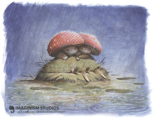
Networking and self promotion are essential to making it as an artist. Whether you are an animator, concept artist or illustrator, your art must sell and you have to get noticed! Bobby Chiu is an old hand at making conventions work for him, so he has kindly shared his observations on what artists commonly get wrong and how to make it right...
01. Try something new
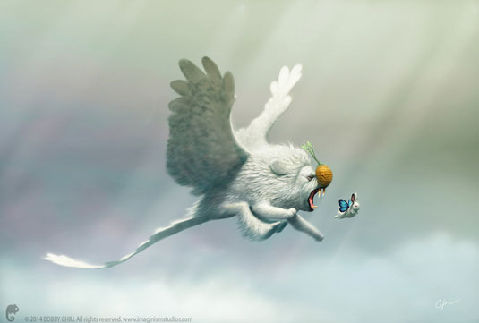
One thing we've noticed over the course of our many years at conventions is that many of the same people return to our booth during each iteration of the convention. This means that those same customers from last year are looking to purchase again, but do they want to purchase the same print or something very similar to last year? Not as much.
Say I'm a huge fan of yours, but you put out the same stuff every year, how much stuff am I going to buy from you? I'm definitely going to buy something at first, but perhaps not next year if you're always offering the same prints or very similar prints.
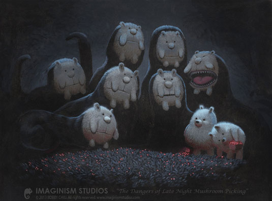
Constantly consider if your art is evolving enough. The world is evolving, and your art should be on the tip of that wave.
One tip I have that relates to this is to sell a convention exclusive (and don’t just take some second-rate painting that you never meant to sell, and slap on the word, "exclusive". Make it truly special). At San Diego Comic Con last year, we offered an exclusive creature mix-and-match book. It was creative, exclusive, and it gave people a big incentive to visit our booth.
02. Good artwork doesn't always make for good prints
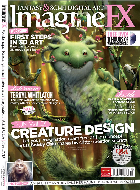
If you're a veteran of film, game, or another industry, whatever it may be, you might be surprised that images that do very well online, don’t always sell well when produced in print.
You have to think, what do you want to paint that would also go good on a wall, and what kinds of things do people want to hang up, but that's not all. The number one thing, is if it gives an effective emotional experience to the viewer.
If it's supposed to be a funny illustration, make sure that it is truly funny. I'm not talking about perhaps a picture of a little boy looking the other way while a dog eats his ice cream.
That's like 15 percent funny. I'm talking about laugh-out-loud funny. If you hit your emotional mark dead-on 100 percent, that's a sure sign that it's going to be an awesome print, because people like to hang up art that garners a strong emotional response for them.
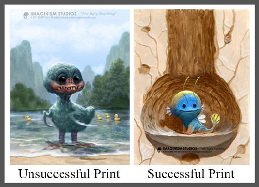
For example, I have these twin paintings I've attached to this post, and both are named "Ugly Duckling". The first one I created is an ugly duckling with greenish feathers, and big, black, buggy eyes, and it just looks kind of scary.
But, you see, the other very key element to knowing if your print is going to do well is if you can tell by looking at it, what room in a home it should go in. My first ugly duckling is obviously meant to be hung in your child’s room, because it’s a duckling and even though it's ugly, it's also cute.
But would it look great in your child's room? No, because it symbolizes your child, and through that you're saying that your child is super scary looking! So, that image did very well online, but it did horrible as a print and we discontinued it immediately.
Later, I made another print, also named "Ugly Duckling". This ugly duckling is strange, but very cute. It's blue, yellow, pink, and overall just very colorful. It has an aquatic tail, wings, fins, all sorts of bizarre parts, but it's done in a way that makes it special as opposed to ugly. This ugly duckling would go great in a child's room because it says that whatever is special about your child, is what makes them beautiful. Because of the emotional message in this second print, it sold much better than its predecessor.
03. Don't look down
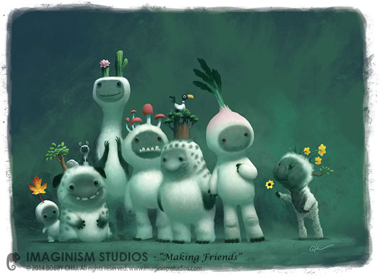
Every year, at every convention we attend, I see booth runners playing games (sometimes online with other booths!), or reading books, or just keeping their heads down and waiting to help customers only when a customer calls to them for help.
Keep your head up, because opportunities will sometimes literally walk right past you
If you're a first-time presenter, and especially if you're an original artist not just making fan art, people have perhaps little reason to come to your booth. You have to try to engage people walking past. If I'm not occupied, I'll engage anyone who even gets close to my booth, even if they're not looking at me. All you have to do is say something to them. I've always done this from the beginning until now (and I love it) and it's been invaluable to our success.
One technique we use is handing out cards to those passing by. We say, "Can we give you a card?" And many times, that's what starts a conversation.
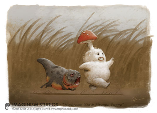
Here's a story about this with a lesson inside: At our very first convention, there were a lot of moms, so this mother comes by with her baby and stroller, looking very mommy. She came up to me to ask what we do and if we work for other companies and we were thinking it was no big deal until she gave me her card and it said, "Creative Director at Universal Studios, Universal City, Universal Street #1!"
You never know who's going to come by your booth. Another time, a young girl wandered over to us and even though she wasn’t buying, and she was asking a lot of questions, we talked to her, and remained kind. She ended up being the daughter of a very, very famous artists that I greatly adore.
Keep your head up, because opportunities will sometimes literally walk right past you, and you have to be present if you want a chance at grabbing them.
Words: Bobby Chiu and Flynn Ringrose
Bobby Chui has worked for Warner Bros., Dreamworks, and Sony's Imageworks and Animation divisions. He owns and Imaginism Studios in Toronto and founded schoolism.com.
Flynn Ringrose is an artist, Dungeon Master, and one of the pens behind the Imaginism Canvas newsletter that you can subscribe to HERE for more articles like the one you just read!
Bobby and Flynn will both be at the Schoolism booth this July at San Diego Comic Con!
Like this? Read these...

Thank you for reading 5 articles this month* Join now for unlimited access
Enjoy your first month for just £1 / $1 / €1
*Read 5 free articles per month without a subscription

Join now for unlimited access
Try first month for just £1 / $1 / €1
Get the Creative Bloq Newsletter
Daily design news, reviews, how-tos and more, as picked by the editors.

The Creative Bloq team is made up of a group of art and design enthusiasts, and has changed and evolved since Creative Bloq began back in 2012. The current website team consists of eight full-time members of staff: Editor Georgia Coggan, Deputy Editor Rosie Hilder, Ecommerce Editor Beren Neale, Senior News Editor Daniel Piper, Editor, Digital Art and 3D Ian Dean, Tech Reviews Editor Erlingur Einarsson, Ecommerce Writer Beth Nicholls and Staff Writer Natalie Fear, as well as a roster of freelancers from around the world. The ImagineFX magazine team also pitch in, ensuring that content from leading digital art publication ImagineFX is represented on Creative Bloq.
