How to promote yourself for less
You don't need to flash the cash to get your name out there – cheap self-promo tricks are all around, you just need to know how to make them work for you.
The idea of being able to promote yourself for free might seem like an unattainable goal, but it's hardly unrealistic.
After all, just by maintaining a well-presented, up-to-date design portfolio on a website, you're effectively employing self-promotion, if only of the most basic kind.
But there are other ways to broaden your profile and get your name out there without resorting to the costly methods of printing up flyers, making letterpress business cards, creating complex gifts to send to clients and so on.
Simple methods
True, these may not be entirely free, especially in terms of your own time – but by keeping an eye on current trends and using the resources already available to you wisely, you can put off that multi-million-dollar marketing campaign for just a bit longer.
If you're a freelancer and have new work to show, it might be as simple as finding an empty high street shop (not too difficult these days) and putting on a pop-up show, perhaps with other local artists.
If you're part of a larger studio with access to video or animation facilities, you could use your downtime to create viral videos and teasers – still one of the most effective word-of-mouth promotion methods. And anyone with access to a computer, the internet and a microphone can put together a podcast, as we'll see later on.
Timing it right
One period that can prove especially fruitful for word-of-mouth promos and virals is Christmas (or from late November onwards – the US 'holiday season').
Get the Creative Bloq Newsletter
Daily design news, reviews, how-tos and more, as picked by the editors.
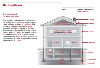
With many people looking forward to the break, and with its general air of festivity, a well-placed promo can grab the attention more easily than other times of the year. That's exactly what happened with *Santa*, a tongue-in-cheek brand book for a 'brand refresh' of the entire Christmas concept.
Brilliantly presented in a deadpan manner as a real web-based brand book, it's full of lofty but meaningless phrases such as: "*Santa* is a Concept, not an idea. It's an Emotion, not a feeling. It's both Yesterday and Today. And it's Tomorrow as well". Venn diagrams chart the relationship between 'Ho' and 'Ho ho ho', while a 'brand house' gleefully and meaninglessly deconstructs brand values.

*Santa* went viral just before Christmas 2013, popping up all over Facebook and featuring on newspaper websites. To date, it's had more than 1.1 million views.
Perhaps most intriguingly, the only clue to its origin was a discreet line on the very back page of the booklet: "If you've been affected by any of the issues in this brand book, please contact Quietroom."
Accidental promotion
Quietroom, of course, is a very real communication consultancy, based in London and specialising in branding. "The *Santa* brand book was not intended as promotion originally," explains Quietroom writer and workshop leader Simon Grover. "It was literally just our Christmas card, but people liked it so much we decided to do more with it.
"When we first put a PDF of it on our website three years ago, several companies got in touch. It directly led to significant new projects for us. This time, we put some proper effort into making it shareable, and it soon went viral. Meanwhile, we have had lots more enquiries from all sorts of interesting people."
Because it was produced in-house and presented on the web rather than as physical media, *Santa* cost virtually nothing to produce other than the team's time. Grover says they worked with a small design company to sharpen up the overall look, then gave it to a web company to put it online and – importantly – to make sure it was easily shareable in a simple, browser-friendly format.
"We really don't do much self-promo other than some social media," he adds. "We are a small company, and rely on word of mouth and just doing a great job, so people ask us back and recommend us."
Even though Quietroom expected a positive response from the industry, the sheer volume of attention *Santa* garnered in general still surprised the creatives. "We were fairly confident that anyone in branding would have a giggle at it," says Grover.
"Your self-promotion material obviously has to be engaging to your audience, otherwise they won't stick with it. And it should reflect you authentically so that your audience connects you with the material. But *Santa* seemed to chime with people in a much broader way, probably because it reflects a whole world of awful, pompous marketing that most people come across from time to time."
Christmas card replacement
Wolff Olins' Higby was another slice of clever Christmas-themed promotion, which took a similarly subtle but impactful approach to Quietroom's *Santa*. The concept evolved in late October 2013 as a replacement for the usual Christmas card, and was agreed upon towards the end of November.
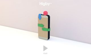
Described by Wolff Olins as "a set of friendly interventions for those technological pocket distractions", Higby aimed to encourage people to spend more time with each other over the holiday period, rather than with their mobile phones.
In reality, Higby was simply a set of small moulded plastic pieces: one in the shape of a smiley face that plugs into and blocks a phone's headphone socket, a pair of clip-on arms that bind two phones together in a 'hug' (so they can't be used), and another that clips over the phone's camera lens.
Mystery package
"Higby is an experiment in using design and technology to make delightful, useful and valuable new things possible for people – something that's central to all of the experiences we create at Wolff Olins," runs the press blurb.
But there was no branding on the parts themselves; Higby was sent to clients, with Wolff Olins relying on the idea that anyone who saw it would ask where this cute device came from.

This concept of word-of-mouth is all part of the Wolff Olins strategy. "Great design and utility are the most important factors," says head of marketing Dionne Griffith.
"We wouldn't send something out if it wasn't somehow useful or beautiful – to misquote William Morris. We hope that the Wolff Olins brand and our personality comes through in the idea without the need to do anything more overt."
Controlling costs
And it worked. "The feedback has been great – we've been contacted directly by members of the public asking if they can buy it, there was a strong buzz on social media and Higby found himself on the Fast Company and Huffington Post websites," says Wolff Olins designer Jody Hudson-Powell, who worked on the project, along with fellow designer LA Hall.
Indeed, there are now plans to sell Higby as a commercial product. In terms of financial impact, the fact that Higby was printed in-house using Wolff Olins' 3D printer enabled the studio to control production costs, while its compact size made it quick and easy to distribute.
A simple explanatory video posted to social media sites completed the picture. "Keeping in touch, which perhaps sometimes falls under 'self-promotion', is something we do as a matter of course," adds Hudson- Powell – and of course it helps if your promotion can link to an event in order to boost momentum.
Mock commercial
As we have seen, even established and well-respected companies are turning to more viral means of promotion. In an increasingly competitive environment, where effects budgets are being squeezed more than ever before, visual effects house Cinesite decided it needed a way to showcase its artists' work in a more engaging way than the usual showreel of impressive but rather meaningless shots from Hollywood films.
Even though it was established in 1993 and has worked on more than 150 films, Cinesite had never actually produced its own animated film from scratch. Thus from May to October of last year, between projects, the company worked on Beans, a 42-second mock commercial for 'Haynes Beans' involving men on the moon, aliens and a thoroughly tongue-in-cheek ending.
It's short, snappy, very silly and superbly demonstrates the company's skills. Beans launched on YouTube in early December 2013; two months later it had racked up 8.1 million views and been mentioned as a 'must see' on websites, in newspapers and blogs both inside and outside the VFX industry.
The film was written and directed by animator Alvise Avati and produced by Cinesite's animation director Eamonn Butler. "We're delighted that so many people loved the movie," says Butler. "It's too early to say if it will bring in paying work, but we are getting a lot of interest from clients who wouldn't normally consider us for animation work. It's also been generating a lot of very supportive and positive word of mouth within the VFX community."
As this was a first for Cinesite, Butler says that the last thing the team wanted to do was take the focus away from the company's paid-for client work. "We made sure that everyone knew that the real shows were our priority and that Beans was a free-time project," he explains.
As a result, and because of the way the VFX pipeline works in a linear fashion, it took far longer to create than a 'real' job would have. "But I'm glad we did it this way," Butler continues. "Taking longer to make the film allowed us the time to make mistakes and learn from them, adapt our process and still keep a high quality bar."
A lighter side
Beans is clearly a labour of love, but perhaps more importantly, it provided Cinesite with a platform to express itself without the pressure of client restrictions. As Butler says, it allowed the company to show a lighter side to what is often considered a very serious and intense industry.
"I think if you are passionate about an idea and work hard to realise it, it will show in the work," he adds. "But passion isn't enough for an audience. They want to be entertained."

Now the plan is to produce at least one new creative project in the style of Beans each year, no matter how busy the studio is. So what advice does Butler have for other creatives considering embarking on a collaborative self-promo project?
"Don't over-reach creatively or you may not finish it," he says. "Play to your strengths and reduce the risk of not getting it done. Don't be afraid to ask for stuff for free. You will be turned down a lot, but you will also be surprised and delighted when someone says yes.
"And always ask a busy artist to help – their wheels are turning already. It's harder to get an artist to do stuff during their free time when they are not actually that busy."
Podcast promotion
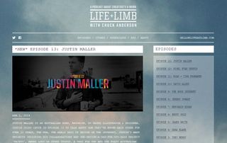
Designer Chuck Anderson has taken a completely different approach – one that he argues isn't self-promotion at all. In December 2013 he started producing his own podcast. And while it might not be designed as a self-promo exercise, it's enabled the creative to reach a far wider audience than he might have achieved through more traditional means.
Life + Limb is a series of talks with fellow creatives, on a whole range of subjects. There's no particular agenda and everyone's free to talk about whatever they want – it's like a relaxed version of a design conference. Indeed, Anderson says, "Each episode I do is almost like taking a really great class for me and therefore, I hope, for others."

According to Anderson, the self-promo element takes a back seat: "I'm aware that's a benefit to doing it and it's a nice built-in bonus, but it's not the point… It just doesn't cross my mind to talk about myself. In fact, I think I've only even mentioned my own Twitter name and website maybe once or twice so far."
Cheap to produce
Creating your own podcast enables you to deal with the subjects that engage you the most in a much deeper way than any showreel or portfolio. Anderson says his own is very cheap to produce, with the purchase of the domain name being the most expensive component: "The microphone, mic cables, mic stand, and audio interface were about US $400."
He adds that when he started his career back in 2003, there were far fewer low-cost options for self-promotion available to most people. These days, he says, it's different. "Let's take a bleak scenario into account and imagine you can only budget $100 for yourself to spend on self-promo. Start with your home printer. Make a zine, bring it to a printing place, get some copies made. Sell them, give them away, whatever.
"The problem is getting hung up on not having enough money or the 'right' tools or whatever other excuse you can think of… Just do something, anything!"
Words: Tom Dennis Illustration: Miguel Montaner
This article originally appeared in Computer Arts issue 225.

Thank you for reading 5 articles this month* Join now for unlimited access
Enjoy your first month for just £1 / $1 / €1
*Read 5 free articles per month without a subscription

Join now for unlimited access
Try first month for just £1 / $1 / €1
The Creative Bloq team is made up of a group of design fans, and has changed and evolved since Creative Bloq began back in 2012. The current website team consists of eight full-time members of staff: Editor Georgia Coggan, Deputy Editor Rosie Hilder, Ecommerce Editor Beren Neale, Senior News Editor Daniel Piper, Editor, Digital Art and 3D Ian Dean, Tech Reviews Editor Erlingur Einarsson and Ecommerce Writer Beth Nicholls and Staff Writer Natalie Fear, as well as a roster of freelancers from around the world. The 3D World and ImagineFX magazine teams also pitch in, ensuring that content from 3D World and ImagineFX is represented on Creative Bloq.
