Build a rotating 3D carousel with CSS
Explore the new CSS transforms features and create a 3D carousel that rotates from panel to panel. Paul Hayes takes you through the project and explains browser support and fallbacks along the way
- Knowledge needed: HTML, advanced CSS, basic JavaScript
- Requires: Modernizr, jQuery, Safari browser (not Chrome, for now)
- Project time: 1 hour
- Download source files
This article first appeared in issue 213 of .net magazine - the world's best-selling magazine for web designers and developers.
By now we’ve all played with CSS3’s rounded corners, gradients and drop shadows, but these only touch the surface of what’s now possible. CSS transforms, transitions and animations take our beloved HTML elements and contort, tween and mutate them. What was once dogged scripting and glitchy animation is now smooth, hardware accelerated and easy. And whilst purists aren’t happy about using CSS for behavioural declarations, everything just got a whole lot simpler.
There are two sets of CSS transforms, the widely supported 2D ones (working draft) and the more advanced and exciting 3D versions (working draft), which have a hardware acceleration bonus and which we’ll be using in our carousel.
Currently, only Safari browsers will render these correctly (since April 2009 no less). Chrome support is coming soon and early work has started at Mozilla. Fingers crossed for 2D transforms in IE9, but 3D won’t happen for a long while yet. Importantly, iOS devices (iPhone, iPad and iPod touch) support hardware-accelerated 3D transforms beautifully. Based on browser support, and for brevity, only WebKit-compatible CSS will be used in this tutorial. Please note, however, that the linear gradient on panels doesn't display correctly in the latest webkit because it's using an old syntax.
The basic HTML5 outline
We’re going to create a six-panel rotating carousel, and to keep things simple we’ll make it a fixed width. Let’s start with a basic HTML5 outline. We’ll put all our CSS in carousel.css and JavaScript in carousel.js. We’re also using Modernizr to detect 3D transform capabilities (as well as for the HTML5 shim) and jQuery. When 3D transforms are supported, Modernizr will add a class csstransforms3d to the HTML tag, which we can use in our CSS.
- <!DOCTYPE html>
- <html>
- <head>
- ...
- <link rel="stylesheet" type="text/css" href="css/carousel.css" />
- <script src="js/modernizr-1.6.min.js"></script>
- </head>
- <body> ...
- <script src="js/jquery-1.4.4.min.js"></script>
- <script src="js/carousel.js"></script>
- </body>
- </html>
For our carousel we’ll use a list, with each list item being a panel. To navigate the carousel there are previous and next links that will hook into some JavaScript:
- <div id="carousel">
- <div class="container">
- <ul class="panels">
- <li>
- <div>
- <h2>Panel title</h2>
- <p>...</p>
- </div>
- </li>
- ... (6 panels total)
- </ul>
- </div>
- </div>
- <nav>
- <ul>
- <li><a href="#prev">« Previous</a></li>
- <li><a href="#next">Next»</a></li>
- </ul>
- </nav>
Before we delve into the 3D realm we should have some basic styles set up, so the carousel looks roughly like we might expect. The carousel has a black background, and a fancy radial gradient (from dark grey to black); it’s centred with a light border. The background will only show through when the panels are animating. We’ll need to add overflow:hidden to this later so the element acts like a window, but while building it’s helpful to see everything:
Get the Creative Bloq Newsletter
Daily design news, reviews, how-tos and more, as picked by the editors.
- #carousel {
- width: 580px;
- height: 300px;
- background: #000;
- background: -webkit-gradient(linear, right bottom, right top, color-stop(1, rgb(70,70,70)), color-stop(0.57, rgb(0,0,0)));
- margin: 0 auto;
- border: 1px solid #ccc;
- }
The containers are absolutely positioned, with a slightly larger width (600px) so we can space out the panels a little and make them more visually appealing during animations:
- #carousel .container {
- width: 600px;
- }
- #carousel .panels,
- #carousel .panels > li {
- width: 600px;
- display: block;
- position: absolute;
- }
- #carousel .container,
- #carousel .panels > li {
- height: 300px;
- }
And finally come our panels: 580px total width, the same size as the carousel, but with a little padding, gradient and text-shadow to prettify it.
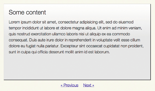
During development, making this panel slightly transparent can help solve bugs and illustrate 3D structures more clearly:
- #carousel .panels > li > div {
- background: #fff;
- background: -webkit-gradient(linear, right bottom, right top, color-stop(1, rgb(255,255,255)), color-stop(0.57, rgb(230,230,230)));
- height: 260px;
- width: 540px;
- padding: 20px;
- text-shadow: 0 1px 0 #fff;
- }
3D needs perspective
To begin our 3D adventure we need to give our carousel some perspective. It’s a one-liner with a hefty explanation:
- .csstransforms3d #carousel {
- -webkit-perspective: 800;
- }
Here's the science part. In three dimensions we have three planes, x, y, and z. x and y run left to right and top to bottom respectively. The z-plane runs from front to back, perpendicular to x and y. The perspective value defines the distance of the z=o plane from the viewer, which affects the magnitude of the 3D effect.
With a low number the z=0 plane is very close, and small changes have a big effect. Imagine standing beneath a skyscraper and looking straight up: you’re small and the object is huge. With a high number, the z=0 plane is far away and changes are more subtle – it’s the same skyscraper, but this time you’re flying way above and looking down. A perspective around the 800 to 1,000 mark feels natural. By default, the perspective’s origin, ie its vanishing point, is centred – this suits us fine, but it can be altered if necessary:
- -webkit-perspective-origin: 50% 50%;
The perspective applies to all the child elements, and the element with perspective becomes a containing block. This may sound complicated, but remember: all the difficult perspective calculations are performed by the browser, and after playing with the code it quickly becomes second nature.
One more thing: direct children of an element with perspective will be positioned in 3D space (eg div.container), but their children will be flatted into 2D. We can avoid this by setting the transform-style to preserve-3d:
- .csstransforms3d #carousel .container,
- .csstransforms3d #carousel .panels {
- -webkit-transform-style: preserve-3d;
- }
A circle of panels
When we move from panel to panel, the carousel will rotate. For this effect, we first need to position each panel in a circle, using a 3D transformation about the top-to-bottom y-axis. There are six panels in this example, so each will be at 60 degrees to the next:
- .csstransforms3d #carousel li:nth-child(1) { -webkit-transform: rotateY(0deg) }
- .csstransforms3d #carousel li:nth-child(2) { -webkit-transform: rotateY(-60deg)}
- .csstransforms3d #carousel li:nth-child(3) { -webkit-transform: rotateY (-120deg)}
- .csstransforms3d #carousel li:nth-child(4) { -webkit-transform: rotateY (-180deg)}
- .csstransforms3d #carousel li:nth-child(5) { -webkit-transform: rotateY (-240deg)}
- .csstransforms3d #carousel li:nth-child(6) { -webkit-transform: rotateY (-300deg)}
But rotating around just the y-axis will put all panels on top of each:
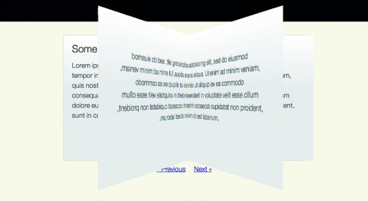
We need to spread them out so edge of each list element touches the next and a circle is formed.
This is simple enough: translating in the z-plane will move each panel away from the centre point. Calculating the exact distance to translate, ie the circle’s radius, requires a little trigonometry. In this case, for six panels of width 600px, it’s about 519px.
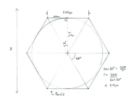
Translating 519px will put the panel faces on the outside of the circle: -519px will send them in the opposite direction and they’ll be on the inside. It depends how you want your carousel to behave. In this example we’ll be on the inside looking out, so we’ll use -519px and our final transforms look like:
- .csstransforms3d #carousel li:nth-child(1) { -webkit-transform: rotateY(0deg) translateZ(-519px); }
- ...
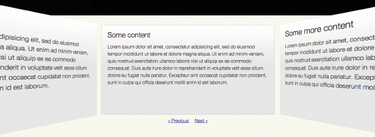
Alas, there’s another problem: all the panels are in a circle but the front-most has scaled up and looks huge.
We’ve moved the panels in the z-plane. Using our container we can alter where we view the circle from by moving the panels back, ie by translating Z an equal amount but in the opposite direction:
- .csstransforms3d #carousel .container {
- -webkit-transform: translateZ(519px);
- }

Rotating the circle
Our circle is complete and we’re sitting in the middle of it, but how do we move from one panel to the next?
Rather than change the position of each element we can shift the container. The <ul> looks straight ahead. Rotating it by 60 degrees will move all six panels and bring the next panel into view: -60 degrees will go in the opposite direction and show the previous one.
This can be scripted by accessing the <ul> element’s style property. Try typing something like this into a JavaScript console:
- $('#carousel .panels')[0].style.webkitTransform = “rotateY(60deg)"
That changes the panel, but there’s no animation. We need to add a transition. Using -webkit-transition (specification: www.w3.org/TR/css3- transitions) we’ll tell the browser that when we change from one transform to another we’d like a transition between two states over 500ms:
- .csstransforms3d #carousel .panels {
- -webkit-transition: -webkit-transform 500ms ease-in-out;
- }
Try the JavaScript again and you’ll see the circle smoothly move around from one panel to the next. (Don’t forget to put overflow:hidden back onto #carousel.)
JavaScript
In our JavaScript we can define this behaviour and hook it to clicks on the ‘next’ and ‘previous’ links.
When the page has loaded, and when a link is clicked, depending on the hash of the link we add or subtract 60 from our variable y and update an inline webkitTransform style. The browser does the hard bit:
- $(function(){
- var y = 0;
- $('nav a').click(function(evt) {
- evt.preventDefault();
- switch(evt.target.hash) {
- case “#prev":
- y = y - 60;
- break;
- case “#next":
- y = y + 60;
- break;
- default:
- break;
- };
- $('.panels')[0].style.webkitTransform = 'rotateY(' + y + 'deg)';
- });
- });
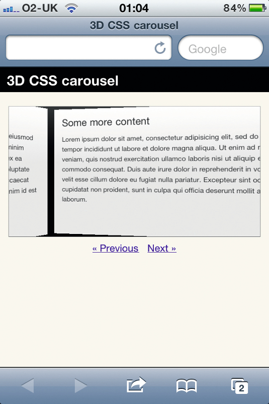
Clicking the next and previous links now animates the carousel.

Summary
So that’s it, a simple 3D carousel to wow your friends with. It even works on an iPhone! There are obviously some caveats: the angles of rotation and transform values are hard-coded to work with six panels of a fixed size, but that’s nothing a little scripting can’t rectify. We should also provide fallbacks for other browsers – the no-csstransforms3d Modernizr class is a useful hook for that.
If you’ve enjoyed this and perhaps want to play a bit more I’ve included an advanced version in the tutorial files. This adds a zoom effect and chains multiple transitions using the webkitTransitionEnd event.
Transitions and transforms
Transforms rotate, scale, translate and skew elements. Transitions define a behaviour for moving from one state to another (www.w3.org/TR/css3-transitions). And animations use keyframes to change multiple properties over a time period (www.w3.org/TR/css3-animations).
Transitions
transition: <property> <duration> <timing-function> <delay>
Example: When the opacity changes (eg, on hover from 0.5 to 1, or back again), transition from one value to the next linearly, over 50ms:
-webkit-transition: opacity 50ms linear;
-moz-transition: opacity 50ms linear;
Transforms
transform: <transform function> [<transform function>]*
A number of transform functions are available to you, the most useful being:
Scale:
scaleX(), scaleY(), scaleZ(), shorthand: scale(x,y), scale3d(x,y,z)
Rotate:
rotateX(), rotateY(), rotateZ(), shorthand: rotate(x,y), rotate3d(x,y,z)
Skew:
skewX(), skewY(), shorthand: skew(x,y)
Translate:
translateX(), translateY(), translateZ(), shorthand: translate(x,y), translate3d(x,y,z)
Examples:
-webkit-transform: rotateX(-10deg) rotateY(20deg); -webkit-transform: translateX(10px) rotate3d(20deg, 20deg, 5deg);

Thank you for reading 5 articles this month* Join now for unlimited access
Enjoy your first month for just £1 / $1 / €1
*Read 5 free articles per month without a subscription

Join now for unlimited access
Try first month for just £1 / $1 / €1

The Creative Bloq team is made up of a group of art and design enthusiasts, and has changed and evolved since Creative Bloq began back in 2012. The current website team consists of eight full-time members of staff: Editor Georgia Coggan, Deputy Editor Rosie Hilder, Ecommerce Editor Beren Neale, Senior News Editor Daniel Piper, Editor, Digital Art and 3D Ian Dean, Tech Reviews Editor Erlingur Einarsson, Ecommerce Writer Beth Nicholls and Staff Writer Natalie Fear, as well as a roster of freelancers from around the world. The ImagineFX magazine team also pitch in, ensuring that content from leading digital art publication ImagineFX is represented on Creative Bloq.
