Why the new Guinness logo doesn't signal the end of flat design
Guinness' redesigned identity is about authenticity, not killing off the flat, minimalist trend.
The Guinness logo redesign featured on Creative Bloq last week triggered a response on our social channels suggesting that this signals the death of flat design (with some celebrating this assertion!).
The redesign of one of the most famous brands around is certainly emblematic of a major design trend in recent years, but its departure from clean minimalism is not the main story here. It's much more about heritage, and authenticity.
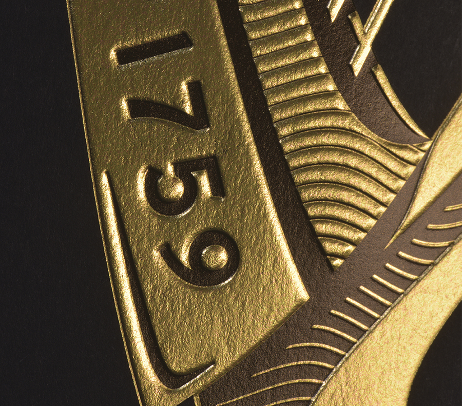
The previous Guinness logo design was never following a 'flat design' trend, in recent terms at least – it has featured a simple, graphic harp since the 1960s – nor was its much-lauded redesign about embellishment for its own sake.
Back to the roots
It's a beautifully executed return to its roots, an emblem of its 250-year heritage. Rather than a simple flat icon that represents a harp, Design Bridge went above and beyond by consulting with harp-makers Niebisch & Tree during the creative process, to craft the perfect shape that would actually function musically were it to be extruded.
In a crowded market in which Guinness has long traded on the notion that the Black Stuff is worth the wait, and more recently 'made of more', this is something of a master-stroke in craft, which truly practises what the brand values preach.
Authenticity is key
Brands have been tapping into the 'heritage' trend for years now, with varying degrees of success – but consumers are increasingly wary and skeptical of inauthenticity in this field.
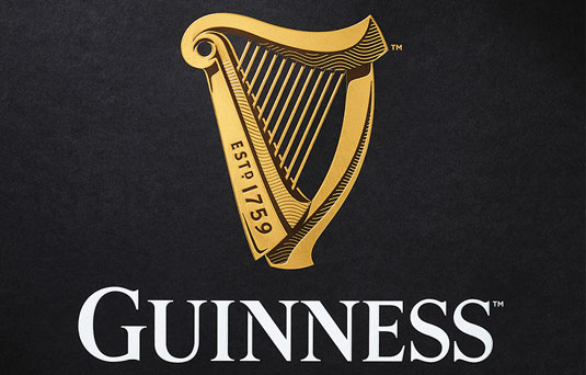
For Guinness, like many brands with genuine heritage and longevity, 'estd. 1759' has been part of its logo lockup since well before the notion became a hipster trend. In this latest redesign, this venerable date becomes etched directly into the harp, which is scaled up significantly in the hierarchy compared to the wordmark.
Passionate about the process
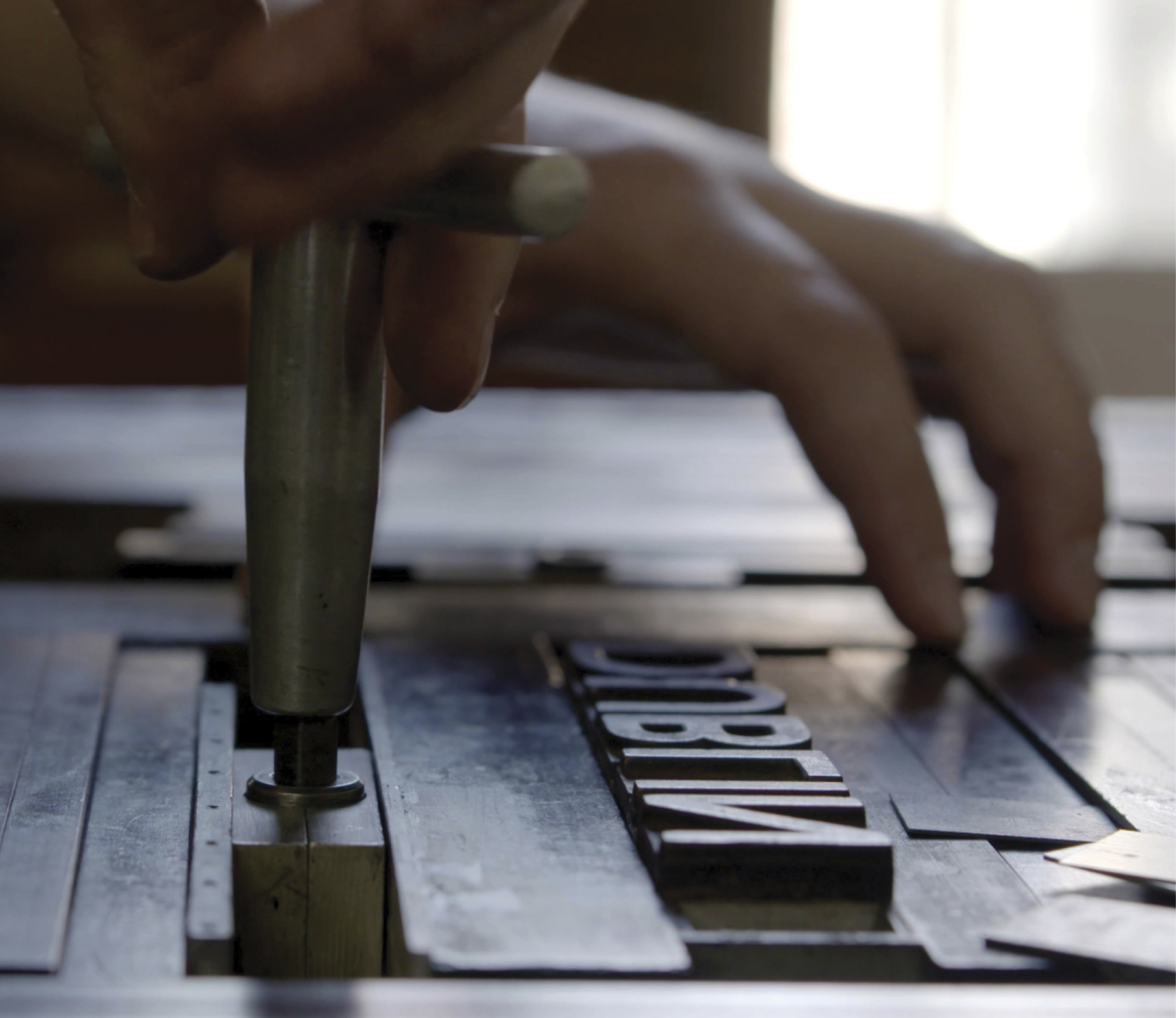
Gerry Barney's woodcut-esque one-colour version is strikingly elegant; the tactile letterpress by New North Press takes the craft aspect to the extreme with the kind of exquisite combination of print finishes more akin to the world of high-end luxury packaging.
Of course, in day-to-day mass-market application this effect is replicated in full-colour print on cans and bottles, but it's the effort, craft and attention to detail that went into the process to reach that point that's the story here. After all, authenticity isn't about wrapping a gold texture around a 3D digital render of a harp.
Made of more
But does the average stout drinker know or care that Design Bridge went through this intricate process? Do they care that the lettering on the harp was inspired by the metal-stamped type on the ironwork in the Guinness Storehouse, or that the waves on the harp represent the River Liffey?
In a way, it doesn't matter if punters know this at a glance. The important thing is that every layer is carefully and lovingly built, rather than a thin veneer. The final logo mark is beautiful, but in a considered, and crucially authentic way. It's genuinely 'made of more', and if anyone cares to dig deeper, the story keeps on giving.
Minimalism and flat design are about communicating quickly, simply and effectively, without excess noise. A rebrand like this is more like a worn, leather-bound book that draws you in.
Championing brand assets
Guinness is not the only alcoholic beverage brand to have drawn on its heritage and longevity in recent years.

Last year, Taxi Studio gave 169-year-old Carlsberg a major global overhaul that emphasised the Danish brand's century-old association with the hop leaf, in much the same way as Guinness has brought the harp to the fore.
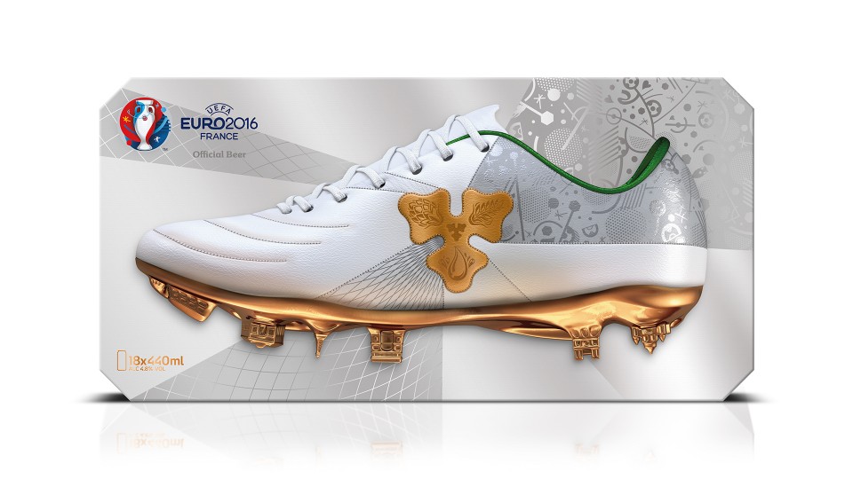
This versatile graphic emblem has since been carefully crafted into a plethora of different applications, across sub-brands and sponsorship associations, such as the forthcoming Euro 2016 tournament, for which the limited-edition 'Bootiful Game' packaging gives the hop leaf a beautifully crafted gold makeover.
Craft is king
NB Studio, meanwhile, captured the unique eccentricities of the 300-year-old Aspall cider brand by collaborating with two different illustrators – woodcut specialist Christopher Wormell, and traditional botanical illustrator Rosie Sanders – to convey the values of the eight-generation family business, which was founded in 1728.
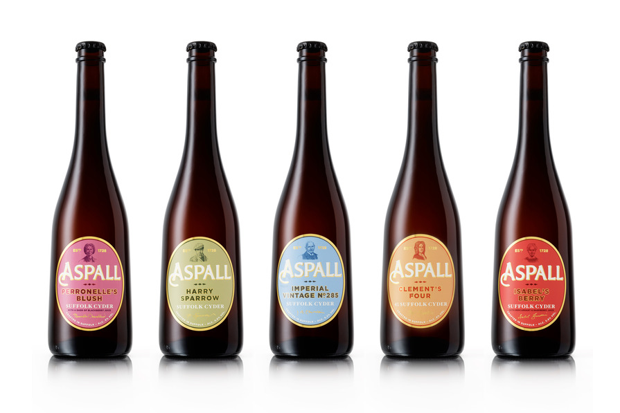
Impeccably and stylishly executed it may be, but the Guinness rebrand is just the latest in a line of recent examples of using heritage as an asset, celebrating centuries of craft in a stylish, contemporary way.
Guinness images courtesy of Design Bridge

Thank you for reading 5 articles this month* Join now for unlimited access
Enjoy your first month for just £1 / $1 / €1
*Read 5 free articles per month without a subscription

Join now for unlimited access
Try first month for just £1 / $1 / €1
Get the Creative Bloq Newsletter
Daily design news, reviews, how-tos and more, as picked by the editors.

Nick has worked with world-class agencies including Wolff Olins, Taxi Studio and Vault49 on brand storytelling, tone of voice and verbal strategy for global brands such as Virgin, TikTok, and Bite Back 2030. Nick launched the Brand Impact Awards in 2013 while editor of Computer Arts, and remains chair of judges. He's written for Creative Bloq on design and branding matters since the site's launch.
