Gourmet branding looks good enough to eat
The carefully crafted branding for Urbanbites is leading a gourmet revolution for foodies.
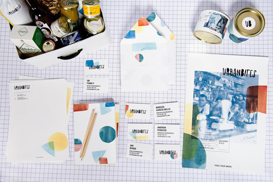
Here’s a branding design project that’s sure to whet your appetite. Aimed at urban foodies looking for a new fix of gastronomic goodness, this Spanish brand of subscription boxes from Urbanbites is as attractive as it is appetising.
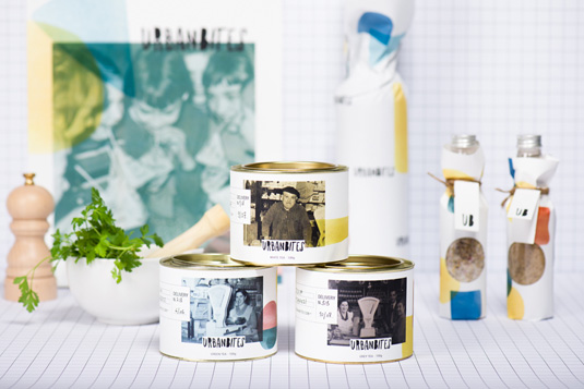
Award winning Spanish creative consultancy Masquespacio are behind this branding and web design project which aims to “Feed your mood”.
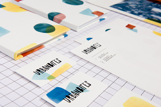
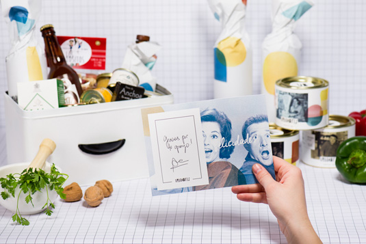
Inspired by the needs and tastes of Urbanbites’ customers, this aesthetic also seeks to find a balance between the craftsmanship of Urbanbites’ products as well as reflecting the new kind of gourmet flavours they offer. Masquespacio sum up the seductive mix of different design ingredients as ‘vintage contemporary.’
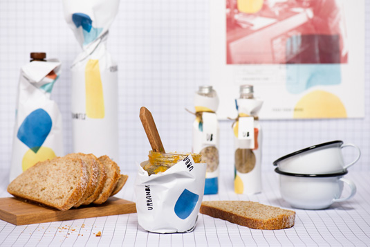
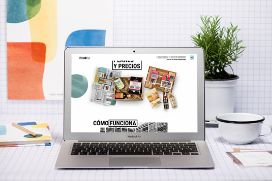
The design concept is brought to life through elements that appear handmade. This includes the blotchy, uneven typography, plus beautiful coloured patterns which have been realized with acrylic paint. Old pictures showing typical Spanish cooking and eating scenes finish off the branding.
Like this? Check out these articles on successful branding, and things to think about when considering a rebrand:

Thank you for reading 5 articles this month* Join now for unlimited access
Enjoy your first month for just £1 / $1 / €1
*Read 5 free articles per month without a subscription

Join now for unlimited access
Try first month for just £1 / $1 / €1
Get the Creative Bloq Newsletter
Daily design news, reviews, how-tos and more, as picked by the editors.

Dom Carter is a freelance writer who specialises in art and design. Formerly a staff writer for Creative Bloq, his work has also appeared on Creative Boom and in the pages of ImagineFX, Computer Arts, 3D World, and .net. He has been a D&AD New Blood judge, and has a particular interest in picture books.
