5 big trends in spirits packaging for 2014
Stuart Chapman of design research agency The Big Picture predicts how the look of spirits will evolve in the coming year.
Following on from our recent article on beer packaging, we’ve been looking to see how the trends identified in our annual Trends Analysis report are distilling into the world of spirits packaging.
Take a look below at the top five emergent design trends we can expect to see this year in the packaging design of hard liquor.
01. Machined
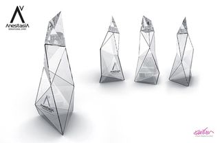
Rem Koolhaas might have had a hand in inspiring this trend, which kicks out the friendly, human curves and skeuomorphism of times past.
Unashamedly technological, this trend is defined by aggressively chamfered shapes with a distinctive sci-fi feel. In spirits, that code is used by AnestasiA Vodka to communicate a crisp, pure taste.
02. Art Deco Revived
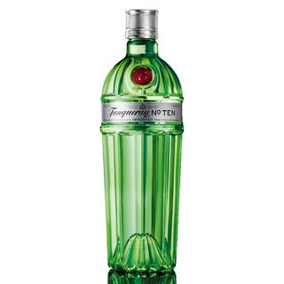
Moving from a forward-facing trend to one which looks back. Art Deco Revived takes the baton from the well-underway 50s retro revival and rewinds a few more decades to puts a modern spin on an era of classic design.
Diageo has refined the glamour of the period in its new bottle for Tanqueray No.Ten, which uses the trend to reflect the booming desire for classic cocktails, such as the Martini.
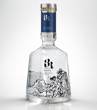
03. Drawn Freeform
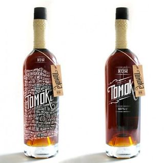
A trend which is also surfacing in the world of brewing is the use of drawn idiosyncrasies which add individuality and character to products.
Get the Creative Bloq Newsletter
Daily design news, reviews, how-tos and more, as picked by the editors.
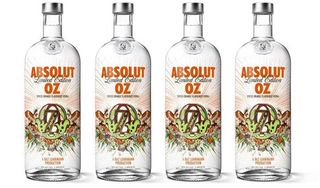
In brewing, it’s largely limited to small craft beer brands, but in spirits it’s growing across both the smaller brands, such as Tomoka and 3R Tequila to larger global brands including Absolut Vodka.
04. Monochrome
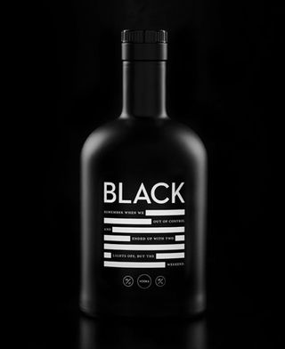
The bold, attention-grabbing combination of black & white (which has momentum in fashion via Issey Miyake & Chanel) is being used in spirits to convey an intriguingly understated message suggestive of hidden potency.
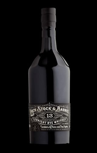
Lock, Stock & Barrel whiskey and Black vodka both use this to powerful effect.
05. Black Magic
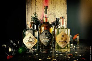
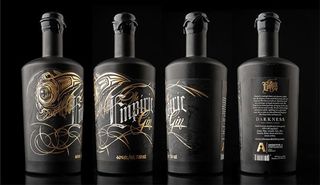
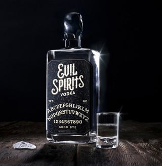
The Guillermo del Toro of design trends, this movement sees the darker side of fairytales come bubbling to the surface through graphics that promise the adventure and excitement of potions, spells and witchcraft.
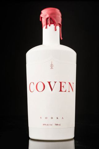
Evil Spirits vodka, Coven vodka, The Empiric gin and The 3 Howls all exemplify this most wicked of trends.
Words: Stuart Chapman
Stuart Chapman is associate director at The Big Picture.
Liked this? Read these!
- Brilliant craft beer label designs
- Colour-match your beer with the Beertone colour chart
- Helvetica typeface gets its own beer
Have you spotted a packaging trend we should be covering? Let us know in the comments!

Thank you for reading 5 articles this month* Join now for unlimited access
Enjoy your first month for just £1 / $1 / €1
*Read 5 free articles per month without a subscription

Join now for unlimited access
Try first month for just £1 / $1 / €1
The Creative Bloq team is made up of a group of design fans, and has changed and evolved since Creative Bloq began back in 2012. The current website team consists of eight full-time members of staff: Editor Georgia Coggan, Deputy Editor Rosie Hilder, Ecommerce Editor Beren Neale, Senior News Editor Daniel Piper, Editor, Digital Art and 3D Ian Dean, Tech Reviews Editor Erlingur Einarsson, Ecommerce Writer Beth Nicholls and Staff Writer Natalie Fear, as well as a roster of freelancers from around the world. The ImagineFX magazine team also pitch in, ensuring that content from leading digital art publication ImagineFX is represented on Creative Bloq.
