The top 10 brand icons in the spirits industry
Purple Creative, who redesigned the Glenfiddich stag, celebrates the graphic identities behind the world's biggest liquor brands.
A spirit brand's icon is probably the most powerful tool in its design arsenal. The best examples embody the spirit and essence of the brand, and tell a powerful and emotive story as simply as possible.
Many of the most famous icons also have the most heritage; they've simply been around longer and so have had longer to be understood and adopted. But even the oldest icons need constant evolution to stay credible and relevant to a modern audience – with some faring better than others as they seek to appeal and compete in a digital age.
Here's are the top 10 most powerful icons chosen by Jamie Fleming, head of copy at Purple Creative.
01. Bacardi's bat
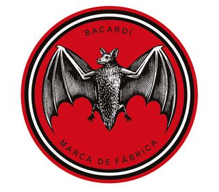
Background: In Cuba, the bat is a symbol of good luck and family unity, so when Don Facundo noticed a large colony of fruit bats living in the rafters of his newly-established distillery in Santiago de Cuba in 1862, he knew it was a sign.
Why it works: Even if you don't know the story, the bat is mysterious, unpredictable and embodies everything to do with the night – an emotive and attractive association for drinkers.
Icon design: One of the most consistent and recognisable logo designs in the spirits industry, it started appearing on bottles in 1890 and hasn't changed all that much today. The black bat has always appeared in a red roundel, the only significant design change being the bat's gradual simplification over the years (from an anatomically correct bat to a simpler symbol for the digital age) and his head being changed from looking back to looking forward in 2005.
02. Johnnie Walker's Striding Man
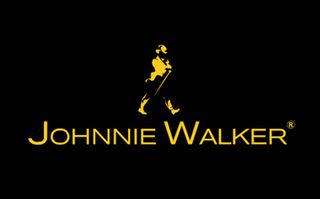
Background: The story is simple. John Walker, a shopkeeper and tea blender from Kilmarnock Scotland, found success blending whiskies in the 1850s. He was later honoured by artist Tom Browne, who painted a man wearing a red coat and tails and a top hat and cane – the uniform for success at the turn of the century.
Get the Creative Bloq Newsletter
Daily design news, reviews, how-tos and more, as picked by the editors.
Why it works: Longevity, of course (the icon was first used in advertising in in 1909), but it's also become bigger than it was originally intended. The icon is no longer a depiction of a founder but a more universal symbol of male success – anyone can be the Striding Man. It perfectly captures a man's progression, dynamism, restlessness, ambition and desire to succeed.
Icon design: Hugely recognisable, the red, white and black colour system hasn't changed for over 100 years. Famously, the Striding Man was turned to face the future (rather than the past) in 1999 – something perfectly encapsulated in their brand line, Keep Walking.
03. Kraken rum
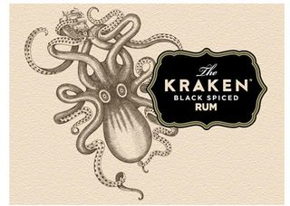
Background: In the black depths of the ocean hunts the fearsome Kraken, the giant beast of myth and fable that has terrified seafarers for hundreds of years. The inky black spice rum was named after it.
Why it works: The Kraken represents strength and mystery – a rum with a unique personality.
Icon design: The Kraken is a modern brand, created in 2010 with no heritage, but they have invented a legend and created a unique illustrative style that sets it apart from its Caribbean-themed competitors. It has instantly made a design impression – and attracts a devout following.
04. Courvoisier's Napoleon icon
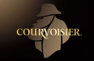
Background: Legend has it that Napoleon Bonaparte, Emperor of France, requested several casks of Courvoisier cognac as his luxury on his journey into exile from France to St Helena. It was forever after called 'The Brandy of Napoleon'.
Why it works: The Napoleon silhouette neatly represents revolutionary spirit, the brand's essence. In a few simple strokes, it captures the power, mystery and status of one of the most famous figures in European history.
Icon design: First used in 1909, the Napoleon silhouette has been simplified and made more iconic over the years. There aren't many brands who use people as their symbol, other than their founders, making this association a rare, enigmatic and memorable one.
05. Smirnoff's double-headed eagle
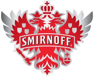
Background: The Smirnoff heritage story is a turbulent one, the family's fortunes rising after the Napoleonic Wars but falling during the Russian Revolution. Said to be the Tsar's favourite vodka, the double-headed eagle icon was inspired by the Imperial Russian Court's coat of arms.
Why it works: Smirnoff is proudly Russian, and the double-headed eagle embodies all that was great about the Russian Empire of old. It is heraldic, ancient and captures the history and personality of the brand perfectly.
Icon design: Like a lot of brands with history, Smirnoff has decided to shed its ornate royal crest and opt for a simpler more streamlined and stylised double-headed eagle. Like the white spirit it is, its symbol has been purified – making it relevant for a modern digital audience. But have they stripped away the story depth too?
06. Cutty Sark's clipper ship
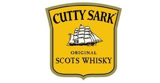
Background: Created in 1923, this whisky was named after The Cutty Sark: one of the last British tea clippers, a fast sailing ship with sails and three masts. Legend has it Cutty Sark was smuggled into Prohibition-bound USA by Captain Bill McCoy, who built up a reputation for supplying the good stuff (hence the phrase 'the real McCoy').
Why it works: The ship represents freedom and the spirit of adventure, finding new markets and global exploration. It is the opposite of a traditional Scottish whisky marque based in or around a distillery.
Icon design: This is one of the most recognisable icons in the spirits industry, mostly for its colour: the famous yellow label was apparently the result of a printer's error. It's an incredibly complex design, with 20 sails seen, but feels fresh and free – sailing forward into the future.
07. Famous Grouse's grouse
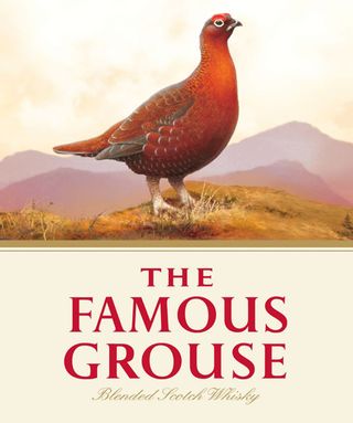
Background: In 1896 Matthew Gloag, a wine merchant from Perth, created his first blended whisky. The distinctive label featuring a local rare red grouse was illustrated by Matthew's daughter, Phillippa, and it gained such a reputation amongst the Victorian drinkers that it was renamed The Famous Grouse.
Why it works: The red grouse represents the spirit of Scotland in a charismatic way; its unusually wild and free spirit is brought to life in all communications.
Icon design: The red grouse icon is always used in an unusually prominent way on the label and in advertising: it's massive and unavoidable. Look closer, though, and it's an incredibly intricate icon too – the bird is in the heart of a painted Highlands. The company has used this bird so consistently that just hearing the name brings visions of the brand.
08. Beefeater Gin beefeater
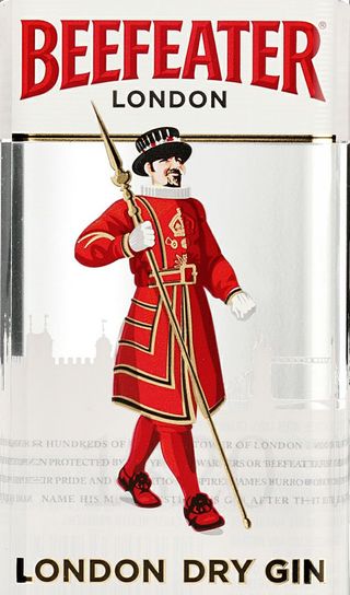
Background: Beefeaters, aka Yeomen Warders, guard the Tower of London, where the Queen's most precious and ancient jewels are kept. Their recognisable red and gold uniform is worn on state occasions, when the Queen visits the Tower.
Why it works: The Beefeater is a true and ancient symbol of London, where this gin proudly still hails from. Again, it shows a man striding forwards – but signifies traditional techniques.
Icon design: The Beefeater is a complex brand icon and has been redrawn many times to gently simplify the ceremonial uniform and make it as contemporary as possible. The red and gold colours, used starkly alongside the word marque, add remarkable recognition.
09. Chivas Regal's luckentooth
Background: In design terms, Chivas has long been associated with ornate heraldry and coats of arms based on the royal warrants they received in recognition for the quality of their goods supplied to the Queen Victoria's Royal household – symbols also representing tradition and Scottish clans. In 2012, the brand adopted the symbol of a 'luckenbooth', a traditional Scottish love token, taken from the wrought iron gates to Strathisla distillery.
Why it works: Chivas has been moving with the times. Old heraldic marques weren't appealing to the younger modern drinker, so the compant sought a new symbol. Heraldry still features in its packaging and labels but it's created a new icon for the digital age.
Icon design: Chivas Regal is an old brand that's done a very brave thing – thrown away its most recognisable asset and created something more contemporary. Design-wise, the 'luckentooth', with its curvaceous heart shape, feels more feminine (or certainly less male). It probably hasn't had time to 'bed down' yet, but who's to say in a generation it won't be as recognizable as the last?
10. Glenfiddich's stag
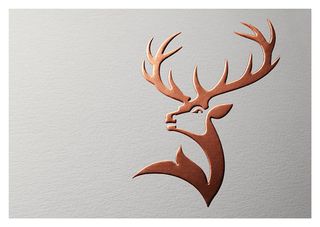
Background: The stag visually represents the Glen of Fiddich, which means Valley of the Deer in Gaelic, where the distillery was built by William Grant and his family in 1886 – and where it still stands today. It first started appearing on bottle in the early 1960s, when Glenfiddich effectively established the entire single malt Scotch whisky category.
Why it works: The stag represents so much more than just a place. It is the emblem of Scotland, and represents pride, strength, masculinity, maturity and confidence.
Icon design: The stag was originally based on the Monarch of the Glen painting by Sir Edwin Landseer. He used a proud royal stag, with 12 antler points, but in 2007 a new simpler design brought it down to eight points – which is a younger buck. The new evolved stag, created in 2014 by Purple Creative and revealed this week, reasserts the stag as the alpha male and head of the herd (perfect for the world's most awarded malt).
Words: Jamie Fleming
Jamie Fleming is head of copy at Purple Creative, an independent design agency based in Clerkenwell employing 20 people.

Thank you for reading 5 articles this month* Join now for unlimited access
Enjoy your first month for just £1 / $1 / €1
*Read 5 free articles per month without a subscription

Join now for unlimited access
Try first month for just £1 / $1 / €1
The Creative Bloq team is made up of a group of design fans, and has changed and evolved since Creative Bloq began back in 2012. The current website team consists of eight full-time members of staff: Editor Georgia Coggan, Deputy Editor Rosie Hilder, Ecommerce Editor Beren Neale, Senior News Editor Daniel Piper, Editor, Digital Art and 3D Ian Dean, Tech Reviews Editor Erlingur Einarsson and Ecommerce Writer Beth Nicholls and Staff Writer Natalie Fear, as well as a roster of freelancers from around the world. The 3D World and ImagineFX magazine teams also pitch in, ensuring that content from 3D World and ImagineFX is represented on Creative Bloq.
