Supersized infographics whisk you on a journey with D&AD New Blood
Enjoying the ride: Craig Oldham on his bold, subversive identity for 2014's D&AD New Blood.
On Thursday, Computer Arts' sparkling New Talent issue hits the newsstand. Inside, you'll find an in-depth guide to the year's most outstanding new graduates – and outside you'll see (and smell) the striking lemon-fresh results of our D&AD New Blood cover competition, crafted by talented Falmouth graduate Paddy O'Hara.

July's D&AD New Blood exhibition marked the end of an eight-week campaign for the Computer Arts team, which saw us traverse the length and breadth of the UK in search of tomorrow's design superstars.
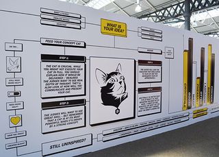
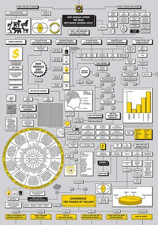
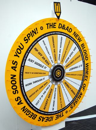
But it wasn't just creative from the graduates that caught our eye at New Blood. The exhibition itself boasted a bold new look, courtesy of The Office of Craig Oldham and copywriter and co-creative director John Goddard.
Dream brief
Running across print, online and most recently adapted for the multi-venue New Blood show, the campaign amalgamates D&AD's previous Student Awards, Graduate Academy and New Blood exhibition into one programme, mixing humour with bold graphics to communicate with its younger audience.
In the countdown to Thursday's New Talent launch, we caught up with Oldham to find out more about the unique challenges of the campaign…

What was the brief for the D&AD New Blood 2014 campaign?
Naturally, being a multi-faceted, year-long campaign, the dialogue and the iterative nature of that time develops the brief. The initial starting point was building on the strategy of exploding and explaining the rich and varied opportunities and journeys that can come from being involved in the New Blood programme as a young creative.
On top of that we felt it was necessary – and D&AD agreed – that the tone and voice of the campaign was going to be vital. We needed to relate to people not alienate them. It's about having a go at the briefs and having fun, not just about winning as that’s not the only reward New Blood offers.
What did you want to achieve?
For me I wanted to reconnect with students and young creatives. In my honest opinion, whilst strong and interesting prior campaigns have been created for the New Blood scheme, they could all have been just as easily done for the professional activities which D&AD do. New Blood isn't about that. Also, New Blood is the best thing D&AD do, and I wanted to create a campaign that reflected that. But that's for others to judge…

Where do you start with a brief like this?
Briefs can be long or short, hard or tough, clear or complicated, but the best way to start this was to just have conversations with D&AD. I love the New Blood programme and really wanted to get to know as much as I could about it so who better to ask than those people who run the programme who have all the passion you’d ever need.
Then you get to some sort of human truth, and form a real aim and ambition for the project, and that’s where the good stuff is. It’s cliché but if you dig deeper you rise higher. But it's important that you come from a starting point that matters, that is relative, and that can ultimately be meaningful. If you have nothing to say (or no content) then the best advertising and design won't save you.
One of your main aims was to help D&AD find its voice. What was the problem?
Think I've kind of mumbled through this in the above but it was just about reconnecting. I still remember my student days. I exhibited at New Blood when I graduated almost 10 years ago and I remember the experience vividly – and I will never let myself forget that.
So we wanted to use this and have a bit of empathy with those about to engage with New Blood, tell them we know how they feel, how nerve-wracking it can be, all the things that run through your mind… and reassure them that even in the industry we do that. We also wanted to lead with the campaign that was humourous, and that in some sort of way said, "look, always try and enjoy your work".
What was the most challenging part?
New Blood is a fantastic programme because it's so diverse. There's so many things that they do, that they put on, organise, show, inform, and do. So the size of it was quite challenging. But the flexibility of the campaign, and the humanising of the 'voice' made it easier in that no matter what it was we could just tell people what it was.

How did you ensure the campaign had maximum impact at every stage?
By understanding the aims and intentions, but more importantly the context and the content. Two things without which you're fucked.
What's your favourite part of the final campaign?
That's like asking me what my favourite song or film is, it changes with my mood. But from an overview I think it's the depth. The campaign never got to a point where it was re-sizing or re appropriating previous elements – just regurgitating the same ideas. We never once said, "oh let’s just re-use that idea we had for… and just put it here." Every context and application was a little idea in and of itself.
Given the chance, would you do anything differently?
The one that got away. We wanted to create three mascots, one of which was a 2.5m long two-man box costume… The exclusion of which still hurts today.
The Office of Craig Oldham is the eponymous practice of designer Craig Oldham, who creates brands, books, websites, films and objects, for clients, audiences, and for the sheer fun of it. Oldham has been awarded by Art Directors Club, D&AD, Design Week Awards, Creative Review, New York Festivals, Type Directors Club, for personal and previous work.
Save 50% on a CA subscription today!
In the spirit of new talent – and to celebrate the 2014 degree show season – we're offering an incredible 50% off an annual subscription to Computer Arts magazine.
For just £39 you'll receive an entire year of industry insight, opinion and inspiration, delivered directly to your door.

Thank you for reading 5 articles this month* Join now for unlimited access
Enjoy your first month for just £1 / $1 / €1
*Read 5 free articles per month without a subscription

Join now for unlimited access
Try first month for just £1 / $1 / €1
Get the Creative Bloq Newsletter
Daily design news, reviews, how-tos and more, as picked by the editors.

Julia is editor-in-chief, retail at Future Ltd, where she works in e-commerce across a number of consumer lifestyle brands. A former editor of design website Creative Bloq, she’s also worked on a variety of print titles, and was part of the team that launched consumer tech website TechRadar. She's been writing about art, design and technology for over 15 years.