Stylish tea shop branding blends emotion with information
This branding for a tea shop in Mexico is so delightfully stylish, it certainly hits the spot.
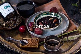
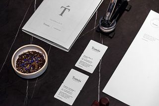
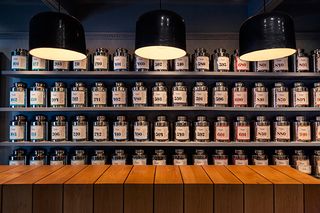
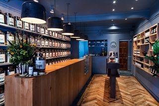
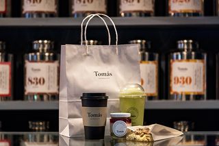
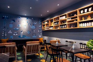
Opening up a new shop raises all sorts of challenges. From business cards to interior design, the branding has to live and breathe every corner of your company. Tomás is a tea shop located in Mexico and Monterrey based design agency Savvy Studio took on the job of creating their look.
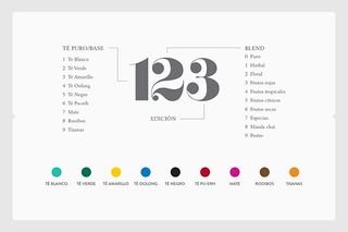
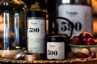
"Through a simple and clean identity, we portray tea itself as an experience – through scent and taste – that translates into wellbeing for body and mind," they explain. "Our design is inspired upon the lifestyle that surrounds the daily ritual of drinking tea for which we developed a complex graphic system that helps identify all of Tomás' products, categorising and emphasising their origins and key attributes and benefits.
"All of the texts were written so that Tomás would turn all of its brand experiences into an actual journey across the emotional – and informational – world of tea." This simple graphic system teamed with beautiful typography choices and a sleek finish certainly makes this tea shop branding a belter.
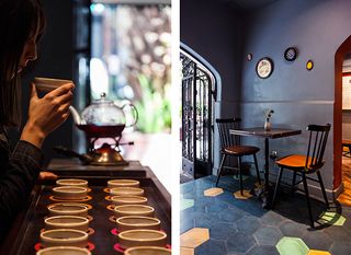
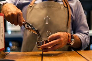
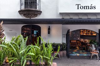
What do you think of this tea branding? Is it your kind of blend? Let us know in the comments box below!

Thank you for reading 5 articles this month* Join now for unlimited access
Enjoy your first month for just £1 / $1 / €1
*Read 5 free articles per month without a subscription

Join now for unlimited access
Try first month for just £1 / $1 / €1
Get the Creative Bloq Newsletter
Daily design news, reviews, how-tos and more, as picked by the editors.
Sammy Maine was a founding member of the Creative Bloq team way back in the early 2010s, working as a Commissioning Editor. Her interests cover graphic design in music and film, illustration and animation. Since departing, Sammy has written for The Guardian, VICE, The Independent & Metro, and currently co-edits the quarterly music journal Gold Flake Paint.
