Studio gives storefront a stunning pirate-themed identity
This store rebrand and packaging project is a treasure-chest full of inspiration.
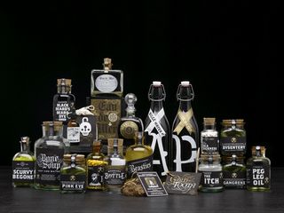
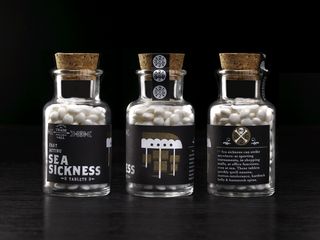
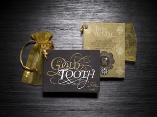
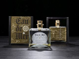
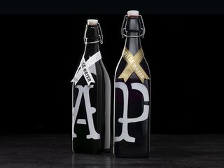
Redesigning a storefront comes with all sorts of challenges; from the window display designs to the packaging designs, it all has to fit into one iconic brand. Here, San Francisco based company Office created this beautiful brand for a pirate store, which includes logo designs and gorgeous typography efforts.
"Office collaborated with 826 Valencia – a nonprofit tutoring center for youth – to reinvigorate its storefront, which houses San Francisco's only pirate supply store," they explain. "We developed the store's new identity, and conceptualized and designed nearly 50 new products."
"Office has produced some of the most ravishing and funny buccaneer supplies yet known to man," said Dave Eggers, 826 Valencia founder and McSweeney's editor. "Reflecting the store's wildly imaginative experience, the products represent 826's mission to support creative expression. All proceeds directly benefit 826 Valencia's writing programmes." Take a look below.
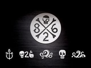
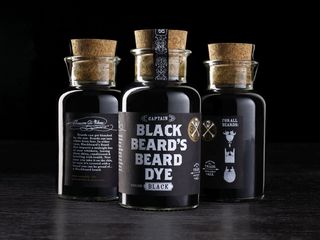
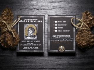
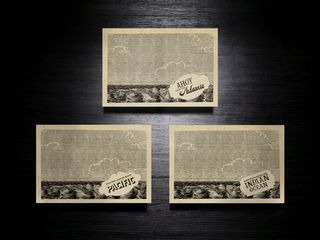

What do you make of this branding? Let us know in the comments box below!

Thank you for reading 5 articles this month* Join now for unlimited access
Enjoy your first month for just £1 / $1 / €1
*Read 5 free articles per month without a subscription

Join now for unlimited access
Try first month for just £1 / $1 / €1
Get the Creative Bloq Newsletter
Daily design news, reviews, how-tos and more, as picked by the editors.
Sammy Maine was a founding member of the Creative Bloq team way back in the early 2010s, working as a Commissioning Editor. Her interests cover graphic design in music and film, illustration and animation. Since departing, Sammy has written for The Guardian, VICE, The Independent & Metro, and currently co-edits the quarterly music journal Gold Flake Paint.
