Studio Dumbar: Dutch by design
With outposts in China and Korea, Studio Dumbar is truly international – but its Netherlands roots have also helped shape Dutch design for over three decades
Can it be said, in these days of the internet and global travel, that a design studio’s location influences the look and feel of its work? Are Swiss, Scandinavian or Italian flavours still detectable in modern design? Or are we witnessing the visual equivalent of a multicultural feast nowadays? Well, whether or not you can see anything of the Dutch creative heritage in the work of Studio Dumbar, the Rotterdam-based outfit is certainly well embedded in the country’s design landscape.
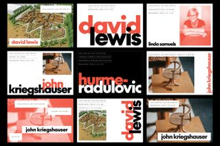
When a train goes past, for instance, you’ll notice that it bears the double-arrow Nederlandse Spoorwegen logo. Graphic designer Gert Dumbar was instrumental in designing this identity back when he worked at Teldesign, before later setting up Studio Dumbar in The Hague in 1977. This work for the Dutch national rail company is still associated with Studio Dumbar, even today. As his studio and reputation grew, the country’s postal and telecommunications services, automobile association and even the police force joined the client list, along with various government departments. With the Danish postal service and Czech Telecoms also onboard, Studio Dumbar became a global player.
Today it’s run by creative director Liza Enebeis, CEO and strategist Tom Dorresteijn, and client services director Karmen Kekic. “Studio Dumbar was one of the first that went across borders, outside of the Netherlands,” says Enebeis, whose history with the company goes all the way back to an internship in 1994. “In the 90s a lot of the work became known, not because of the D&AD awards it won, but because at the time it was groundbreaking, looking at identity and branding – or what we call branding now – and how it was approached. It wasn’t just a logo.”
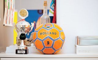
The company has won an astounding number of awards. On D&AD’s all time list, Studio Dumbar is the third most awarded design outfit, beaten only by Apple and Pentagram. The cabinet near the reception area in the open plan studio is overflowing with D&AD pencils, Dutch Design Awards and many others.
Riding the storm
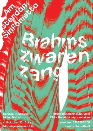
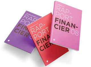
Well into its fourth decade, Studio Dumbar has seen plenty of ups and downs. There’s been all the churn of two big dips for the design industry – in the early noughties and again with the recession that began in 2007. So these days things are a little different. Dumbar himself retired from the studio in 2003, and the business moved to Rotterdam. It’s still producing brilliant work, however, and remains arguably the biggest name in Dutch design. Shell’s annual report is designed there, and it helps the oil giant with communications strategy. From the Amsterdam Sinfonietta to Alzheimer Nederlands and the University of Twente, Studio Dumbar’s work permeates Dutch civil society.
About 10 years ago, the company moved into its current studio, in a defunct electrical facility on a derelict spit of land by the river. This used to be dockland, and while huge container ships slid past, going to and from the Port of Rotterdam, other buildings popped up nearby. One of the neighbouring structures housed a nightclub for a while. It was part of Rotterdam’s well-known techno scene, before being converted into flats.
Now the neighbours include other studios, architects and video production companies. It’s turning from wasteland into quite a creative neighbourhood, but there’s still plenty of space outside, with enough room for a football pitch.
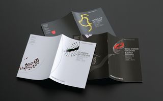
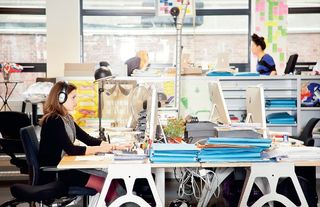
The atmosphere is fun and friendly, and the studio is decorated with examples of its brightly coloured work. At one desk there’s a cardboard cut-out of a man called Chris. Chris left a while ago, but the designers still like having him around. Meanwhile, intern Jowan de Haan comes over to say hello, and explain that he’s been reading Computer Arts for the last seven or eight years. The staff currently numbers 24, including creatives from a number of countries – Kekfeng Lee is Malaysian, Sven Neitzel is German, Erik de Vlaam is Dutch and Clara Kerkstra is half-Spanish. Enebeis herself is Greek.
“It’s a mixed team, but I think maybe there’s an essence, a mentality and a straightforwardness,” she says. “I know you talk about flamboyant, but I don’t necessarily find the work flamboyant – it’s more colourful. Also, there are the influences of different designers at different times. Okay, we go through our black and white periods or our colour periods, but if I look at our work I don’t find that there’s a certain style to what we do.”
Fresh styles
Though she says the studio is style agnostic, the straightforwardness she refers to is manifest in the look and feel of much of its output. It’s also underpinned by a sense of honesty and fairness. The way things are done at Studio Dumbar seems to come across in the aesthetic – bold, clear, never fussy, often colourful and highly conceptual. It’s a democratic place to work and each designer gets to have their say – even interns are asked to sketch ideas for new projects.
When a new brief comes in, whether it’s actual work or just a pitch, two or three designers and an intern are asked to solve it. They go away and sketch, coming up with their own concepts for two or three weeks, or as long as the project requires. “If someone’s asking for an identity, it doesn’t mean we start sketching logos. It depends. You can start backwards, forwards, everybody has their own way of working. But what we do is we meet every two or three days just to review the work as a group, and usually what you see is one designer helps another to go further,” says Enebeis.
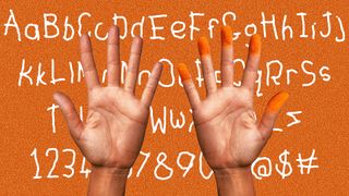
Enebeis uses the identity Studio Dumbar recently created for Alzheimer Nederland to take us through their creative approach. First of all there are some typographic roughs. The ‘A’ has been played with so that it resembles a spaceship, and elsewhere it looks almost like a condom. The ‘N’ has been tilted on its side. This all seems so wrong for an Alzheimer’s charity, but looking at things in diff erent ways, experimenting and making mistakes is all part of finding the right identity.
Among all the work-in-progress material, another designer was layering photographs, repeating the imagery, and applying treatments to it in Photoshop. This explores how photos can represent memories, and the way they become fuzzy or are lost entirely to the disease. Distortion, cutt ing up, re-composing images and words, creating patt erns – it was a long and difficult period as the designers tried to find the right solution.
Finding a balance
“One of the hardest parts was keeping the≈balance. Okay, this is a disease that will eventually kill you, but it is also an identity for an organisation that has to make money. You have to find a good balance in communicating your message without it looking like it’s the end,” explains Enebeis.
Colour became a big issue. They explored a bright palett e, but the brakes were applied for two reasons. Firstly, the charity had used a dark green in the past and was quite att ached to it. Secondly, Alzheimer Nederland works mainly with people over 60, while vibrant colour is associated with youth. Still, maybe colour could liven up the brochures about diff erent things the charity does with Alzheimer’s suff erers, families and carers. The solution came aft er looking into what people with Alzheimer’s experience in relation to colour.
“Are these colours too trendy?” asks Enebeis. “That was a big discussion. But when we were looking at it, when we were doing research, colours that are bright are also colours that are easier for patients to remember because they are so in your face. So that was partly the reason why we used these colours.”
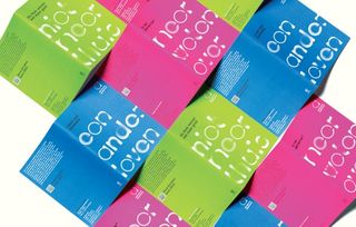
All the work – falling in and out of love with ideas, concepts and colours – was worth it. The final identity is wonderfully conceptual, with a very contemporary feel to it, and it really chimes with the mission of the charity. Lowercase type is used, with blurred circles occluding certain areas of the lett ering. It reflects the way Alzheimer’s disease causes activity in parts of the brain to fade away, which is what the charity deals with on a daily basis.
Although she’s the creative director, Enebeis doesn’t do any actual design. This, she feels, would undermine the work of the people around her, and at Studio Dumbar the designers are shown a lot of respect. Aft er all, imagine spending weeks sketching out concepts, researching images and working on a typographic treatment only to be told that your creative director’s idea will be the one taken to the client. Instead, she helps choose the team for each project, reviews work, asks questions and guides the process along until the designers come up with the best possible solution for the project.
“Our projects are quite large. They can last for a year. And it’s important that we stand behind everything we present. So it means that if a concept is picked, every designer stands behind it, because then as a team we still have to continue that project. If there’s a feeling that this is not strong enough or not good enough we really have to push each other,” says Enebeis.
An open approach
Like Enebeis herself, the process is all friendly, open and honest. However, at times it’s also brutal. Many of the walls around the studio are covered with metal panels so that work can be posted up, using magnets, for review. And that’s where even beautiful ideas often die. Concepts they might have fallen in love with are killed if they’re not quite right for the project. Then, either a better idea swims on for further development, or it’s back to the sketchpad. Clients are part of the process, she explains, and it’s important that the designers meet and get to know them. Seeing clients, listening to them, reading their body language, it’s all part of her open approach.
“We call them kitchen reviews, where we show sketches or the directions that we’re going in,” she says. “We’re also very clear, so it’s not like we don’t know where we’re going. They are directed reviews, to get their feedback. We find that important, that relationship. I don’t believe that clients don’t know what they’re talking about and that designers know better. I really don’t believe that. Ideas can come from anyone and everyone, and it’s about having a really good relationship in order to have good design as a result.” Ultimately, Enebeis and her team pursue that feeling of excitement you get when you really believe you’ve found the single most effective answer to the brief. “There’s a designer, and they’re sketching, and suddenly they’re coming up with ideas. When you think this is the only way, you ask, ‘What else is there?’ Then somebody comes up with a brilliant idea. It makes me really excited, when everything fits and you have an answer.”
The current recession seems to be far from over, and this is a challenge Enebeis pinpoints when asked about the future. Studios might have to do more work for less money, but she’s adamant that no corners are cut.
Looking outwards, there’s also the challenge of working for clients in Asia. The company has a field office in South Korea, and a small studio in Shanghai. She’s willing to adapt to what overseas clients expect, both in terms of process and aesthetics. “There’s a different way of working. For example, in proposals. Maybe here (The Netherlands) we will make two or three proposals, maybe in Shanghai we will have to look at four or five because they need to look at more than two to make a choice,” she says.
“There was a project in Korea where we made a design, but our partner there said, ‘In Korea, this symbolises something that can be negative.’ So we had to try to understand why. There’s a lot more research and a lot more dialogue. You’ve got to learn,” she concludes. And looking around the studio, there seems little doubt that such a strong multinational mix of talent will crack it.
Discover the ultimate guide to logo design: 40 pro tips, over at Creative Bloq.

Thank you for reading 5 articles this month* Join now for unlimited access
Enjoy your first month for just £1 / $1 / €1
*Read 5 free articles per month without a subscription

Join now for unlimited access
Try first month for just £1 / $1 / €1
Get the Creative Bloq Newsletter
Daily design news, reviews, how-tos and more, as picked by the editors.
The Creative Bloq team is made up of a group of design fans, and has changed and evolved since Creative Bloq began back in 2012. The current website team consists of eight full-time members of staff: Editor Georgia Coggan, Deputy Editor Rosie Hilder, Ecommerce Editor Beren Neale, Senior News Editor Daniel Piper, Editor, Digital Art and 3D Ian Dean, Tech Reviews Editor Erlingur Einarsson and Ecommerce Writer Beth Nicholls and Staff Writer Natalie Fear, as well as a roster of freelancers from around the world. The 3D World and ImagineFX magazine teams also pitch in, ensuring that content from 3D World and ImagineFX is represented on Creative Bloq.
