This studio branding is all about me
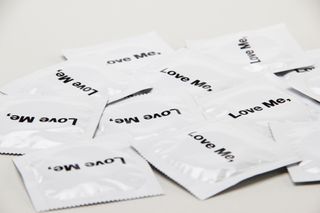
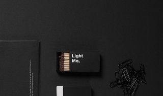
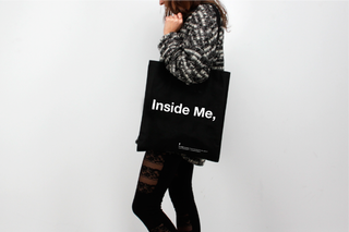
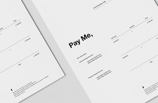
Me is Mirco and Eva - take a look at the branding for their design agency.
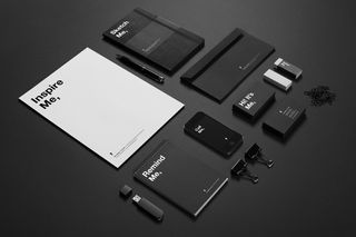
Coming up with your own iconic brands to self-promote and suit your design agency is a huge task. Here, a London based agency have decided to focus on themselves and showcase a sleek, monochrome branding effort that is bound to catch the eye.
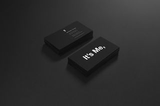
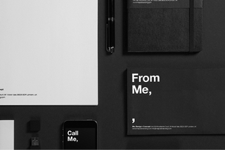
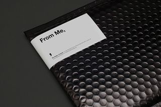
"Me is the union of the initials of Mirco and Eva, co-founders of the studio. That's how our friends, clients and partners call us. The comma, reflects the narrative process of our our practice. We tell stories, create concepts and bring them to life through our designs." they explain.
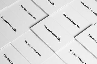
"For our promotional material, we chose a collection of un-conventional objects and branded them with simple and bold phrases. The collection consisted of bags, notebooks, condoms, posters, mugs. Inside Me, Remind Me, Love Me, Inspire Me, Taste Me... Every object utilised the 'Me,' theme to create a message not only to highlight the nature of the product but also to create an emotional link between people and us, between people and Me."

What do you think about this agency branding? Let us know in the comments box below!

Thank you for reading 5 articles this month* Join now for unlimited access
Enjoy your first month for just £1 / $1 / €1
*Read 5 free articles per month without a subscription

Join now for unlimited access
Try first month for just £1 / $1 / €1
Get the Creative Bloq Newsletter
Daily design news, reviews, how-tos and more, as picked by the editors.

Sammy Maine was a founding member of the Creative Bloq team way back in the early 2010s, working as a Commissioning Editor. Her interests cover graphic design in music and film, illustration and animation. Since departing, Sammy has written for The Guardian, VICE, The Independent & Metro, and currently co-edits the quarterly music journal Gold Flake Paint.