Speed up your corporate identity design process
Designer Jo Gulliver explains how to save time when applying a brand identity across different print collateral.
There's no need to create multiple documents when working with multiple different page sizes in InDesign. In this walkthrough, I'll demonstrate how to set up a selection of different-sized stationery templates in one document.
Multi-page documents can really help streamline your workflow with the use of style sheets, which enable changes to be made quickly across all pages. They also help you to maintain consistency throughout a project. Additionally, we'll cover paragraph styles and create nonprinting layers in this workshop.
The first step is to roughly plan the structure of your stationery elements and collate all the copy you need for the documents. Remember to take adequate time to plan and set up documents at the beginning of your process – it'll save time later.
01. Set up your document
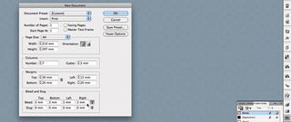
Set up a new document in InDesign. First create the letterhead. Create an A4 document and uncheck the Facing Pages box. Set up the margins: top margin is 30mm; left is 15mm; bottom is 20mm; and outside is 20mm. Set a seven-column grid with a 3mm gutter and add 3mm bleed on all edges (hit More Options).
02. The baseline
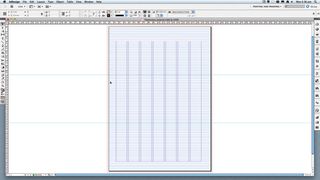
Set up a baseline grid. This isn't essential for a document with such little text, but it helps with lining up text elements. Set the baseline grid to start at the top margin – at 0mm – and the increments at every 9.5pt (we want to use 8pt text). Add ruler guides to mark folds in the paper. We've marked a tri-fold.
03. Start designing
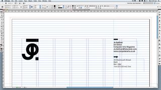
With your ruler guides in place, add the required elements to your letterhead and experiment with the design and layout. Consider the hierarchy of your information: of course your logo takes prominence, while your address and other information should be secondary. Research other designer stationery.
04. Set up style sheets
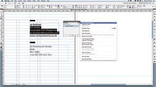
Creating style sheets makes it easy to adjust all pages in one step. Select the required text, and in the Paragraph Styles panel select New Paragraph Style. Name it. We added a new black to the Swatches panel and applied it to the logo, so it's easier to make a group adjustment to the logo colour later on.
Get the Creative Bloq Newsletter
Daily design news, reviews, how-tos and more, as picked by the editors.
05. Non-printing layers
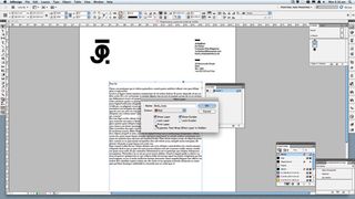
You want to see how your letterhead works with fake copy in place, so check the balance of the layout by adding a non-printing layer. Create a new layer and uncheck the Print Layer box. The layer name will appear italicised in the Layers panel. Non-printing layers can be used for information and measurements.
06. Create a compliment slip
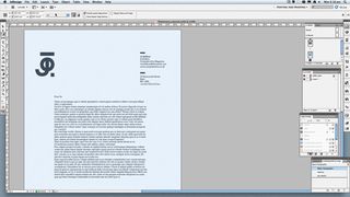
Duplicate your page and select the Page tool. Click the new page. In the Control bar, select a new page size preset from the drop-down menu, or enter measurements. For a compliment slip we divide the height by three. Check Enable Layout Adjustment – this adjusts the layout when the page sizes changes.
07. Adjust new margins
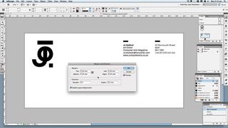
Next, you need to adjust the margins of the new page to work within the smaller size. We've added 10mm on all edges using the dialog found at Layout>Margins and Columns. Make some adjustments to the layout and positioning of the elements to get the layout of the compliment slip working within the page.
08. The business card
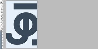
Repeat this process to create the business card, with measurements to 85mm (w) x 55mm (h). Duplicate the page for a double-sided card, place the logo on one side and info on the other. For a portrait-orientated card, duplicate the card pages, select the Page tool and hit the Portrait icon in the Control bar.
09. Quick adjustments
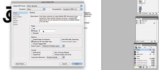
This is where setting up new colour swatches and style sheets early on pays off. To make changes to elements, make the adjustments and choose Redefine Style in the Paragraph Style panel menu. To add a spot colour, tweak the logo colour swatch in the Swatches panel. Finally, export to PDF.
Words: Jo Gulliver
Jo Gulliver is art editor of both the print and award-winning digital editions of Computer Arts magazine. This tutorial originally appeared in Computer Arts issue 234: Branding Secrets – find out how the world's top design agencies develop a new brand, plus discover 2015's hottest packaging trends. Buy a copy of CA234 here.

Thank you for reading 5 articles this month* Join now for unlimited access
Enjoy your first month for just £1 / $1 / €1
*Read 5 free articles per month without a subscription

Join now for unlimited access
Try first month for just £1 / $1 / €1
The Creative Bloq team is made up of a group of design fans, and has changed and evolved since Creative Bloq began back in 2012. The current website team consists of eight full-time members of staff: Editor Georgia Coggan, Deputy Editor Rosie Hilder, Ecommerce Editor Beren Neale, Senior News Editor Daniel Piper, Editor, Digital Art and 3D Ian Dean, Tech Reviews Editor Erlingur Einarsson and Ecommerce Writer Beth Nicholls and Staff Writer Natalie Fear, as well as a roster of freelancers from around the world. The 3D World and ImagineFX magazine teams also pitch in, ensuring that content from 3D World and ImagineFX is represented on Creative Bloq.
