Simple and chic branding catches the eye
This pared-back approach to branding, with a hint of Cluedo, demonstrates that sometimes less is more.
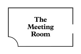
When it comes to crafting an iconic brand, you've got to stand out from the crowd. You have to offer up something completely unique that will also stand the test of time, whilst keeping your creativity at the top of its game. Here, Singapore based design agency Fable take the less is more approach.
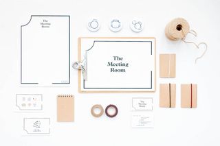
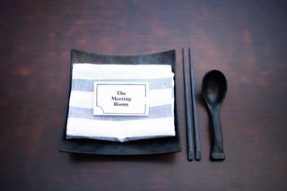
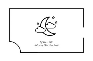
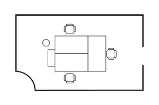
"Set in a vintage-chic space, The Meeting Room seeks simplicity while providing a comfortable space for discussion and casual conversations after work," explains designer Jiahui Tan. "The identity takes on a simple approach – the blueprints of a meeting room and office space, with the outline of a room being the anchor visual."
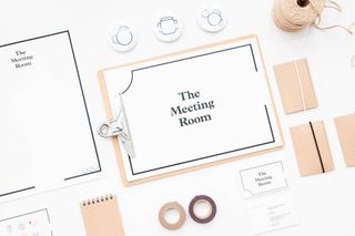
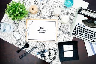
Using crisp typography and a subtle colour scheme, the branding works wonders in all aspects. From the minimal business card designs to the gorgeous icon sets, Fable have done a stellar job in creating an utterly eye-catching project.


What do you think of this branding? Let us know in the comments box below!

Thank you for reading 5 articles this month* Join now for unlimited access
Enjoy your first month for just £1 / $1 / €1
*Read 5 free articles per month without a subscription

Join now for unlimited access
Try first month for just £1 / $1 / €1
Get the Creative Bloq Newsletter
Daily design news, reviews, how-tos and more, as picked by the editors.

Sammy Maine was a founding member of the Creative Bloq team way back in the early 2010s, working as a Commissioning Editor. Her interests cover graphic design in music and film, illustration and animation. Since departing, Sammy has written for The Guardian, VICE, The Independent & Metro, and currently co-edits the quarterly music journal Gold Flake Paint.