The secrets behind the Wrangler site redesign
The design team at Retrofuzz reveal how they redesigned and updated Wrangler's website.
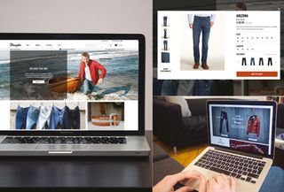
As one of the world's leading denim brands, Wrangler needed a website that reflected its heritage, style and commitment to innovation. It was also looking to expand its online offering to enable it to target consumers around the globe and sell directly to customers.
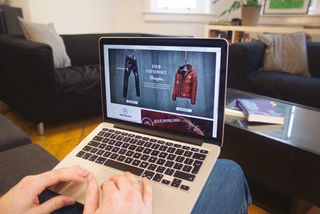
Here, the creatives at Manchester-based agency RetroFuzz, namely Matt Kendall, Matt Shilliday and Amanda Johnson, explain how they went about building Wrangler's first ever ecommerce site: eu.wrangler.com.
How did the project come about?
MK: Wrangler approached us in 2012 to work on some new digital campaigns after they'd noticed our work with Lee jeans. In 2013 the brand knew they needed a new website that was strongly focused on educating target consumers in key countries about the new innovations they were making.
MS: Our first non-transactional version of the site was designed and developed in a little under six weeks. This began Wrangler's evolution towards its first dedicated ecommerce platform.
What was the client's brief?
MK: Following the successes of our first two seasons of eu.wrangler.com, the call came to make the site fully transactional, so we set about creating a site that not only adhered to ecommerce best practices, but also reflected the brand's personality in a creative way.
AJ: With the growing use of mobile and tablets, we needed to ensure the site was fully responsive, as well as being multilingual across nine countries.
What were your main goals when you started out, and how did they evolve?
MK: We wanted to show people the thought and attention to detail that goes into designing every pair of Wrangler jeans. This is a company that's very forward-thinking.
MS: The brand has great campaign imagery so we wanted to inspire the user by leading with large images that reflected the Wrangler lifestyle and heritage. Another key element was to educate the user on the benefits of the innovative smart fabrics available, such as water- resistant denim.

AJ: Of course, we needed to ensure the designs actually converted browsers into buyers. Trying to balance all three goals was a constant challenge.
What initial research did you carry out, and what did you discover?
MK: The brand had a wealth of in-depth consumer insight that we were able to use to help inform our approach.
AJ: Real-world user research plays a large part in all of our projects, and this was no different.
To supplement the existing research, we carried out remote user testing through UserTesting.com to gain insights into what was working well on some best-in-class ecommerce sites – not just direct competitors but those with interesting new takes on ecommerce, such as Nike and Indochino.
MS: During our design sprints, we created rapid prototypes that were then guerrilla tested with passers-by in our local shopping centre.
How did you come up with the design concept and visual language?
MS: In a lot of cases – and especially with clothing – persuading a user to part with money online is much harder than it would be in a high street store.
Having great, detailed photography, and lots of it, can give the user confidence in their purchase. As a result, photography played a large part in the visual language here.

A well-designed and easy to use site will aid the buying experience, with that in mind we aimed for a design that was clean and focused.
AJ: We wanted to include any familiar ecommerce UI patterns, so the purchasing process was as frictionless as possible.
MK: Our experiences from the two previous seasons allowed us to drill down into Google Analytics to see what affect our design decisions were having. With the bounce rate down significantly and the page visits up, we could be confident our design approach was correct for the audience.
What is the key to driving sales and revenue from a website?
MS: All pages should be designed with onward journeys in mind, as the first place a consumer visits might be a product page. As content marketing becomes more influential, it's important to integrate this as seamlessly as possible.
A good story attached to a product will always help engage the user and give depth and meaning to a product.

AJ: Language is key – keep it personal and friendly, yet functional and informative. This visit may be the only touchpoint for a brand. You want users to come away from the purchase feeling excited.
MK: Understanding that an ecommerce site is a living, breathing project. It's not a case of signing the project off and watching the pennies drop in – there is always scope for improvement, optimisation and new features. Going live is just the start!
What technologies and tools did you use to build the site?
AJ: Axure for wireframing. And pens, paper and Post-it notes ...
MS: Photoshop for design. And pencils.
MK: We also used static HTML for the frontend prototypes.
What was the biggest challenge you faced, and how did you overcome it?
MK: Time and location. This was a relatively quick project, with stakeholders in the UK, Germany, Switzerland and Belgium, so good communication was key. The most important tool overall was a regular, set-agenda conference call for all parties each week, to ensure everything was aligned.
MS: Our great relationship with Wrangler meant that they were very welcoming of quick design sprints and early feedback phases. This really allowed us to iterate quickly, taking all feedback into account.
Finally, what's the dress code like at RetroFuzz?
MK: Denim, double denim and sometimes even triple denim.
Words: Matt Kendall, Matt Shilliday, Amanda Johnson
Liked this? Read these!

Thank you for reading 5 articles this month* Join now for unlimited access
Enjoy your first month for just £1 / $1 / €1
*Read 5 free articles per month without a subscription

Join now for unlimited access
Try first month for just £1 / $1 / €1
Get the Creative Bloq Newsletter
Daily design news, reviews, how-tos and more, as picked by the editors.
The Creative Bloq team is made up of a group of design fans, and has changed and evolved since Creative Bloq began back in 2012. The current website team consists of eight full-time members of staff: Editor Georgia Coggan, Deputy Editor Rosie Hilder, Ecommerce Editor Beren Neale, Senior News Editor Daniel Piper, Editor, Digital Art and 3D Ian Dean, Tech Reviews Editor Erlingur Einarsson, Ecommerce Writer Beth Nicholls and Staff Writer Natalie Fear, as well as a roster of freelancers from around the world. The ImagineFX magazine team also pitch in, ensuring that content from leading digital art publication ImagineFX is represented on Creative Bloq.
