Revolutionary bespoke typeface splits opinion
How Pentagram resolved a New York institution's visual identity with groundbreaking new type.
When The New School approached Pentagram partner Paula Scher to help resolve its unique visual identity challenges, she didn't think she would end up designing a whole new typeface.
The logo and identity, which replace Siegel+Gale's 2005 efforts, have attracted a mixed reaction, but the bold new typeface undeniably commands attention, gaining personality as it extends. Here, Scher walks through the design process. (Or skip to her 10 steps for creating a new logo system.)
The New School was founded in 1919. It's a progressive institution in New York City with a mandate to be inventive and solve problems that affect society.
Over the years, donations or acquisitions helped to form different parts of the school, housing different institutions, such as Mannes, the classical music college; Lang, the college for liberal arts; and Parsons school of design. But it had become confusing which programmes belonged to which schools.
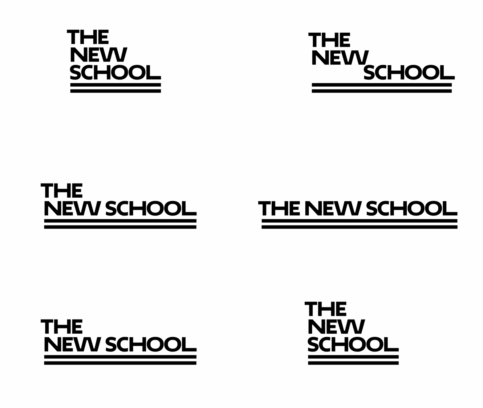
The project they came to me with was 'naming'; helping them resolve the hierarchy and mission with that research, and to end up with a logo system. We knew that we had to create an identity where it didn't matter if you saw The New School and it had a listing for Parsons or Mannes, or a listing of 'liberal arts', 'performing arts' or 'design'.
It had to be completely recognisable, no matter how the schools were listed; this would allow the curriculum to evolve as the years went by. It all had to be flexible, without being generic.
Resolving the hierarchy
The first part of the project was hierarchical – figuring out how to list things. There was a committee that was deeply involved in everything I did. We agreed that The New School is essentially an umbrella for listing lots of things. We had to find a way to make everything connected and customised at the same time.
Get the Creative Bloq Newsletter
Daily design news, reviews, how-tos and more, as picked by the editors.
We knew we had to take a typographic approach to the design, but I didn't want to take a regimented font like Helvetica and make Parsons red and Lang blue.
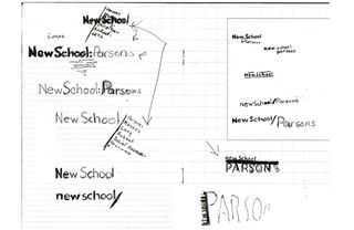
Once we created hierarchy, we made order; but The New School is also about challenging and disrupting that order, so we needed to express the independent revolutionary spirit of the school and still have it function as understandable hierarchy.
Whatever informed the look of the identity had to be something that had historic significance for the institution or was part of The New School DNA. I drew inspiration from the architecture of the old Joseph Urban building and the new building by SOM. Both have stripes which are very distinctive – that's where the two lines on the logo come from.
Testing the type system
The new building also had an interesting type system by Peter Bil'ak, called Irma, which we thought we could use. We soon realised, however, that once you started stacking it, it looks like any other identity.
We began extending letterforms, and it started to get interesting. The first thing I did was widen the P on Parsons to make it look more like a logo. Then somebody pointed out it needed something at the end, so I widened the N.
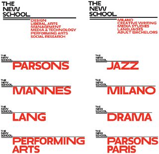
Then they said The New School looked ordinary, and the Os looked too round, so we should widen them too. Then they were too wide, so we needed something in the middle. That's literally how it happened.
Syncopated rhythm
I realised that if you had three letterforms – a very wide one, a regular one and one in the middle – then you could create this syncopated rhythm with typography. We customised every school name such as Parsons or Mannes as well as design, performing arts, liberal arts and so on.
We then began customising each word, so they all had their own distinctive look together, as well as when on their own. We ended up asking Bil'ak to redraw his font and create the three weights, and also programme an algorithm that would dictate how different widths can or cannot work next to each other.
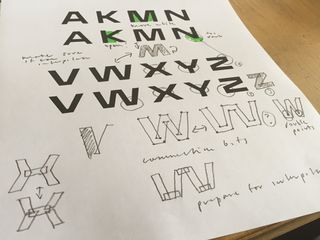
This was crucial; for example, two different Os next to each other look cock-eyed, so the programme ensures they never end up next to each other.
There was a point where I thought I was going to have to resign this project – if in a normal client meeting somebody says you have to make a letter wider, you don't. But in this instance, somehow it made sense. We didn't want to make something that was expected.
Instantly recongisable
As things have gone up on Fifth Avenue, you can't help but notice it. And what I really like about the new website, which was designed by The New School in-house team, is that it's a very successful application of the new design.
If you scroll down the home page, for example, you know where you are without having to see the top of the page – it's so recognisable that you don't need a logo at the top of a page.
The colour system is red and black for the whole school, but the schools can do what they want. And it's really the type that holds the identity together.
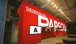
There are three different ways The New School can be configured for varying solutions, but in the future they can change the positioning of what's wide or narrow within the body.
They can add as many schools as they need, change names whenever they want – it is a completely evolving programme.
Next page: Paula Scher's nine steps for creating a new logo system...

Thank you for reading 5 articles this month* Join now for unlimited access
Enjoy your first month for just £1 / $1 / €1
*Read 5 free articles per month without a subscription

Join now for unlimited access
Try first month for just £1 / $1 / €1
The Creative Bloq team is made up of a group of design fans, and has changed and evolved since Creative Bloq began back in 2012. The current website team consists of eight full-time members of staff: Editor Georgia Coggan, Deputy Editor Rosie Hilder, Ecommerce Editor Beren Neale, Senior News Editor Daniel Piper, Editor, Digital Art and 3D Ian Dean, Tech Reviews Editor Erlingur Einarsson and Ecommerce Writer Beth Nicholls and Staff Writer Natalie Fear, as well as a roster of freelancers from around the world. The 3D World and ImagineFX magazine teams also pitch in, ensuring that content from 3D World and ImagineFX is represented on Creative Bloq.
