The best free fonts: 35 quality typefaces suitable for pro designers
Elevate your design projects with our collection of premium typefaces that won't cost you a penny.
In today's design landscape, typography has never been more crucial. The right font doesn't just convey information; it establishes mood, reinforces brand identity, and creates immediate visual impact.
While premium fonts can cost hundreds of dollars, the world of free typography has exploded with high-quality options that rival their commercial counterparts. From elegant serifs that exude sophistication to clean sans-serifs perfect for digital, today's free fonts offer pro-grade quality without the investment.
Below you'll find 35 of the best free fonts to fit a variety of projects. Make sure you check the font licensing details, though, as some are only free for personal use (check out our font licensing guide if you need a refresh). For more options, see our guide to the best places to download free fonts.
Article continues belowThe best free serif fonts
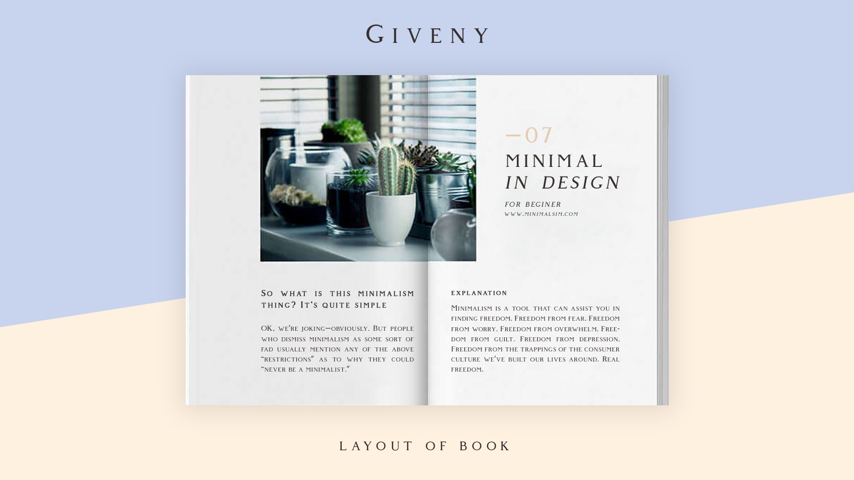
01. Giveny
- Free for personal use
- Download Giveny from Behance
Described as a "fusion of pure geometry and optical balance", and taking inspiration from traditional serif styles, this stylish font nonetheless has a contemporary feel. It adds touch of everything from posters and invitations to logos and personal blogs.
02. Anonymous Pro

- Free for personal and commercial use
- Get Anonymous Pro from Google Fonts
Designed by Mark Simonson, Anonymous Pro is a family of four fixed-width fonts created specifically with coding in mind. It draws inspiration from Anonymous 9, a freeware Macintosh bitmap font from the mid-'90s that aimed to provide a more legible alternative to Monaco. What makes it particularly useful for developers is its careful differentiation of characters that could be mistaken for one another (like O, 0, I, l, 1), making code easier to read and debug.
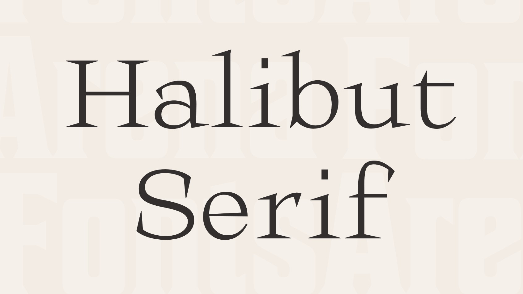
03. Halibut Serif
- Free for personal and commercial use
- Get Halibut Serif from Fonts Arena
Created by the Collletttivo team, Halibut Serif is a striking font family with supersized serifs that make an immediate visual impact. It includes six styles (Regular, Condensed, Expanded plus Thin variants of each) with extensive language support. The font's nonconformist design makes it ideal for daring projects that need to stand out, from headlines and posters to brutalist designs. A variable font version is also available, giving designers precise control over the font's appearance.
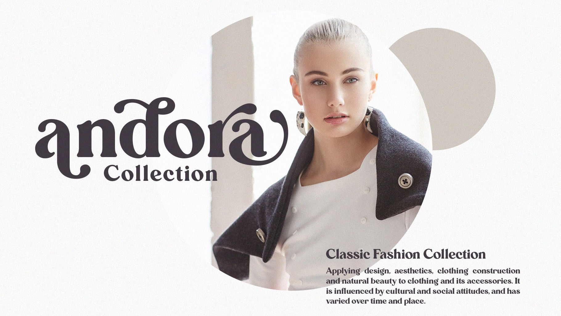
04. Carena
- Free for personal use
- Download Carena from Behance
This minimalistic, ligature style font is perfect for giving your designs that rustic yet elevated look. Beautifully detailed and ornate, Carena would be a good choice for projects that require a more delicate feel, such as for wedding invitations, editorials and personal projects.
Sign up to Creative Bloq's daily newsletter, which brings you the latest news and inspiration from the worlds of art, design and technology.
05. Harmony
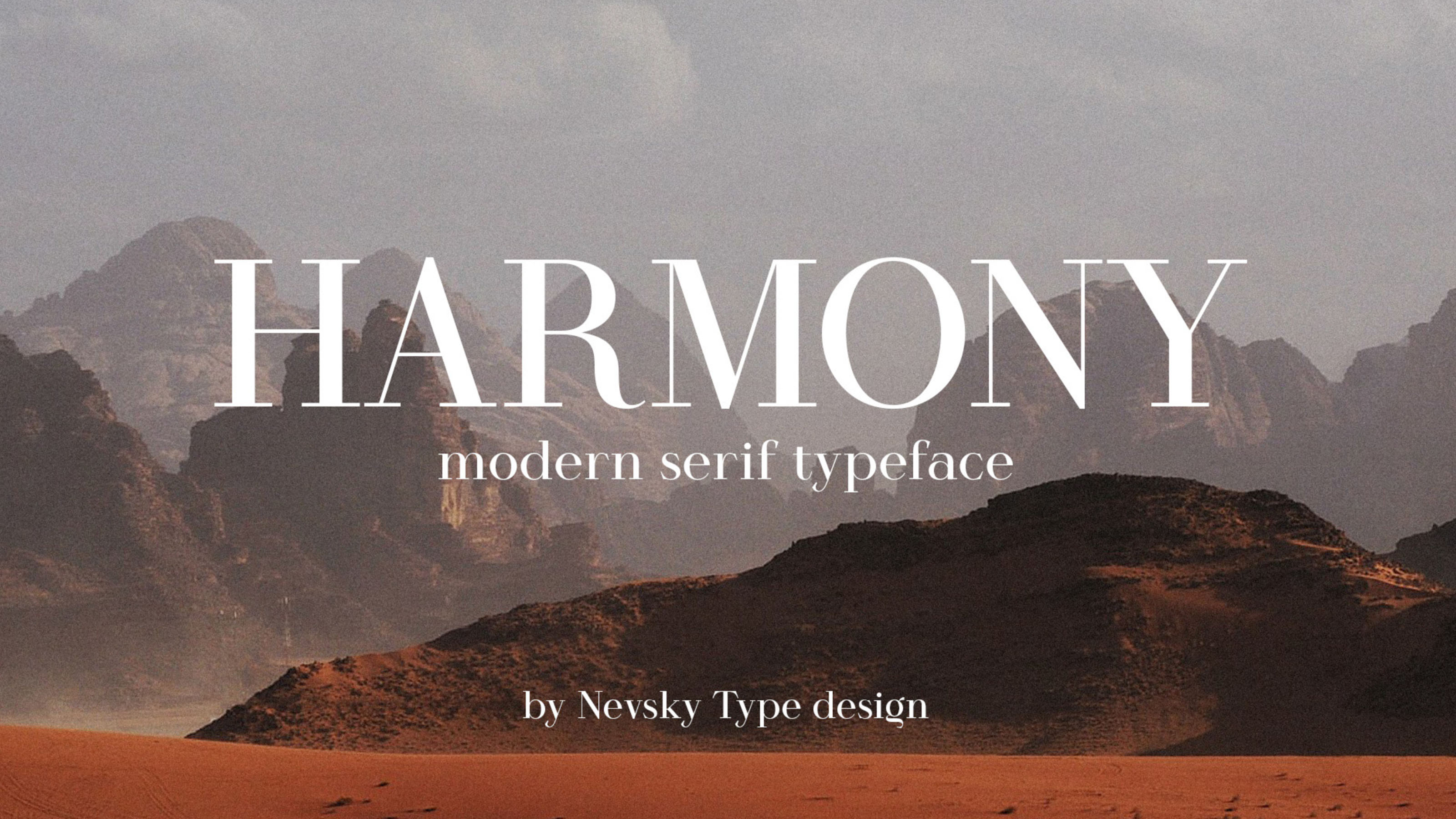
- Free for personal use (commercial licences available from $14)
- Download Harmony from Behance
Harmony is available for download from Behance. This is a stylish modern font that features some gorgeous shapes that make it perfect for a more elegant touch. It is easy to read and professional looking, making it a great option for those looking for a bold statement.
06. Editorial New
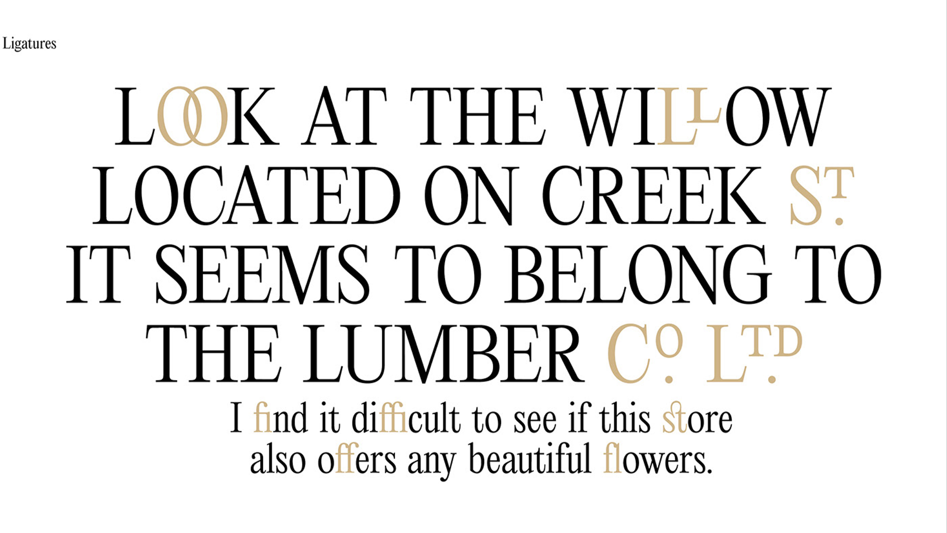
- Free for personal use (commercial licences available from $30)
- Download Editorial New from Pangram and Pangram on Behance
Designed by Mathieu Desjardins, Editorial New is a precise narrow serif designed for long-form copy but with enough personality to be used for titles too. It exudes a 1990s editorial feel, but still comes across as rich and contemporary. It comes in seven weights, from ultralight to heavy.
07. Alegreya
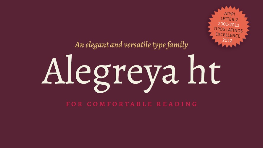
- Free for personal and commercial use
- Get Alegreya from Google Fonts
Crafted by Juan Pablo del Peral expressly for the purposes of book design, this award-winning serif font eminently readable, with a rhythm to it that facilitates the absorption of long texts, and we love it for its fresh, approachable take on a calligraphic style.
08. Restora
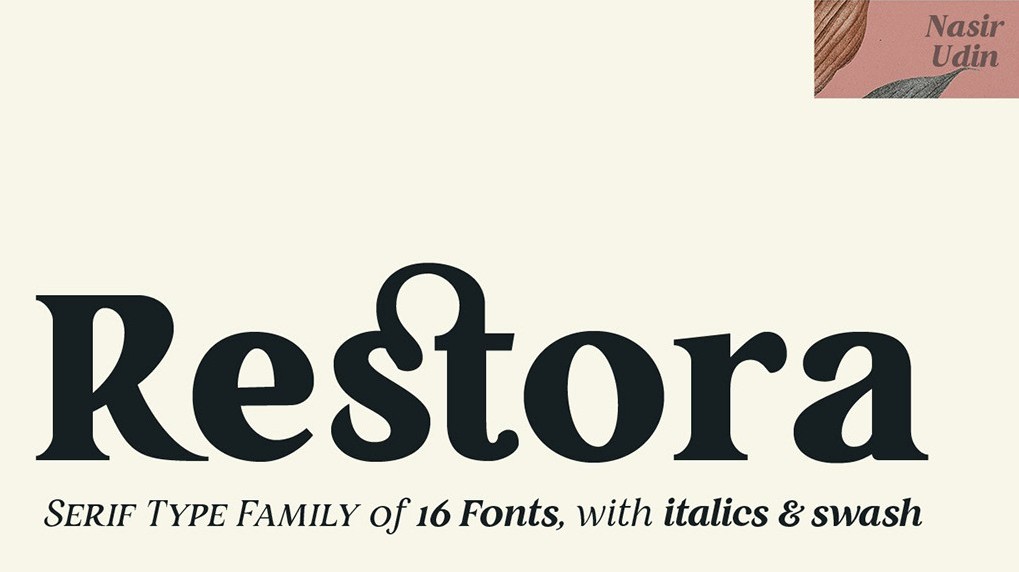
- Free for personal and commercial use
- Get Restora from pixelsurplus.com
Designed by Nasir Udin, Restora is a combination of bright, friendly letterforms with an embellishment that feels classic. In its free version it also includes Restora Extra Light and Restora Thin Italic, giving you a good deal of versatility for general editorial text, a book cover or just a simple bit of branding.
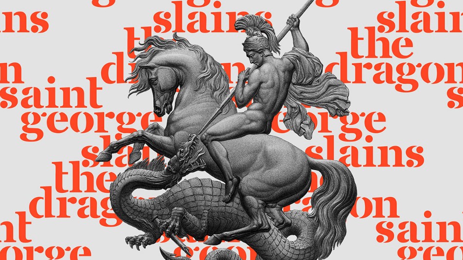
09. Free Saint George Stencil Font
- Free for personal and commercial use
- Get Saint George from Behance
Fans of the classic font Georgia will appreciate this experimental tribute by Vedran Vaskovic. It's made up of a collection of cheeky, playful stencil shapes that are perfect for adding a little flair to your designs. Apparently, it's inspired by the Christian legend of Saint George the dragon-slayer.
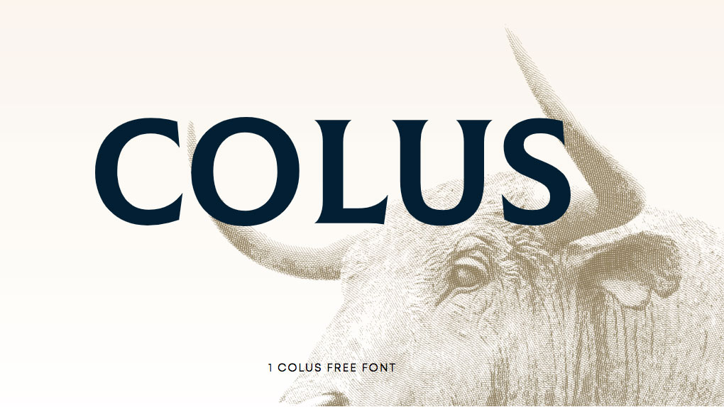
10. Colus
- Free for personal use
- Get Colus from fontfabric.com
With an imposing, classical feel, Colus is great for when you want your designs to feel a little more sombre. It's inspired by carved letter inscriptions in wood and stone, and as such, it hearkens back to the classical ages. An excellent choice of free font for making posters that have a little more sophistication to them.
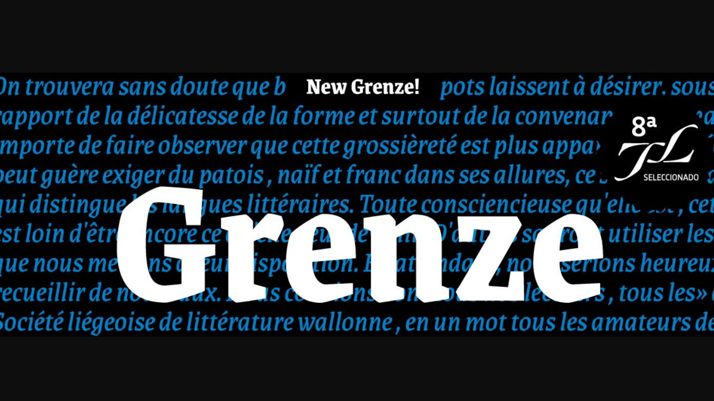
11. Grenze
- Free for personal and commercial use
- Get Grenze
Grenze by Renata Polastri and Omnibus-Type blends Roman and blackletter styles. With nine weights and italics, it offers a lovely balance between visual impact and readability, making it suitable for magazines and other print projects, Grenze is available under the SIL Open Font License for unrestricted use.
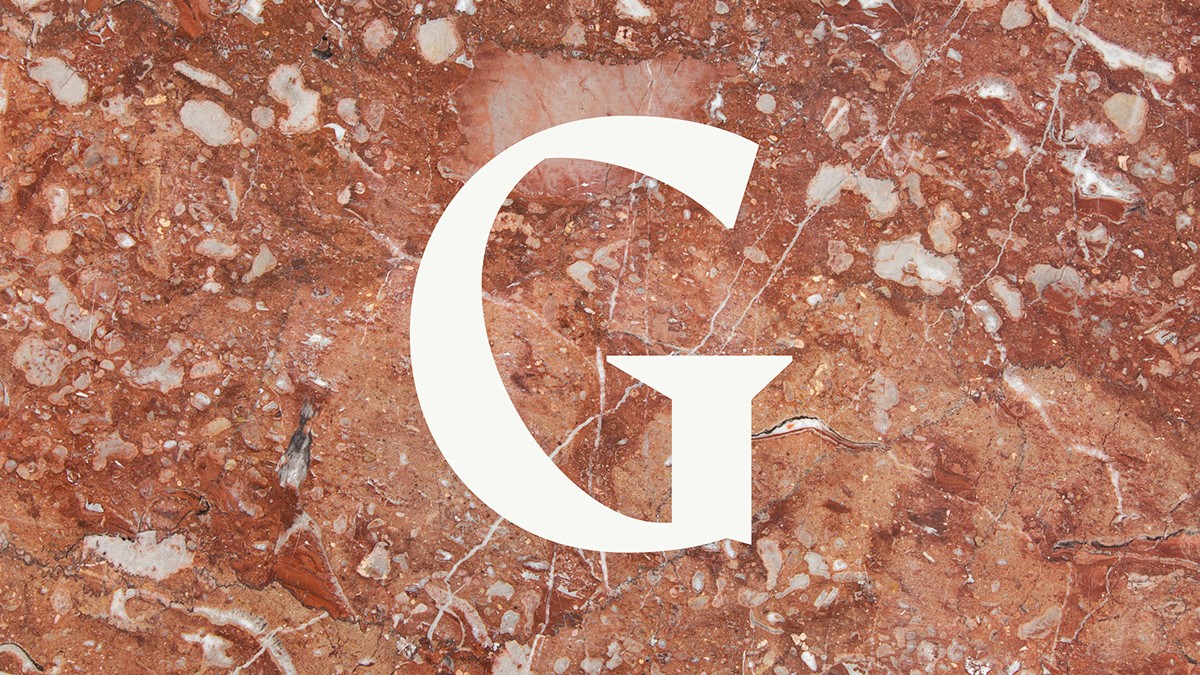
12. Amagro
- Free for personal and commercial use
- Get Amagro from Font Squirrel
For making a big impact (no pun intended), check out this all-caps serif typeface from Fabio Servolo. Amagro consists of strong, angular serifs that are especially good for making imposing headlines, but it's also got some nice touches like a stylish ampersand, and easy-to-read numerals.
The best free sans-serif fonts
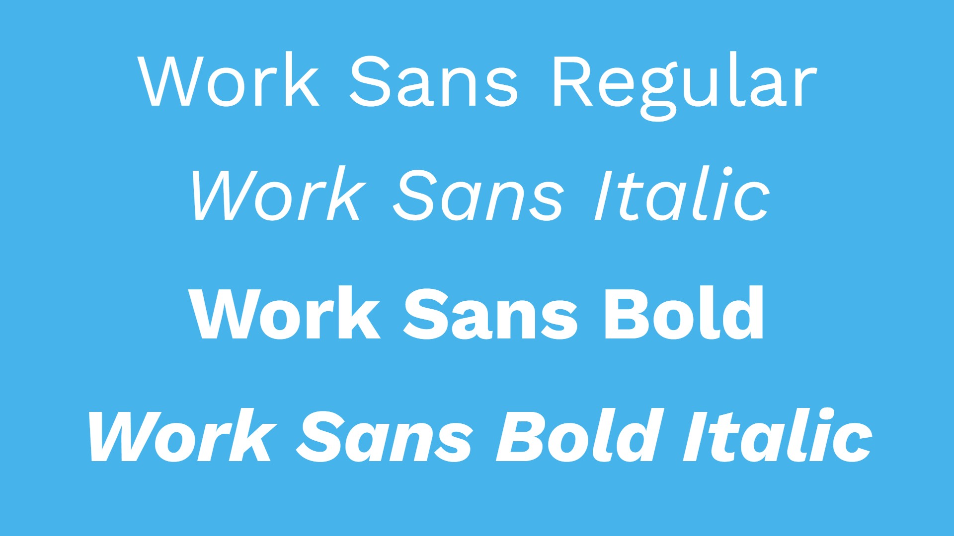
13. Work Sans
- Free for personal and commercial use
- Get Work Sans from Google Fonts
Designed by Wei Huang, Work Sans is a typeface family based loosely on early Grotesques. Its features are simplified and optimised for screen resolutions, with elements like diacritic marks enlarged for better visibility. The regular weight and middle family weights are optimised for on-screen text at medium sizes (14px-48px) while the extreme weights work better for display, both on screen and in print.
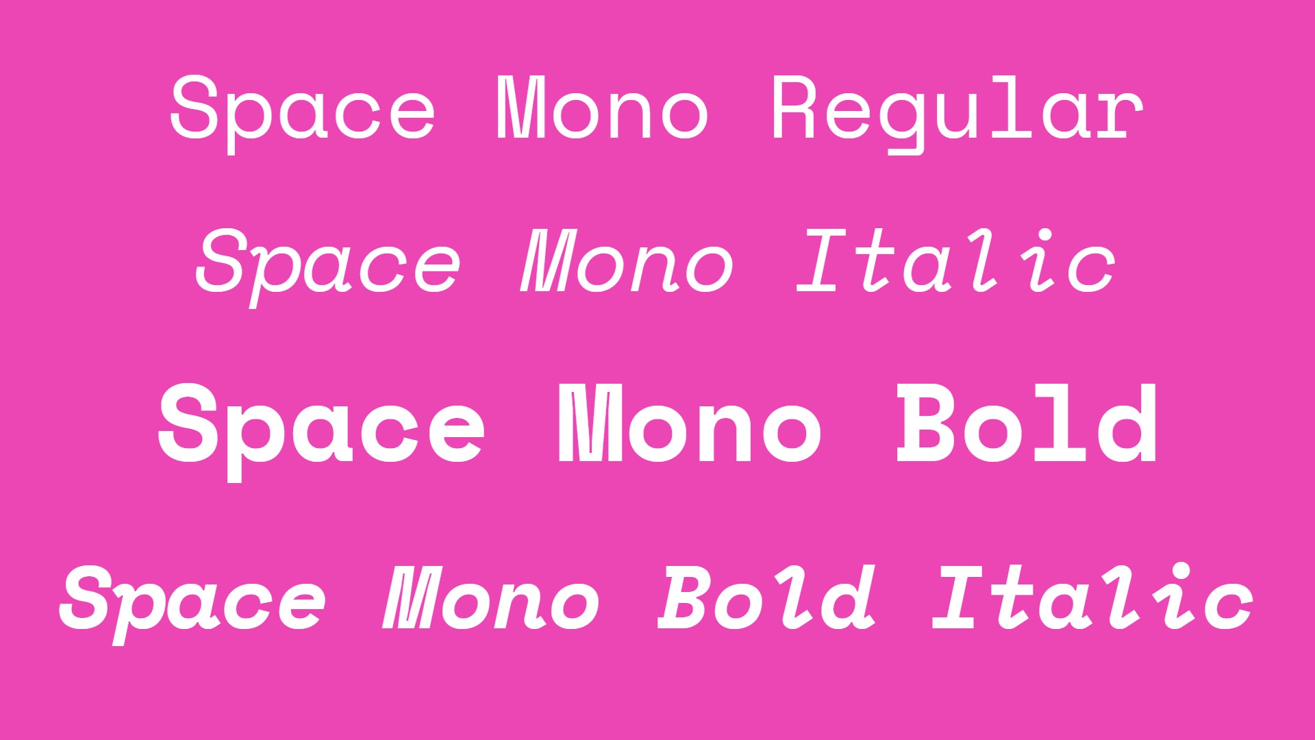
14. Space Mono
- Free for personal and commercial use
- Get Space Mono from Google Fonts
Space Mono is a fixed-width type family designed by Colophon Foundry, specifically for Google Design. This distinctive monospaced font supports Latin Extended character sets and incorporates geometric foundations with grotesque details reminiscent of 1960s headline typefaces that have become staples in science fiction visual language. A great choice for editorial headlines and display typography with a technical or futuristic edge.
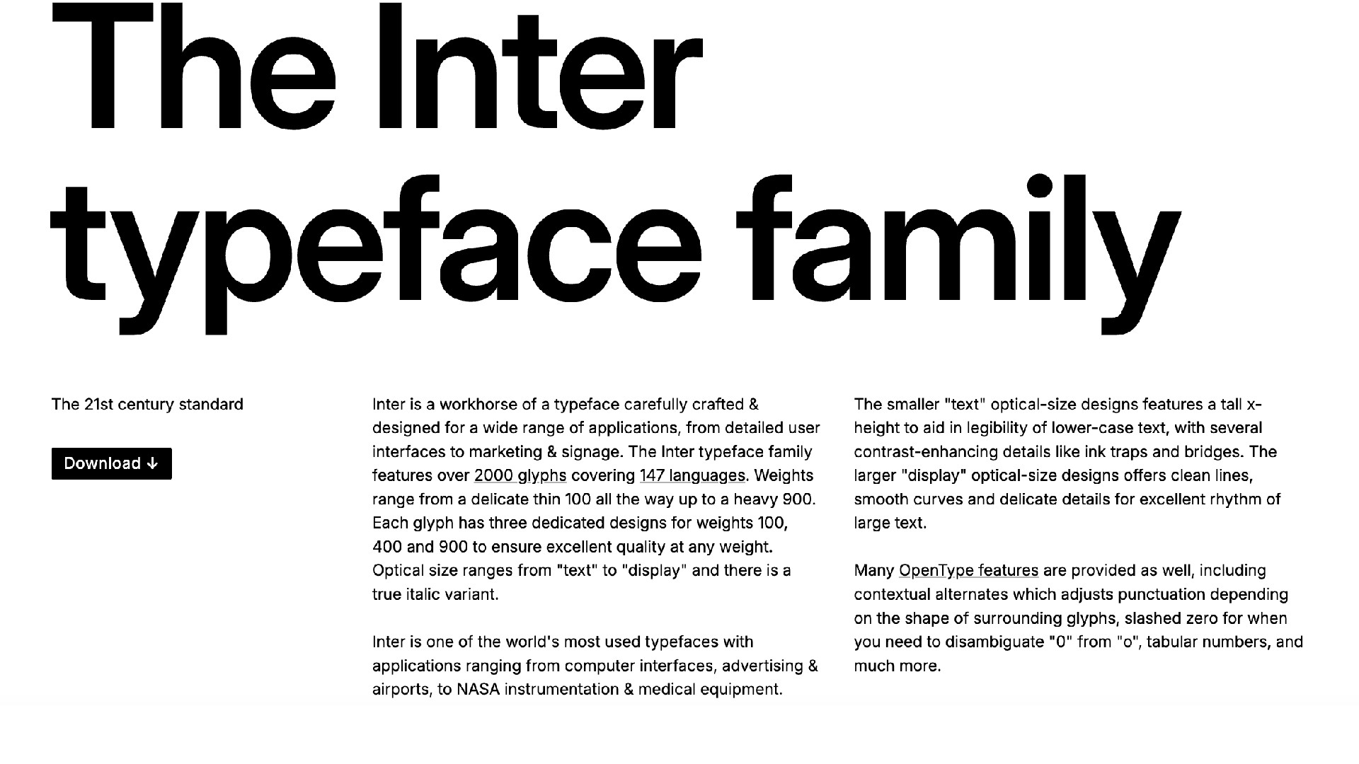
15. Inter
- Free for personal and commercial use
- Get Inter from rsms.me/inter
Inter is a workhorse typeface suitable for a wide range of applications, from detailed user interfaces to marketing and signage. With its tall x-height for improved legibility in smaller sizes and clean lines in display sizes, it's become one of the world's most widely used typefaces, appearing in computer interfaces, advertising, airports, NASA instrumentation, and medical equipment. The font also includes numerous OpenType features like contextual alternates, slashed zeros, and tabular numbers.
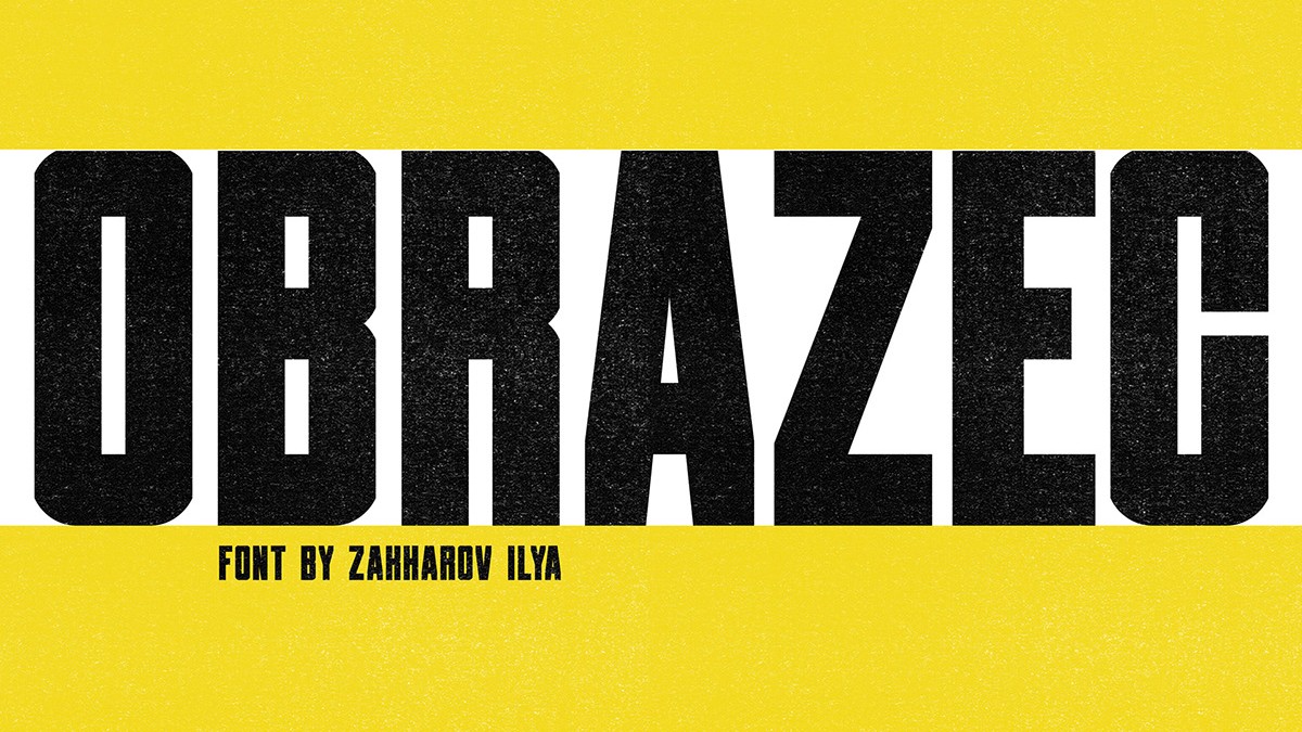
16. Obrazec
- Free for personal and commercial use
- Get Obrazec from Behance
Obrazec is an uncompromising, industrial-style sans serif created by Ilya Zakharov. This sturdy and confident typeface is one of the best free fonts for adding strength and personality to your branding projects, whether you're working on logo design, promotional materials, or advertising.
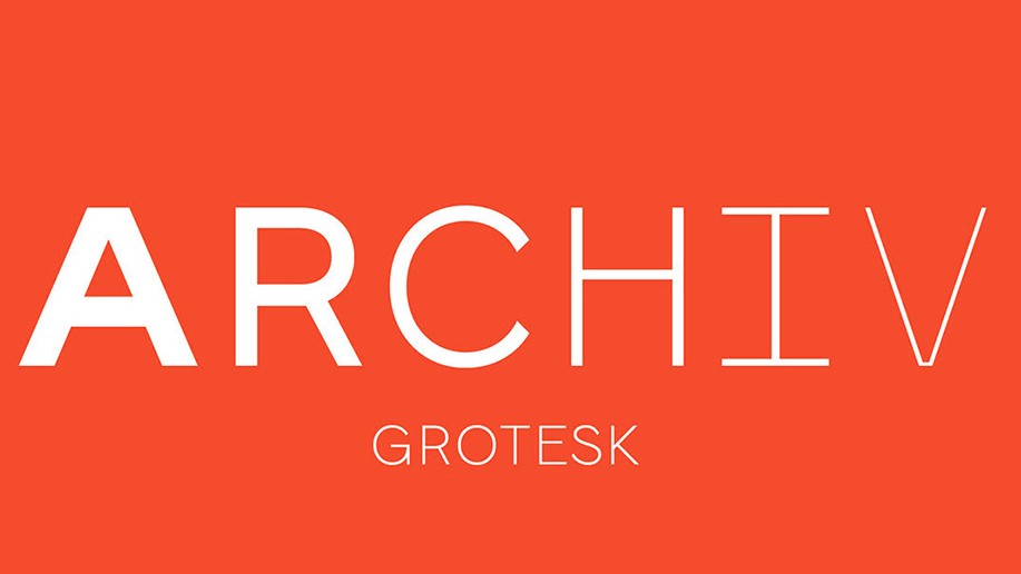
17. Archive Grotesk
- Free for personal and commercial use
- Get Archive Grotesk from Behance
Created by Tomas Clarkson, Free Archive Grotesk is a clean and minimalist sans that features uppercase, lowercase and numerals. It’s one of those free fonts that would work well in everything from headlines and magazine page furniture to invitations, calendars, postcards and fashion designs
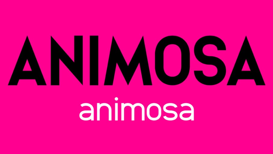
18. Animosa
- Free for personal and commercial use
- Get Animosa from Behance
Animosa is a clean modern sans-serif that comes with a wide range of unique characters. from Created by Stefano Giliberti, this font is available in five weights and includes 93 languages and 508 glyphs. It's one of the best fonts we’ve seen for drawing the reader’s eye to the page, and keeping it there.
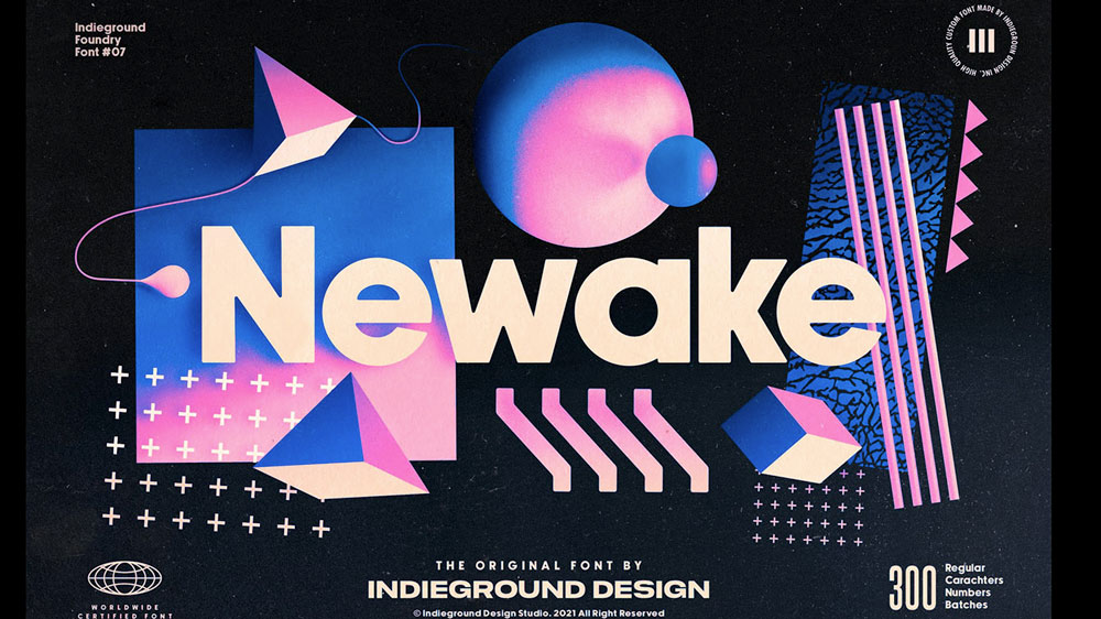
19. Newake
- Free for personal use
- Get Newake from Behance
Combining both humanist and geometric elements, Newake is a versatile sans serif that has slightly rounded corners that provide an elegant line to text designs. Created by the Indieground team, Newake is perfect for creating standout titles, logos, editorial, packaging and web design.
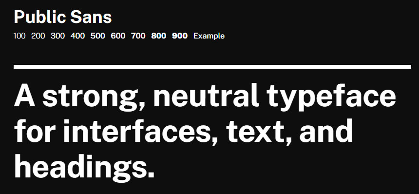
20. Public Sans
- Free for personal and commercial use
- Get Alcubierre from webdesignerdepot.com
Geometric sans serif typeface Alcubierre is the work of designer Matt Ellis. Following in the footsteps of his original free font Ikaros, this clean, minimal typeface works for a variety of uses.
21. Chivo
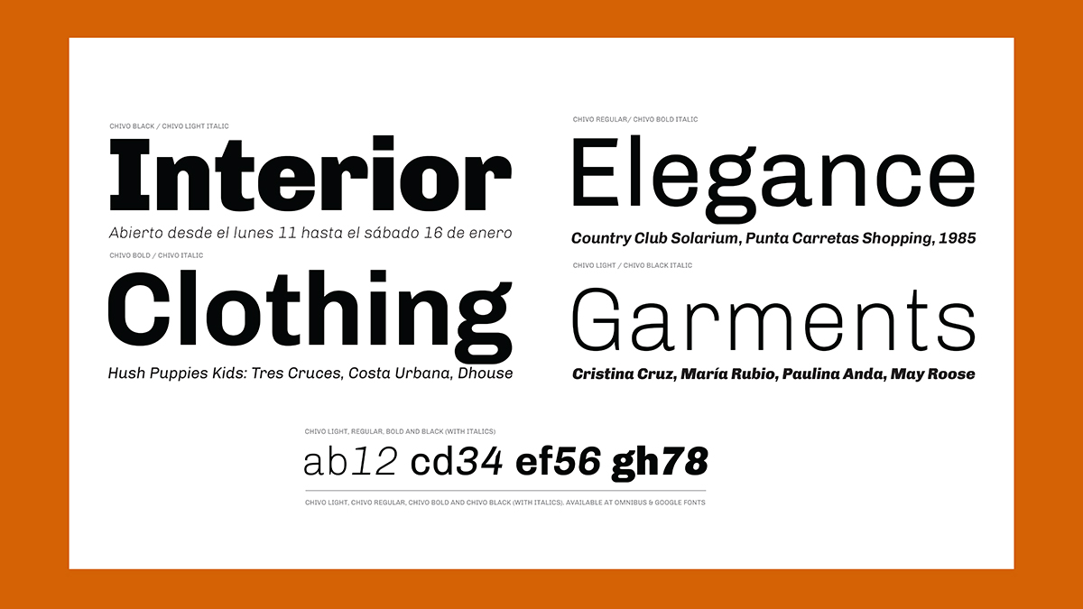
- Free for personal and commercial use
- Get Chivo from Google Fonts
Chivo is a grotesque typeface that’s ideal for headlines, and other page furniture where you want to grab attention. Both confident and elegant, it’s been released in four weights with matching italics. This free font is the work of Héctor Gatti and the Omnibus-Type Team.
22. Comfortaa
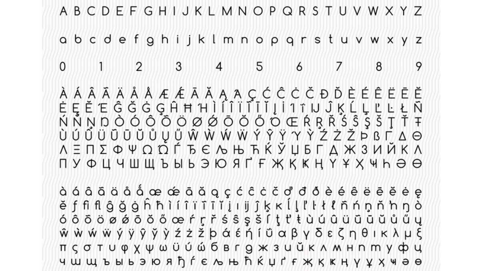
- Free for personal and commercial use
- Get Comfortaa from Google Fonts
Comfortaa is a rounded geometric sans-serif type design intended for large sizes. Created by Johan Aakerlund, a design engineer at the Technical University of Denmark, it’s a simple, good looking font that includes large number of different characters and symbols.
23. HK Grotesk

- Free for personal and commercial use
- Get HK Grotesk from 1001 Fonts
HK Grotesk is a sans-serif typeface inspired by the classic grotesques, such as Akzidenz Grotesk, Univers, Trade Gothic and Gill Sans. It was designed by Hanken Design Co with the aim of creating a friendly and distinguishable font that’s suitable for small text.
24. Clear Sans
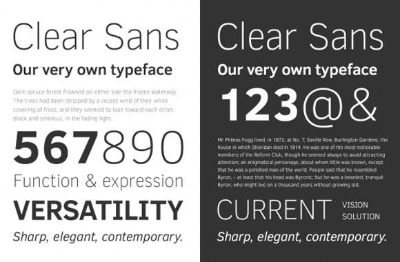
- Free for personal and commercial use
- Get Clear Sans from Font Squirrel
Clear Sans is a versatile font designed by Intel designed with on-screen legibility in mind. Suitable for screen, print, and web, this free font is notable for its minimised characters and slightly narrow proportions, making it a great choice for UI design, from short labels to long passages.
25. Source Sans Pro
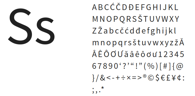
- Free for personal and commercial use
- Get Source Sans Pro from Font Squirrel
Released in 2012, Source Sans Pro was the first open source type family for Adobe. It was envisioned as a classic grotesque typeface with a simple, unassuming design, intended to work well in user interfaces. A solid, reliable font that's easy to read, this would be a good choice for user interfaces.
Unusual fonts
26. Aquiver
- Free for personal use
- Download Aquiver on Behance
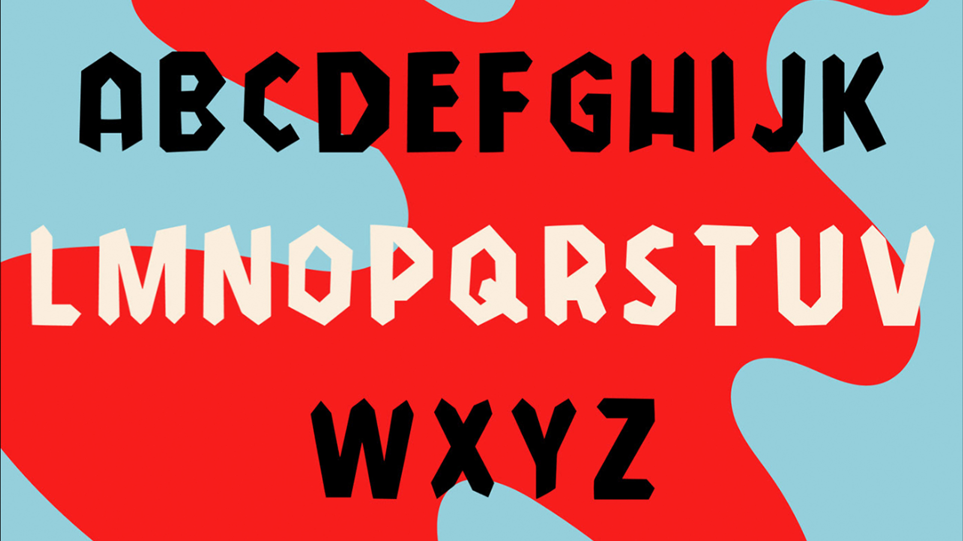
Aquiver is an effortlessly cool contemporary font that's perfect for adding a bit of edge to your projects. The hand-drawn sans serif created by Jessica Solomon is perfect for posters and bold creative projects that require a big impact that stands out from the crowd.
27. Misto Font
- Free for personal and commercial use.
- Get Misto Font from Google Drive
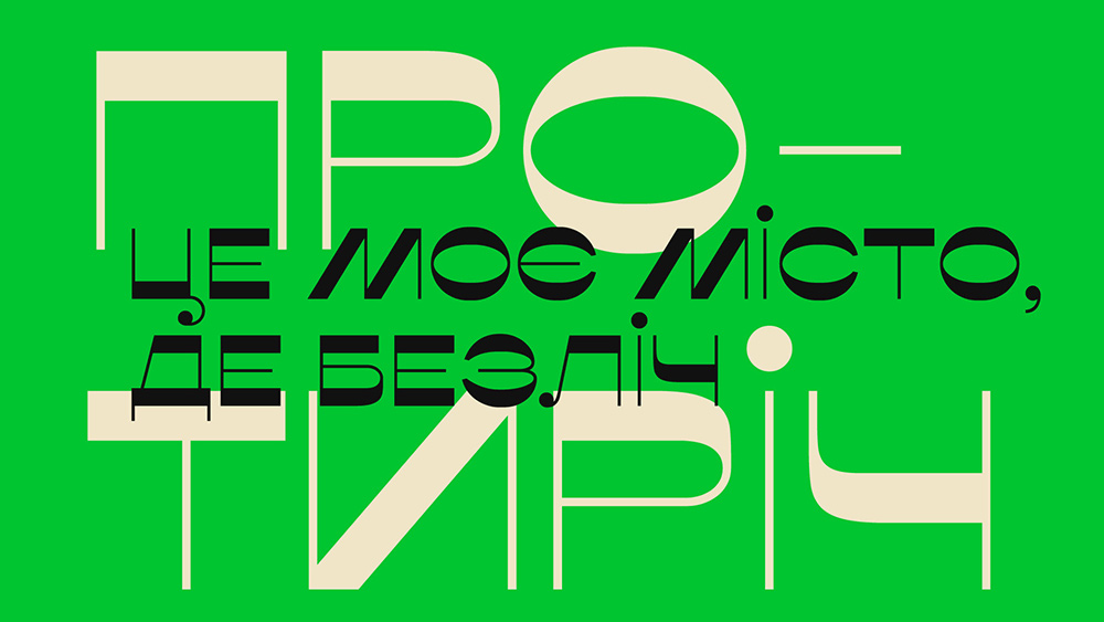
Designed by Katerina Korolevtseva, Misto font is a tribute to her hometown of Slavutych in Ukraine. It features sharp contrasts in stroke width, which are inspired by the town’s postmodernist architecture and utopian ideals. This is a multilingual display sans serif, which supports both Latin and Cyrillic.
28. TC New Worth Font
- Free for trial, tiered licenses available
- Get TC New Worth from Type Colony
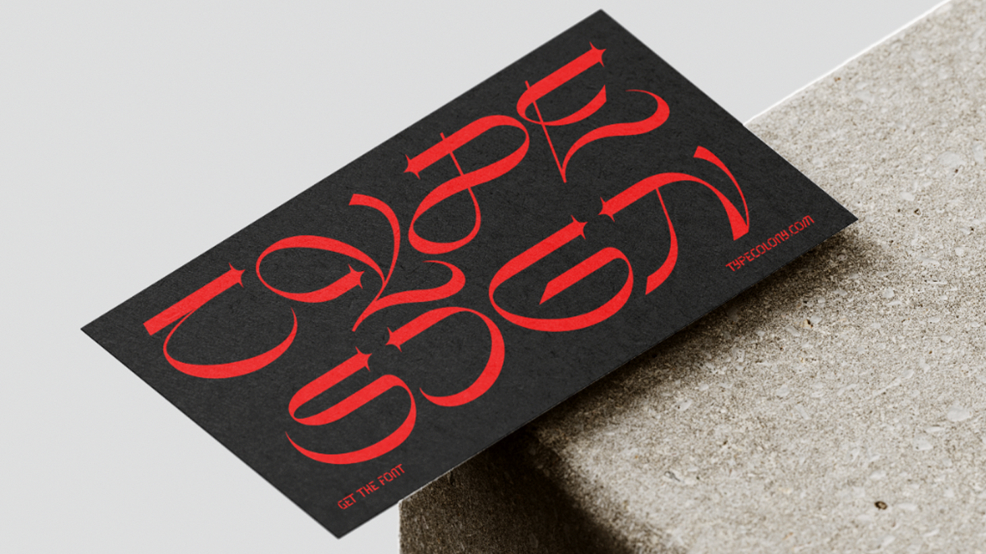
This futuristic font created by Type Colony designers Aliv Pandu and Hasto Nugroho is inspired by cyberpunk and vaporwave aesthetics. Perfect for posters, art projects and personal websites, this contemporary font adds a striking contemporary flair to bold titles and punchy copy.
29. Miratrix
- Free for personal and commercial use
- Get Miratrix from Online Fonts
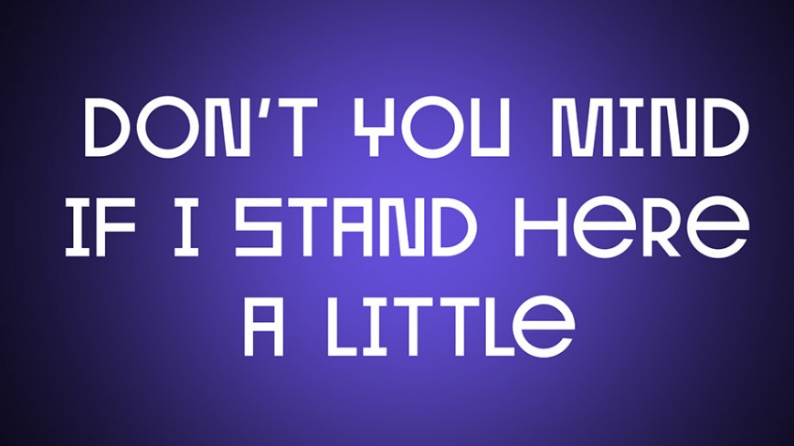
Strongly influenced by Brutalism, Miratrix is a geometric grotesque that’s very far from standard and boring; in fact, it’s one of the most original free fonts we’ve seen in ages. Designed by Andrey Karter, this eye-catching multi-functional font is intended for use in a variety of projects, including web design, logos, brand identity, packaging, posters and headlines.
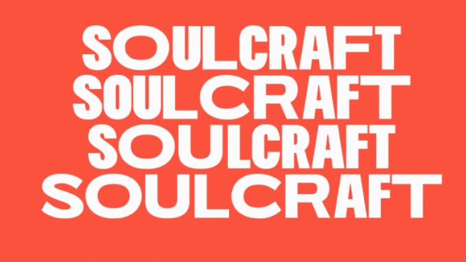
30. Soulcraft
- Free for personal and commercial use.
- Get Soulcraft from Behance
Soulcraft typeface is a free variable font designed to emulate vernacular lettering. Its creators at Massimo Studio intend creative people to make use in varied ways, so they can “express themselves in a bold, raw and unafraid voice”.
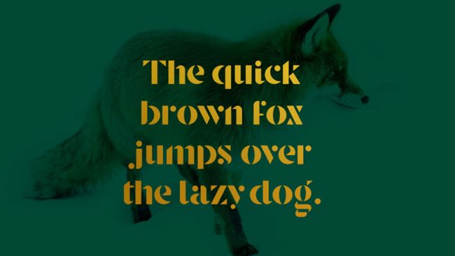
31. Stanley
- Free for personal and commercial use
- Get Stanley from Behance
For a truly stylish font, download Stanley. Created by Jérémie Gauthier, this font combines rounded and more geometric forms and the results are striking. In our view, Stanley would work well for luxury branding or packaging.
32. Gilbert

- Free for personal and commercial use
- Get Gilbert from typewithpride.com
Gilbert Baker, who died in 2017, was a LGBTQ activist and artist who's best known for creating the iconic rainbow flag, and he's been commemorated by this striking free display font. A good option for headlines and banner slogans.
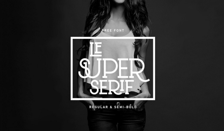
33. Le Super Serif
- Free for personal and commercial use
- Get Le Super Serif from Behance
Le Super Serif is that rare thing: a typographical experiment that actually works. It’s described by its creator, Dutch designer Thijs Janssen, as “a fashionable uppercase typeface with a little modern Western flavour to it”.
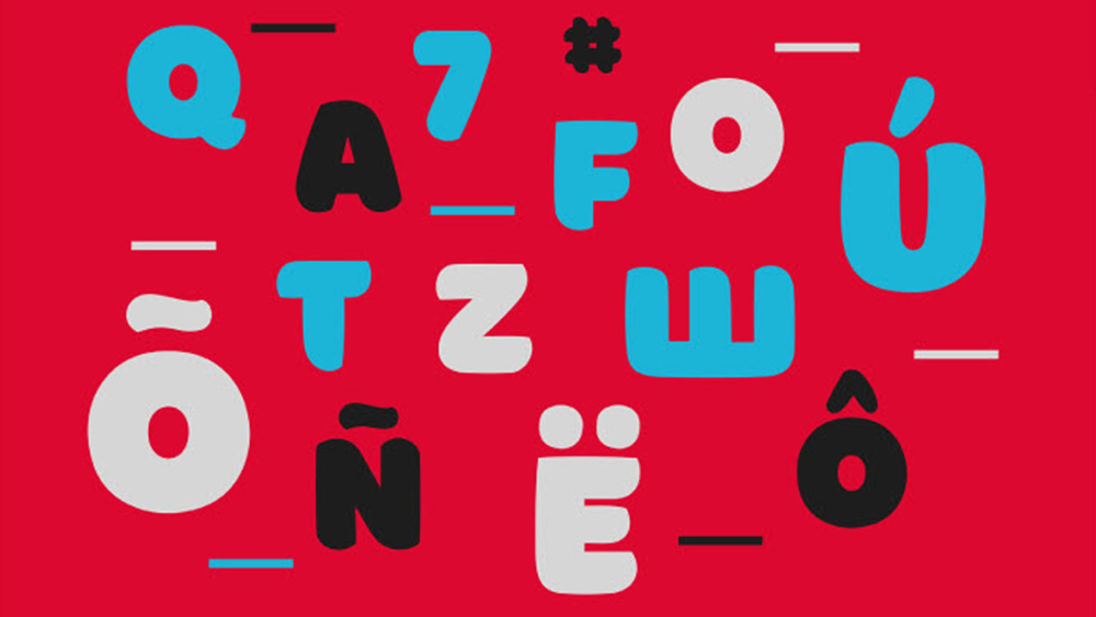
34. Borsok
- Free for personal & commercial use
- Get Borsok from pixelsurplus.com
Borsok is a bold but smooth display font with multilingual support. Its attention-grabbing, rounded shapes makes it perfect for branding, apparel design, product packaging, stylish text, quotes, greeting cards, posters and much more. It includes uppercase & lowercase characters, numerals, punctuation and symbols.
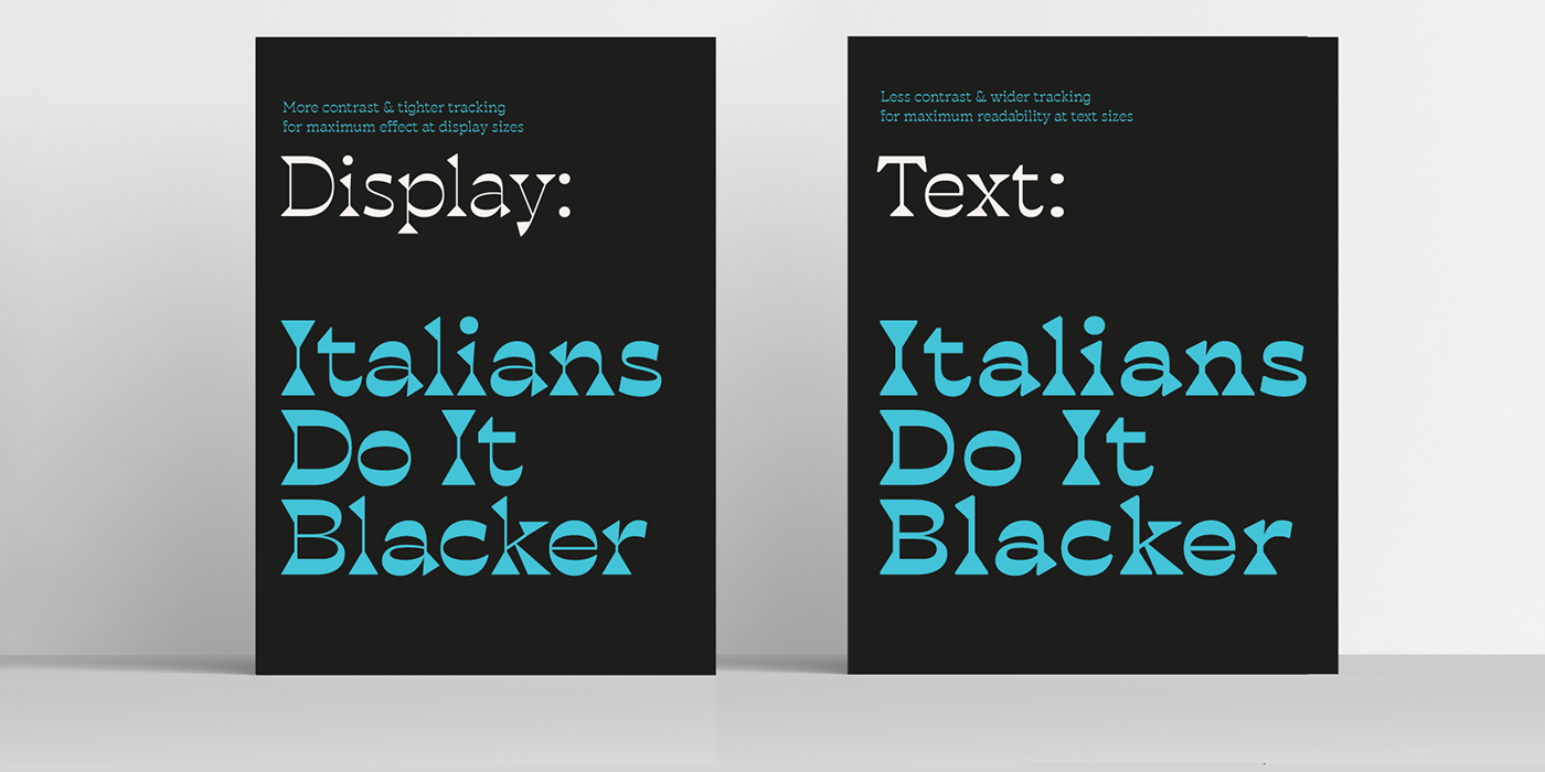
35. Blackest
- Free for personal use, licenses available
- Get Blackest at zetafonts.com
Blackest is a modern inverse contrast wedge serif typeface family based on the Blacker typeface designed by Cosimo Lorenzo Pancini. Designed by Francesco Canovaro and Andrea Tartarelli, the quirky typeface maintains the class of the original design, updating it with more contrast and visual dynamism.

Tom May is an award-winning journalist specialising in art, design, photography and technology. He is the author of the books The 50 Greatest Designers (Arcturus) and Great TED Talks: Creativity (Pavilion). Tom was previously editor of Professional Photography magazine, associate editor at Creative Bloq, and deputy editor at net magazine.
- Abi Le GuilcherFormer ecommerce writer, Creative Bloq
You must confirm your public display name before commenting
Please logout and then login again, you will then be prompted to enter your display name.
