Restaurant branding shows that broken can be beautiful
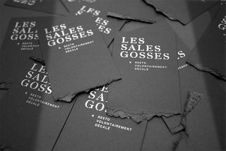
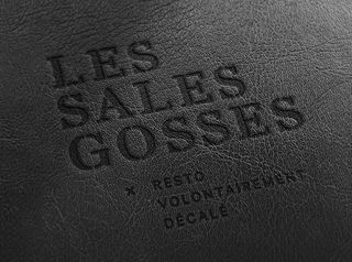
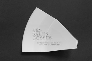
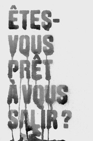
This branding for Les Sales Gosses features ripped business cards and broken promotional materials.
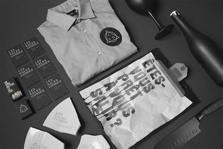
When it comes to crafting an iconic brand, you've got to stand out from the crowd. You have to offer up something completely unique that will also stand the test of time, whilst keeping your creativity at the top of its game. This branding for Les Sales Gosses does just that.
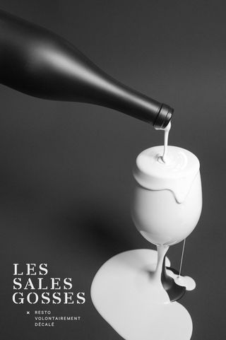
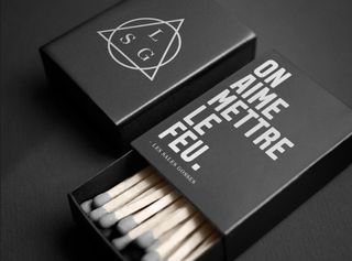
Created by Quebec based designer Jeremy Hall, the branding features ripped business cards and broken promotional materials that show broken can indeed be beautiful. "The restaurant wanted to project a rebellious and elegant image," he explained.
"Thus, we designed all communication tools using these two opposing mixed values." Mixing such values together seems to have worked a treat as we can barely take our eyes off of the execution. A job well done indeed.

See more of this project over on Jeremy Hall's Behance page.
Do you think this branding works? Let us know in the comments box below!

Thank you for reading 5 articles this month* Join now for unlimited access
Enjoy your first month for just £1 / $1 / €1
*Read 5 free articles per month without a subscription

Join now for unlimited access
Try first month for just £1 / $1 / €1
Get the Creative Bloq Newsletter
Daily design news, reviews, how-tos and more, as picked by the editors.
Sammy Maine was a founding member of the Creative Bloq team way back in the early 2010s, working as a Commissioning Editor. Her interests cover graphic design in music and film, illustration and animation. Since departing, Sammy has written for The Guardian, VICE, The Independent & Metro, and currently co-edits the quarterly music journal Gold Flake Paint.
