Reinvent a destination brand identity in 10 steps
How dn&co and digital pioneer Poke collaborated on the redevelopment of the London 2012 media centres.
How the Here East logo was developed
Joy Nazzari is director and co-founder of dn&co. She sets the strategy for each project in the studio. Here, she goes behind the scenes on how dn&co and Poke brought the new visual identity to life…
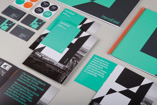
The brief started as a traditional property play and ultimately turned into very much what we do, which is destination place-making, in the sense that this place is going to be about something – it will mean something. Also, it's going to be different than anywhere else. We presented that one name at pitch because we thought it was very strong, and they loved it.
What was so fascinating about this project was that we got to do the initial positioning before the client selected the architect. And not only did they select the right architect, Hawkins\Brown, that company embraced the idea of disruption.
For example, they had seen some of the strategic presentations and riffed off our ideas on the nature of disruption, using that to create the pattern that will envelop the building. The visual identity then folded out of that.
We wanted to apply our thinking about disruption to every element of the visual identity. So with the logo, we took one point of the letterform H and folded it to the opposite point so half of it reverses out. You can also move it around so that it warps and changes its shape, which is quite lovely.
We also created a disrupted version of Aktiv Grotesk, working with Colophon to take some pixels out of the font, and we are developing a graphic font where we disrupt other letters in the same way we did with the H. We haven't used that anywhere yet, but it will be used in super-graphics and some bits of signage.
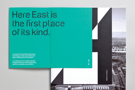
When it came to choosing the colour, we wanted to be deliberately shocking. That green with the fluorescent orange again follows the idea that it's a deeply disruptive combination.
Get the Creative Bloq Newsletter
Daily design news, reviews, how-tos and more, as picked by the editors.
They are two colours you should never see together, but we've managed to make it look quite special. We have been very rigorous about breaking convention where possible without making it a) ugly and b) annoying. Because you can't have something unworkable, it's got to be usable.
Nazzari explains how dn&co applied the idea of disruption to individual letterforms to achieve consistency…
01. Focus on the logo
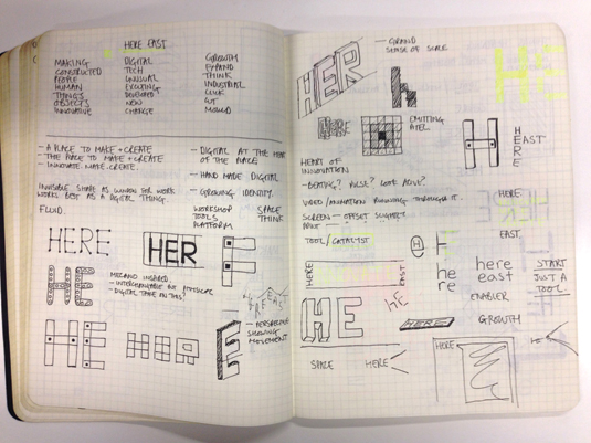
Creating the dynamic H logo was about wanting to do something that had a kinetic, disruptive quality to it. The dazzle pattern used by the architects made us think about how you can manipulate vectors to disrupt something. The idea of disruption was an interesting business proposition but also an interesting visual proposition.
02. Disrupting the 'H'
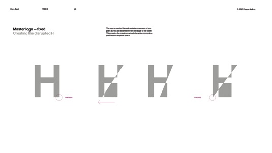
We then thought about how to create maximum disruption to a letterform. The logo is created through moving one point of the letterform from one edge to the other. This creates the ultimate visual disruption by combining positive and negative space.
03. Reducing disruption
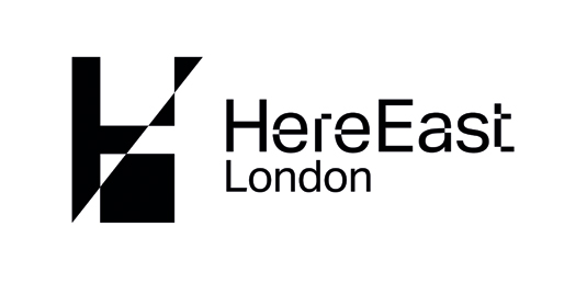
Originally, we really dragged the point out from the character and created something quite spiky, a bit brasher. But gradually it became more solidified and we made into something that was really usable.
We reduced the disruption, keeping it within the form, rather than allowing it to push out into the master brand. It's a very appealing way of doing it.
04. Creating an alphabet
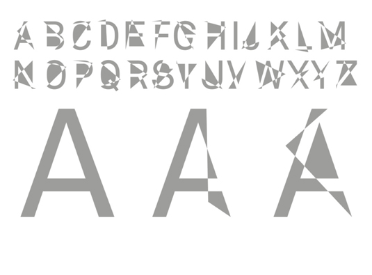
The same process can also be applied to other letters, which we will use more of as a graphic typeface in the future. It's a dynamic approach, and offers the kind of flexibility that could be useful when designing wayfinding and signage, for example.
05. Wider applications
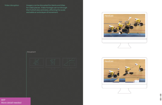
We also looked at the idea of movement, and how the H can appear in films or animations. The disruption can be more complex in moving images, as you can resolve it back to the recognisable identity.
Words: Anna Richardson-Taylor
This feature first appeared inside Computer Arts 237: Pick the Perfect Typeface.
Have you entered your best branding to the Brand Impact Awards yet? Early Bird entry rate ends on Friday 24 April - good luck!
Liked this? Try these…
- Does creative freedom actually exist?
- 10 tips for breaking onto the speaker circuit
- 13 secrets for creating game-changing branding

Thank you for reading 5 articles this month* Join now for unlimited access
Enjoy your first month for just £1 / $1 / €1
*Read 5 free articles per month without a subscription

Join now for unlimited access
Try first month for just £1 / $1 / €1

The Creative Bloq team is made up of a group of art and design enthusiasts, and has changed and evolved since Creative Bloq began back in 2012. The current website team consists of eight full-time members of staff: Editor Georgia Coggan, Deputy Editor Rosie Hilder, Ecommerce Editor Beren Neale, Senior News Editor Daniel Piper, Editor, Digital Art and 3D Ian Dean, Tech Reviews Editor Erlingur Einarsson, Ecommerce Writer Beth Nicholls and Staff Writer Natalie Fear, as well as a roster of freelancers from around the world. The ImagineFX magazine team also pitch in, ensuring that content from leading digital art publication ImagineFX is represented on Creative Bloq.
