Reading and Leeds revamped
London-based design studio Form saw its new identity for the Reading and Leeds Festivals revealed during proceedings last weekend...
Did you go to the Reading Festival over the long weekend? How about the Leeds Festival? Instead, maybe you caught headliners like The Cure, Kasabian and The Foo Fighters on television, or online? Whatever the case, you might well have noticed the new logos for both festivals - which are run by Festival Republic - that have been created by London design studio Form.
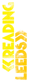
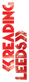
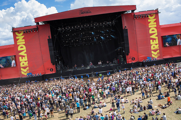
Though the red and yellow colour scheme has been maintained, the new look does away with the black of the old logos (which you can see at the festivals' websites) and also demonstrates the kind of straightforward-yet-sublime design thinking Form has become known for. "We created a graphic language with chevron arrows representing Reading, pointing south, and Leeds, pointing north," explains Form co-founder Paula Benson. "The entire logo runs vertically to emphasise this. This vertical orientation also sets it apart from many other festival promotions."
The new look is aligned with a slight shift in the marketing direction the festivals' promoter is going to take in coming years. Form were aiming for something youthful and appealing, without being patronising or 'tricksy', while still recognising the festivals' rock heritage. Nirvana, Meatloaf and Rage Against the Machine have all rocked these iconic stages.
The studio designed the type themselves, including a distressed effect. Meanwhile, the colour scheme was stipulated in the client's brief for some continuity. After all, the new identity has been introduced for the live stages before appearing online. Benson continues: "The yellow and red colour scheme of the old logos are key signifiers, so we brought those same colours forward into the new identity. Reading is predominantly red with yellow logos and Leeds vice versa. However, the client was quite specific about having less black!"
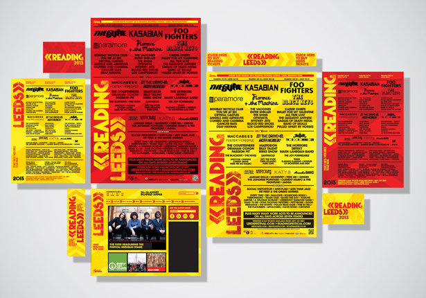
With the new logos appearing on the stage livery itself last weekend, other elements of the new identity will be rolled out in due course - online, on posters and on the tickets themselves as next year's events are marketed.
"Rebranding Reading and Leeds Festivals has been an honour - they are the original rock festivals, a major fixture in the festival calendar, loved by bands and festival goers alike, and designing a stage scrim especially is a dream for any designer who loves music," adds partner Paul West. "We appreciate there was a strong infinity with the existing logo but the client was becoming increasingly aware of its limitations."
You can read our interview with Form from earlier this year, when they celebrated their 21st anniversary, here.
Get the Creative Bloq Newsletter
Daily design news, reviews, how-tos and more, as picked by the editors.

Thank you for reading 5 articles this month* Join now for unlimited access
Enjoy your first month for just £1 / $1 / €1
*Read 5 free articles per month without a subscription

Join now for unlimited access
Try first month for just £1 / $1 / €1

The Creative Bloq team is made up of a group of design fans, and has changed and evolved since Creative Bloq began back in 2012. The current website team consists of eight full-time members of staff: Editor Georgia Coggan, Deputy Editor Rosie Hilder, Ecommerce Editor Beren Neale, Senior News Editor Daniel Piper, Editor, Digital Art and 3D Ian Dean, Tech Reviews Editor Erlingur Einarsson, Ecommerce Writer Beth Nicholls and Staff Writer Natalie Fear, as well as a roster of freelancers from around the world. The ImagineFX magazine team also pitch in, ensuring that content from leading digital art publication ImagineFX is represented on Creative Bloq.
