The process behind branding an iconic poet
We speak to Accent ADC, who won the pitch to create this beautiful geometric branding to celebrate iconic poet Dylan Thomas.
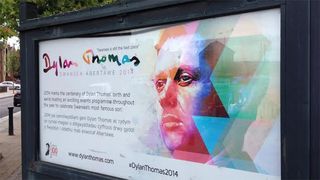
Hailing from Swansea, iconic poet Dylan Thomas has gone on to become one of the world's best loved writers. To celebrate the 100 year anniversary of his birth, local design agency's battled it out to create the branding for the city-wide celebrations. We spoke to Richard Davies of Accent ADC who were responsible for the winning entry.
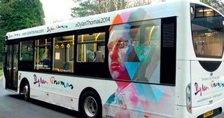
So, what was the brief?
The City and County of Swansea wanted to develop a brand based primarily around Dylan Thomas's signature with consideration to a series of sub brands that would be used across the city. It’s aim was to promote Swansea as the birthplace of Dylan Thomas and position it as a cultural tourism destination.
What was your inspiration for the project?
The key to the branding was creating a fresh new take on such an iconic literary figure not only in Swansea but somebody who is well known throughout the literary world. We wanted to avoid the clichés usually associated with such cultural events but rather reflect the richness and colour of Dylan Thomas's work – hence the use of strong colours in the final branding choices.
Tell us a bit about the process.
We concentrated on the logo initially, experimenting with various colour combinations and how far we could abstract Dylan's signature and still make it recognisable. From there we wanted to see how the logo would work with the sub brands such as The Dylan Thomas Centre and the Dylan Thomas Exhibition.
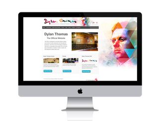
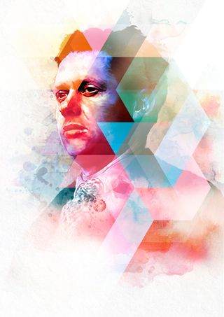
We also added illustration which the clients liked so much that they wanted to incorporate it into the overall branding! Once the design concepts were approved by the client, we put together a comprehensive branding guide which showed examples of how the branding would be used across various platforms, from large outdoor advertising to online social media graphics.
Which applications did you use during the creative process?
The logo and abstract shapes were created in Adobe Illustrator and the Dylan Thomas illustration was painted in Photoshop. Elements of the logo and textures were also combined in Photoshop to create the overall desired effect.
As a Swansea-based design agency, it was a very special project to work on especially because of the affinity the city has with Dylan Thomas and his work. It's also a fantastic showcase for what we do as an agency and proves that there's a great deal of creativity available in Wales.

The colourful branding with the subtle geometric pattern and Thomas' very own handwriting font is a wonderful tribute to the poet and one that works seamlessly across all platforms including buses, billboards, flags, web and even social media.
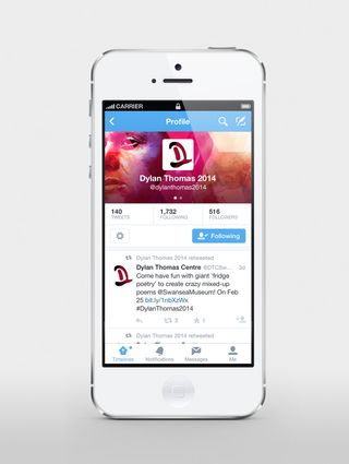
What do you think about this branding? Let us know in the comments box below!

Thank you for reading 5 articles this month* Join now for unlimited access
Enjoy your first month for just £1 / $1 / €1
*Read 5 free articles per month without a subscription

Join now for unlimited access
Try first month for just £1 / $1 / €1
Get the Creative Bloq Newsletter
Daily design news, reviews, how-tos and more, as picked by the editors.

Sammy Maine was a founding member of the Creative Bloq team way back in the early 2010s, working as a Commissioning Editor. Her interests cover graphic design in music and film, illustration and animation. Since departing, Sammy has written for The Guardian, VICE, The Independent & Metro, and currently co-edits the quarterly music journal Gold Flake Paint.