Pizza Hut unveils new logo
The American restaurant chain reveals a new logo as part of a major brand overhaul.

As one of the biggest restaurants in the world, it could be said that Pizza Hut is a pretty iconic brand. Using specific colours in branding throughout their logo history, their red, black, yellow (and sometimes green) designs are undeniably recognisable.
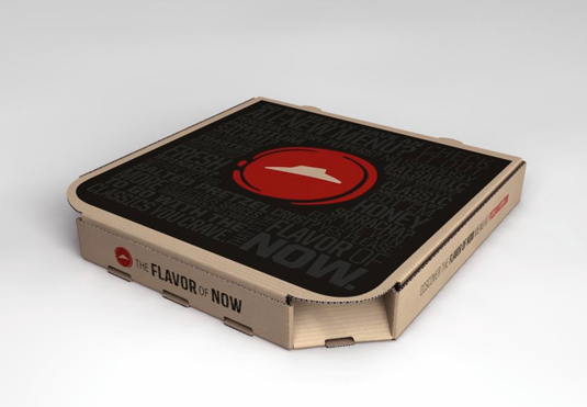
Today the company has announced a major change in its menus and overall look of its restaurants and this, of course, calls for a change in their branding and logo designs. Stripping back the design, the new logo portrays a pizza-like circle with a more muted red whilst still keeping the iconic 'hut' illustration.

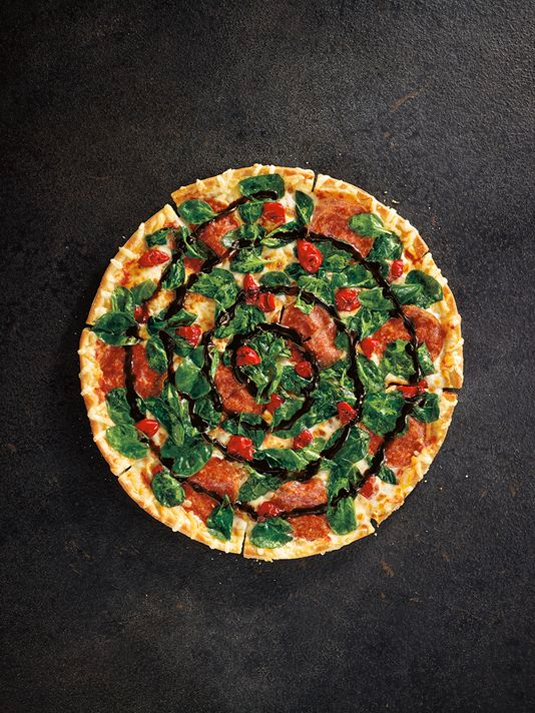
To celebrate the change, the chain will launch its biggest ever advertising campaign entitled 'The Flavor of Now.' It's also adding even more choice to the menu – including salted preztel crusts and sliced banana pepper toppings – but is this the right direction the company should be heading in?


What do you make of the new logo? Let us know in the comments box below!

Thank you for reading 5 articles this month* Join now for unlimited access
Enjoy your first month for just £1 / $1 / €1
*Read 5 free articles per month without a subscription

Join now for unlimited access
Try first month for just £1 / $1 / €1
Get the Creative Bloq Newsletter
Daily design news, reviews, how-tos and more, as picked by the editors.

Sammy Maine was a founding member of the Creative Bloq team way back in the early 2010s, working as a Commissioning Editor. Her interests cover graphic design in music and film, illustration and animation. Since departing, Sammy has written for The Guardian, VICE, The Independent & Metro, and currently co-edits the quarterly music journal Gold Flake Paint.
