39 standout packaging designs
Inspirational packaging design examples, plus online resources.
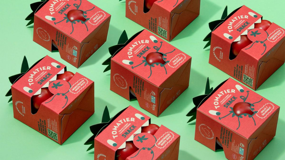
Packaging design surrounds us, wherever we are. Creating an eye-catching packaging design that suits the product, stands out on crowded shelves, and doesn't cost a fortune to produce is a real challenge. And now more than ever, there's the concern of environmental impact. Increasingly, 'excess' packaging or non-eco-friendly materials will result in a backlash from potential customers. Throw in a challenging economic landscape for retailers, and it's safe to say packaging design isn't an easy job right now.
However, designers have risen to the challenge. In this post, we've rounded up standout examples of packaging designs to inspire you and guide your efforts. For more advice, use the jump link above to to skip to handy free online packaging design resources. For more inspiration, check out our roundup of the best print ads around.
Awesome packaging design examples
01. FreeWater
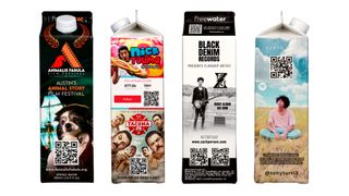
This packaging design may not be particularly beautiful, but it is a revolutionary way of handling product and packaging design and that's why we're including in this list.
It could be argued that the design of many products makes them adverts for themselves, with big-name clothing brands particularly keen on using their products as mobile billboards that people pay to wear. But could they also advertise other brands to cover at least part of the cost of a product?
The US-based startup water brand FreeWater is giving this a shot with a novel proposition. Its paper cartons and aluminium bottles of spring water are free, and the company even donates ten cents from every product it shifts to charities, such as Well Aware. It's even planning to launch a free vending machine to stock the products. Is this a clever way of offering free products or a dystopian advertising nightmare?
02. DCYPHER
Agency Sergeant Walnuts is the mastermind behind the design of DCYPHER – a new beauty brand, which creates entirely mixed to measure products through a bespoke formula and new technology. The branding and packaging design cleverly builds on the concept of a 'beauty code' in a fresh, beautiful way.
“The idea of a beauty code very much inspired our thinking and design language” said Gary Toal, creative director. "From Alan Turing’s Enigma Machine to Samuel Morse’s dots and dashes, the visual world of codes, cryptograms and ciphers is incredibly rich and interesting. So, we chose to amplify it as a visual language – celebrating the technical processes that help to put perfection in the palms of those who use DCYPHER."
"The grids provided us with the structural foundation (no pun intended) for both our packaging and comms, with the dots being placed in specific ‘cells’ to reflect each individual’s unique skin tone ID," Toal continues.
"Our aim was to create an identity that, as well as being distinctive and ownable, was also purposeful and carried genuine meaning".
03. Cameron’s Brewing
As the beer market grew, Cameron's Brewing was in decline. It needed a brand-new identity that would grab attention, yet hold onto the existing consumer base. Cactus came up with a solution. First, it decided to ditch the bottles and house its beer in cans (for increased shelf presence), and then went for a new look that's reminiscent of childhood scout and camp badges.
Each beer style is now unified with a bright colour palette, a different one for each beer, and the iconography and stories highlight the unique products to 'reinforce overall brand recognition'. Beer naming was a crucial part of the story, adding personality. The modular design strategy works across its applications in apparel, advertising, digital and social media.
04. Callaly
This flexible packaging system was created by Design Bridge for Callaly, a direct-to-customer feminine hygiene brand. Design Bridge wanted to create a genuinely beautiful product that consumers would enjoy opening. The bold colour and contemporary graphical style bring Callaly away from the traditional 'discreet' femcare branding.
Details include a 'playful, wave-shaped tear-strip' to enhance the experience of opening the product, and a 'fluid' opening experience as the box 'petals' unfold. Each petal contains information about the brand. The box is resealable, and the packaging is totally recyclable. A bespoke typeface was created to 'complement the brand's conversational and approachable tone of voice'. There's even a bonus bookmark included, to promote Callaly's book club.
05. Kololak House Wine
This stunning packaging was created by Backbone branding for fusion restaurant Kololak, in Armenia. Kololak means a round shape, or meatball, and the rounded design reflects that. The collection is made up of the restaurant's house fruit wines, and each wine was given an individual identity that fits with the restaurant concept. This is centered on the rich Armenian tradition of socialising around the table.
The branding team aimed to represent Armenian ethnic and folk art, in particular the Armenian miniature, manuscripts and calligraphy. The hand-drawn illustrations and calligraphy depict famous toasting quotes and the culture of feasting and wine serving. The bottles have round corks, aiming to unify the packaging and symbolising the 'Kololak'.
06. Motiv from Tong Ren Tang
A recent project from branding agency behemoth Superunion saw it delve into the world of Chinese healthcare heritage. Briefed to create a new identity for Motiv from Tong Ren Tang (China's oldest healthcare brand, founded in 1669), it aimed for a "perfect balance of heritage and modernity" in the new vitamin supplement designs. Looking to target younger Chinese people, the idea was to move beyond visuals associated with traditional medicines and toward Western approaches to wellness.
The identity concept is inspired by "the Chinese ethos of achieving a 'healthy mind in a healthy body',' according to Superunion, with the packaging design giving a contemporary twist to shapes found in the traditional Chinese pottery. After three years spent prototyping, Superunion combined these forms with those of an organic cell structure to create packs that can stack using interlocking ridges. Bold colours and patterns aim to create on-shelf standout in busy retail environments.
07. Who Gives a Crap
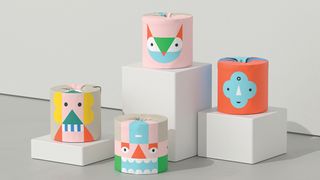
Garbett has created illustrations and packaging for a special edition toilet paper range by Who Gives a Crap, an Australian company that produces environmentally friendly tissues, paper towels and toilet paper and donates half of its profits to build toilets in places that don’t have them. Known as 'The Play Edition', this range was designed to engage people in play.
“The idea for the range was inspired by children’s mix-and-match books – in that they can be stacked in different ways to make whimsical totemic characters,” says Garbett creative director Paul Garbett. For children who may be particularly enthused with this, the outer carton can be recycled and made into a stage.
08. Manos de Cacao
Premium bean-to-bar chocolate brand Manos de Cacao wanted packaging that felt simultaneously timeless and eye-catching. Inspired by the company’s local production process, Mexico-based studio Anagrama combined messy handmade textures with a vibrant colour palette and clean layouts. The result is a new visual system for the brand that places sophistication at the forefront and evokes an appropriately organic undertone.
“Making a ton of stains by hand with different tools and choosing the right ones for each box was challenging,” says David Gutiérrez, partner and creative director at Anagrama. “However, this was also the most fun part of the process.”
09. Hardy
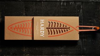
“Third-generation family business Hardy specialises in smoked salmon. The company turned to Portugal-based studio This is Pacifica to design stationery, packaging and a website that would communicate the premium quality of its product. “It’s a long-lasting process that can’t be rushed. From salting to smoking, each stage is executed to perfection. So we created the idea of Hardy ‘Smoked Masterpieces’,” explains creative director Pedro Mesquita.
The identity combines two main elements: an abstract salmon symbol, and a fun, sharp wordmark that could have been cut by a knife. “The packaging was treated as an extension of the brand,” says Mesquita, “and is entirely made of raw micro-corrugated cardboard printed in UV colour.”
10. We Compost
Auckland-based compostable waste collection service We Compost turned to Seachange to help it come up with a brand strategy that speaks to an audience beyond the eco-warriors, and better reflects the work it’s doing. “Our strategy was to do something fresh for the sector; modern, fun and accessible to everyone,” says Seachange creative director Tim Donaldson. “It needed to go against the grain of the visual world of composting which is saturated with leaf logos, recycling symbols and overly worthy messages.”
Seachange came up with a visual identity centred on a green colour palette and a graphical representation of worms, rolling this out across the packaging, website, printed material, bin bags and other merchandise. The bin liners carry the word 'yum', to keep things fun, and the company used biodegradable materials for its business cards and merchandise.
“The iconic worm logo is modern and playful, and speaks to the grass-roots of composting. We extended this into a bespoke typeface ‘Worms Display’, as well as creating a bold graphic worm print for maximum standout,” says Donaldson.
11. Thomas Kosmala
Looking to break into European and global markets, emerging perfume brand Thomas Kosmala tasked Toronto-based agency Concrete with a complete brand overhaul. The new packaging marries classic with contemporary, unexpectedly wrapping a sophisticated custom typeface around the edges of the perfume box and over a subtle emboss.
“The brand needed to appeal to both Middle Eastern and Western audiences,” explains chief creative officer Diti Katona. “Sensuous, provocative and sometimes raw photography conveys the depth and richness of the scents, but is abstracted in the packaging to comply with the conservative sensibilities of the Middle Eastern market. A more explicit use of the imagery is employed in digital media, and it’s more subtle in print experiences,” Katona adds.
12. Wild Island Sacred Tree
After designing the bottle for Wild Island Gin, drinks branding studio Thirst was tasked with designing a second edition, Wild Island Sacred Tree. Inspired by the gin itself – which is infused with hand-gathered botanicals from the small Scottish island of Colonsay – the studio looked to the island’s ripe bramble vine to create a deliciously juicy colour palette using watercolour.
“The brief was to capture the essence of autumn on the island, and the wonderful bounty of berries and botanicals it produces,” explains creative director Matt Burns.
Thirst paired the autumnal colour palette with a simple wordmark that gives a nod to the island’s Viking heritage. When it came to applying the fluid watercolour design to the bottle, the texture was printed on both sides of the transfer, enabling it to be viewed through the distortion of glass and liquid. “This allows the watercolour to take on new life, constantly changing as the bottle is rotated,” adds Burns.
13. Halo
Halo is an adventurous brewery that takes the traditional recipes of rare styles of beer and experiments with the ingredients. With a taproom and bottle shop that welcome inquisitive visitors, the brewery needed an approachable brand that matched its unconventional sensibilities.
“We created a logo, labels and packaging that use geometric patterns in unexpected colours, resulting in a look that’s energetic, modern and a bit rebellious,” explains Claire Dawson, creative director at Underline Studio, the studio behind the project. “This direction was very intentionally chosen as a way for Halo to stand apart visually in the craft beer space.”
Dawson admits it was a challenge to keep each label unique while still being recognisable as part of a larger system. “But finding abstract ways to graphically represent each of the beers was our favourite part of the project,” she adds.
14. Juice Society
Third-year design student Ryan Hicks was tasked with revamping the visual identity of Austin-based juice bar Juice Society as it expanded into the wholesale market. “They felt that their previous identity was too rustic and gave an outdated reflection of their upbeat spirit,” explains Hicks, adding that the company has a philosophy of promoting realistic balance when it comes to wellness.
“I decided to convey this playful attitude through an ecosystem of whimsical, somewhat scientific iconography that hinted at the juice’s benefits, but provided some element of optimism,” he says. “I also wanted to convey the brand’s unconventional approach to the health realm, so to stand out on refrigerator shelves and catch shoppers’ eyes, I chose to design the labels to be as minimal as possible.”
15. Stefano Sauces
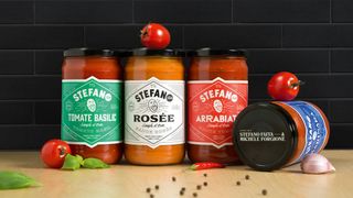
Montreal-based agency lg2 took an original approach to its branding of the first ready-to-eat products from well-known chef Stefano Faita and his partner Michele Forgione. Featuring a jovial, energetic caricature of Faita, the identity gives each sauce a unique typographic treatment – with nutritional and legal information presented in an unusual vertical fashion outside the shape.
“It was a major challenge to differentiate the brand in this type of category, where all brands merge into one,” says David Kessous, creative director at lg2. “The concept’s originality produced a real, appealing identity and packaging that leaps out.”
16. Fierce & Noble
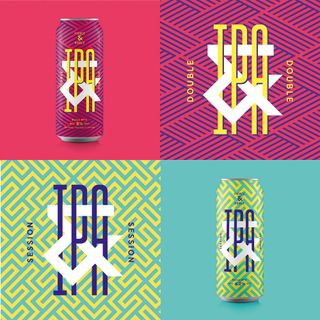
Bristol studio Halo was approached to create a strategy, name, brand identity and packaging for a new craft brewery in St Werburghs, Bristol. The name – Fierce & Noble – represents the brewery team’s fierce independence and respect for the heritage of the craft, while the bold creative, custom type and bespoke patterns reflect the local vibrancy of its location.
“The product needed to jump out on bar and shelf,” explains Halo design director Andy German. “And what with the brewery being in a creative vibrant area of Bristol with other craft breweries in it, it made sense for the building to stand out and be seen. The main pattern for the brand was based around the ampersand we made – my eyes went a bit fuzzy creating this one.”
17. Colors
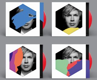
Musician Beck’s latest album Colors sports a customisable record sleeve created by designers Jimmy Turrell and Steve Stacey. Formed from layers of different die-cut coloured transparencies, the cover can be assembled into a bespoke sleeve by listeners.
“We decided on a route of colour and shape – simple and strong,” explains Turrell, who was art director and video director on the project. “We tried not to set too many restrictions on where we went with this in the initial stages. We started looking at a whole range of things for inspiration – childhood games like Ludo and Connect 4, old VHS and cassette packaging, all the way through to artists like Bridget Riley and Piet Mondrian, and Beck was really open to us experimenting. Seeing it all out there – and the positive feedback it’s been getting – is really satisfying.”
18. Artisan
When Québec-based microbrewery Boréale launched a new series of beer, Artisan, it tasked creative agency lg2 with designing the new identity. “The client’s main objective was to restore the brand’s credibility among fans of microbrews,” explains graphic designer Marie-Pier Gilbert. “We had to establish Boréale in a niche segment without detracting from its mass appeal.”
lg2 worked hand-in-hand with the master brewer. For some products, the recipe influenced the artistic direction; in other cases, the reverse happened. “For example, for the Pilsner des Mers, the name and design were developed first, which then inspired the master brewer to give the recipe a salty note,” says Gilbert. “Flexibility and listening were a big part of the teamwork.”
19. Moses Lake Cellars
Thirst specialises in the craft drinks industry, and it's currently exploring new techniques and executions in packaging design as part of its Studio Series. This range of bottle labels for luxury wine brand Moses Lake Cellars was designed to work as a collective on a dinner table.
"We wanted to explore typographic lettering techniques that were bold and youthful, yet still carry the luxurious qualities associated with wine," says Thirst. To give an extra touch of luxury, the studio used heavy paper stock, and each label is double folded, white onto gold.
20. CS light bulbs
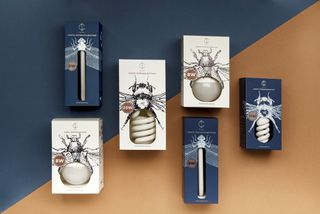
Everyday products such as light bulbs tend to lend themselves to fairly utilitarian packaging, but these, produced by Belarus electrical company CS, boast beautiful boxes that turn the product into an important part of the packaging design.
Designed by Angelina Pischikova, with line illustrations by Anna Orlovskaya, this amazing packaging uses detailed drawings of insects, and the bulbs themselves are paired with certain bugs depending on their shape and size. Long, thin bulbs are stored in dragonfly boxes, while the coiled stripes of an energy saving bulb become the abdomen of a bumble bee.
21. Leafs by Snoop
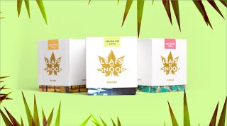
With cannabis slowly becoming less and less illegal in the USA, cannabis branding is increasingly becoming a thing, complete with packaging to match. Snoop Dogg brought in none other than Pentagram to design the brand identity and packaging for his line of cannabis products: Leafs by Snoop.
Stepping far away from the idea of furtively buying a grubby little bag of greenery, Pentagram's designs include a distinctive leaf-based logo (including an animated version), luxurious weed boxes and a range of edibles including six chocolate bars and cannabis sweets called, of course, 'Dogg Treats'.
22. Colour me Blind
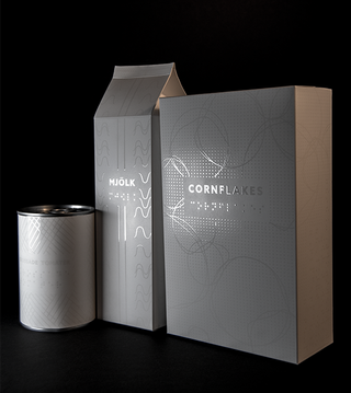
For her graduation project, graphic design student Alexandra Burling wanted to see if it was possible to create an aesthetically appealing packaging design for the visually impaired. Following her research period, she decided to focus on groceries.
“I wanted to give blind people the liberty of doing something so obvious as going down to the supermarket and buying milk,” explains Burling. "The aim was to provoke discussion and pave the way for innovative thinking about how packaging design can appeal to more senses than sight."
23. The Lovely Clinic
London-based creative agency SomeOne created this tactile packaging as part of its branding scheme The Lovely Clinic. Faced with the challenge of branding a beauty client, SomeOne decided it was time to challenge the industry norms. “The beauty sector is awash with images of impossibly beautiful women, who hint that if it wasn't for a particular brand, they would resemble the back of an elephant rather than a glowing example of perfection,” it points out on its website.
“We centred on the visual theme of paint – globally recognised as a way of either enhancing the existing – or a way of working with basic elements to create something astonishing,” adds senior designer Tom Myers.
24. Brandless
US company Brandless has taken minimalism to the extreme by trademarking white space in its range of food and home items. Co-designed with Brooklyn agency Red Antler, each product is made up of a single colour with the white box design dropped on top. The text in the boxes is effectively negative space, and is readable thanks to the colour underneath peeking through.
Interestingly, the lack of identity means that the range can dodge a fee known as Brand Tax, which means Brandless is able to sell all the products at a standard price of $3. Read more about the range here.
25. Chandon
After the huge success of its American Summer limited edition bottles, sparkling wine brand Chandon approached London-based agency Butterfly Canon to create a new series of limited edition branding. The sleek design retains the elegance and playfulness of the original concept whilst replacing the 'Americana' approach with a more globally recognised nautical theme. This way, European and other non-American customers will further relate to the brand.
26. Nike Air
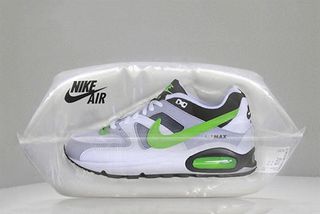
Nike Air is arguably one of the most popular sneaker designs ever released. Not content with a regular old shoebox, Berlin-based agency Scholz & Friends came up with a brand new, reimagined packaging design for its favourite trainers.
Very much taking the 'Air' aspect into account, the team placed the sneakers in an air-tight plastic bag to give the illusion of floating trainers. Highlighting the Air cushioning of the brand, this design also reduces the risk of damage when shipping.
27. Onuma Honey
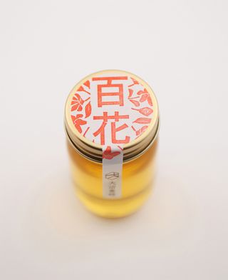
This offering from Japanese studio Akaoni Design is a bee-utiful example of 'less is more' when it comes to packaging. It consists of a small jar, simple stickers and classic brown paper, with an array of sweet coloured stamps to finish it all off. Art direction and design was taken care of by Motoki Koitabashi and it's clear he knows what's he doing when it comes to making a striking impact in the aisle.
28. Spine Vodka
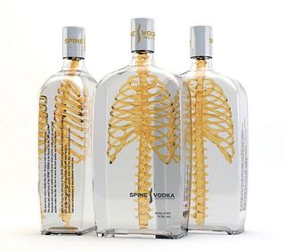
German designer Johannes Schulz created this inspirational packaging for Spine Vodka. "It was a private project I started after my graduation of an international communication design school in Hamburg, Germany," he explains. "Spine is a high quality product just like the design, reduced and simple with a consciously 'twist' in his message and a memorable name fitting to the project."
Integrated the spine with the ribcage to communicate a product with a 'backbone', the uniqe 3D design approach sets it aside from its 2D counterparts. "The transparent glass material stands for a product that doesn't have to hide something," Schulz concludes.
29. Allsorts Black and White
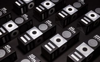
Back in 2014, Liquorice Allsorts had a mini facelift from Bond Creative Agency for Cloetta – a leading confectionary company in the Nordic region. The new packaging took the traditional sweets' distinctive shapes and colours and used them as the basis for a more modern design.
The agency's recent update for Cloetta's Black and White edition follows the same theme, but with the colour stripped away. "The silver print and matt finishing give a tasty touch to the functional cardboard box," says Bond.
30. Cervecería Sagrada
While Corona is probably the most recognisable beer exported from Mexico, Cervecería Sagrada is a Mexican craft beer that captures the country's colourful history and spirit in its label. Designer José Guízar was inspired by Lucha Libre wrestlers, who wear bright masks and have equally colourful personalities.
During the 1950s Lucha Libre were considered folk heroes and starred not only in the wrestling ring, but also in comic books and movies in Mexico. Guízar’s labels recreate the masks of some of the most famous and recognisable wrestlers.
31. REN Skincare
Kangan Arora is a London-based designer with a particular flair for bold textiles and vivid prints. Global skincare brand REN brought Arora in to create Christmas gift packaging to go with the theme ‘little boxes of joy’. The studio created seven different abstract patterns inspired by traditional festive products such as wrapping paper, fairy lights and cosy textiles.
32. Stranger & Stranger Spirit No. 13
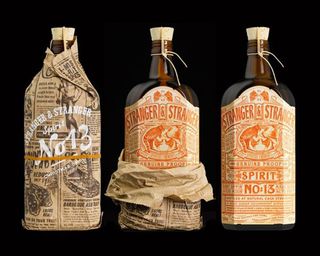
Beverage bottle branding guru Stranger & Stranger designed this limited edition holiday give-away liquor that features one of the most detailed labels you will ever see. The Spirit No 13 label just screams vintage and consists of over 500 words. To top it all off, the bottle is presented wrapped in a specially printed piece of newspaper that gives it what they call a 'moonshine' feel.
33. TIQLD
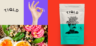
When planning the packaging design for spice blend range TIQLD, Alphabet used humorous illustrations to convey a playful, confident brand identity. The pouches each feature a split design capturing an unexpected combination of objects.
“We wanted to bring the idea of making meals more bold and adventurous into the brand imagery. The structure of the illustrations combines the base ingredient that the spice works with (either meat, fish or veggies) and juxtaposes this with an unexpected abstract element that visualises the story that accompanies the spice blend,” explains Alphabet. “The stories not only represent the bold personality of the brand but also the bold flavours that they create.”
34. Fuego Spice Co.
Upon realising that its products were being slightly misunderstood, hot sauce makers Fuego Spice Co. called on Robot Food to help it better communicate that its range of sauces are more about elevating flavours than being excessively spicy.
“These sauces aren’t scrambling for the top spot on the heat scale; the range focuses on flavour over fire, so the design needed to move away from the gimmicky style of the category,” says Chris Shuttleworth, senior designer at Robot Food. “We decided to look outside of hot sauce at more premium lifestyle products to pull some unexpected sophistication in a category where novelty normally rules.
“To establish Fuego’s hot sauces as a legitimate premium option, bold abstract lettering identifies each sauce and metallic foils are set off by a matte white background. We initiated more of a hierarchy, giving prominence to the master brand and filtering the information down to flavour profiles.”
35. Poilu paintbrushes
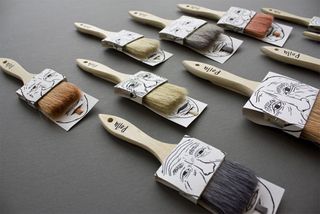
This excellent example of packaging design comes from Simon Laliberté and offers the function of assembling two paintbrushes together with only one cardboard piece, which is printed on both sides. The natural hairs of some paintbrushes have been dyed to give the illusion of the moustache and beard combos. The font at the top of the handle is also noteworthy.
36. Montgomery and Evelyn
Studio Makgill created the visual identity and packaging design for Montgomery and Evelyn, a company offering food supplements for mental wellbeing. “Working closely with the company’s founder, Evie Montgomery, our brief was to create an identity that was not only empowering but also pioneering in its approach, while offering the simplest synergetic supplement support,” says creative director Hamish Makgill.
“Our strategy was to match the clarity in Evie’s approach with an identity and packaging based on a system of balance, structure and order, with a scientific undertone that’s disrupted by molecules that reference the benefit of each product.”
37. Mighty Nuts
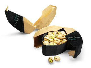
This incredible pistachio packaging design was created by student Maija Rozenfelde, when she was still completing her degree in packaging design at Pratt Institute. She says of the design: "A crucial part of the thought process was to focus on user experience and second function of the package. The main intention was to create graphics that depict the crunchiness of pistachios, that’s where the hand-made type treatment comes in."
38. Helvetimart
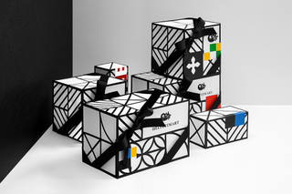
Helvetimart is a Swiss shop that sells specialty food products. For its packaging design, branding heavyweight Anagrama took inspiration from the regional flags of the country's 26 sovereign states.
"We simplified these flags to create a homogeneous language, using representative elements and colours to develop the labels for the brand’s products and the signage within the store to ease its navigation," the agency explains.
39. Utopick Chocolates
Based in Valencia, Spain, Lavernia & Cienfuegos is a multidisciplinary design studio specialising in graphic, product and packaging design. When master chocolatier Paco Llopis required a new design and packaging for his products, the team pulled out all the stops. Llopis already had an icon: a ship, to represent the spirit of adventure and hint at the long journey cocoa pods must make to reach the chocolatier.
Lavernia & Cienfuegos opted for an origami version of the ship, a decision that led the theme for the rest of the packaging design. "Utopick package their batches by hand so we created a unique way of folding the paper to wrap the bars," explains the team. "The paper folds to create two triangles on the front of the design, each with their own colour and texture, personalising every bar."
Top packaging design resources
The web is a wonderful thing, brimming with resources and inspiration for people interested in packaging design. But, sometimes, too much choice can be confusing, so we've picked out the top online packaging design resources to help you really get to grips with it.
01. Packaging of the World
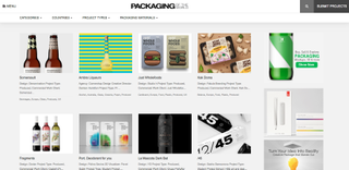
Packaging of the World is an extensive gallery showcasing the most interesting and creative packaging designs from around the world. This site is really well organised; you can choose to search for projects by category, country, product type, most popular, and so on, to narrow down what you're looking for. This is a brilliant resource in the area of packaging design, and is updated regularly with new examples.
02. The Dieline
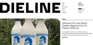
If it's information and inspiration on packaging design you're after, then The Dieline is a fantastic place to start. Founded in 2007, the site aims to define and promote the world's best packaging design. As well as news and opinion pieces, this site features a jobs board and a library of packaging designers and suppliers.
03. Designspiration
All sorts of creative goodness comes together at Designspiration. Created by Shelby White, Designspiration is a hub for collecting and sharing ideas, including a whole host of interesting and innovative packaging designs. The frustrating thing about this site is that there's nothing in the way of commentary; just images – and often there are no links to the creator of the packaging to enable you to explore further. However, for purely visual inspiration, it's great.
04. BXP
Formerly Package Design, Brand Experience – or BXP for short – is a fantastic resource for all things packaging design. The site features work from designers all around globe, the latest industry news, upcoming talent in the field, a resources section and much more. You can also narrow articles by material, to find exactly what your looking for.
05. Pinterest
With hundreds of thousands of inspirational images in its archives, and more being added every day, we couldn't not include Pinterest on this list. Simply type 'package design' into the keyword search and watch the work appear. This is a popular subject on the social networking site, so you'll find yourself scrolling down on what seems like a never-ending page of packaging design projects.
06. Brand New
A division of design firm Under Consideration, Brand New focuses solely on corporate and brand identity work, and features a vast library of inspirational packaging designs. But this is not just a showcase site; as well as all the beautiful imagery featured, many of the designs here are reviewed in detail, with experts giving their opinion on if, how and why each concept works.
07. BP&O
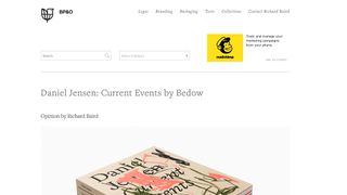
BP&O is a blog run by British freelance designer and former writer for The Dieline, Richard Baird, who specialises in the development of branding and packaging. Baird picks recently developed designs, provides a short background and shares his thoughts and opinions on each. This is a great site for finding new work from around the globe.
08. Dezeen
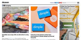
Dezeen primarily explores architecture and interiors, but also offers interesting articles on product design and packaging. The resource is great for staying up to date with the more on the cutting-edge, experimental and innovative news in packaging design, including explorations into environmentally friendly packaging.
09. Retail Design Blog
Retail Design Blog covers everything to do with retail design (as you might expect) – so alongside the sections on materials and branding, there's also dedicated pages for store design and visual merchandising. You won't get too far without hitting the paywall though – if this site looks like it covers what you need, you'll need to shell out €10 a month to read everything (try it out with a free 30-day trial).
10. Ambalaj
Ambalaj is actually the personal site of packaging designer Kristina de Verdier, but offers some interesting insights. The site is split into Insight, Design and Technology sections, with plenty of interesting news and inspiring examples to dig through.
11. Packaging World
Packaging World Magazine's website is a great resource for professionals in packaging and manufacturing automation. It's not the best looking site, but it is updated daily with articles about packaging inspiration, equipment and materials, and provides a great way to stay up to date with the latest news about packaging.
12. Packaging UQAM
French site Packaging UQAM collects together amazing packaging that might have flown under your radar. If your French is not up to scratch, don't worry – there are English translations included. Here you'll find creative solutions for storing trowels, golf tees, wishbones and plenty more unusual products. It's the place to go if you're looking to shake up your research and discover original ideas.
13. Behance
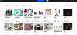
If you're a designer, you'll know Behance – but it's worth including here in case you'd overlooked it. The online portfolio community features all manner of packaging design projects, created by artists of all skill levels, in everything from shoe and pharmaceutical design to alcohol and electrical product designs. And of course, there are new additions being added pretty much constantly.
Related articles:
Thank you for reading 5 articles this month* Join now for unlimited access
Enjoy your first month for just £1 / $1 / €1
*Read 5 free articles per month without a subscription
Join now for unlimited access
Try first month for just £1 / $1 / €1
Get the Creative Bloq Newsletter
Daily design news, reviews, how-tos and more, as picked by the editors.
Rosie Hilder is Creative Bloq's Deputy Editor. After beginning her career in journalism in Argentina – where she worked as Deputy Editor of Time Out Buenos Aires – she moved back to the UK and joined Future Plc in 2016. Since then, she's worked as Operations Editor on magazines including Computer Arts, 3D World and Paint & Draw and Mac|Life. In 2018, she joined Creative Bloq, where she now assists with the daily management of the site, including growing the site's reach, getting involved in events, such as judging the Brand Impact Awards, and helping make sure our content serves the reader as best it can.