Nando's reveals a cheeky new visual identity
Nando's teams up with a South African design agency to create a visual identity filled with heritage.

Famous the world-over for spawning the 'cheeky Nando's' meme, amusing to some, incomprehensible to others, the peri peri chicken-themed chain restaurant Nando's has just launched a new visual identity.
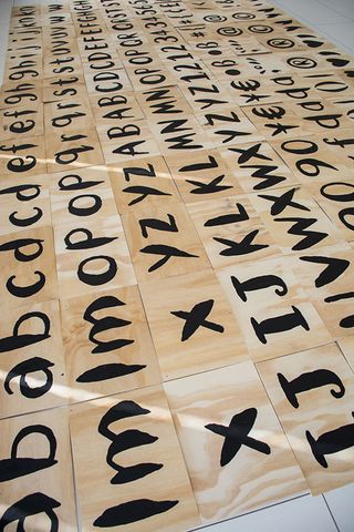
Working with South African agency Sunshine Gun, Nando's refreshed logo design and aesthetic has been described as "a fresh, bold, new look". Complete with a 'PERi Red' Pantone colour and a typeface dubbed Nando's Hand, this identity draws on the company's cultural heritage.
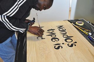
Artist Marks Salimu was inspired by traditional South African sign designs. "DIN Next [Nando's Hand] is the very same font used in road signs in Joahnnesburg, where the first restaurant was opened," Nando's spokesperson explains.
As well as calling on artists and designers from the country to contribute new artworks, the Nando's Hand typeface is also tilted 87 degrees, in a subtle typographical nod to the restaurant's opening date in 1987.


Liked this? Read these!
- Free graphic design software available to you right now!
- The designer's guide to working from home
- 8 brand identity trends to look out for in 2016
Get the Creative Bloq Newsletter
Daily design news, reviews, how-tos and more, as picked by the editors.

Thank you for reading 5 articles this month* Join now for unlimited access
Enjoy your first month for just £1 / $1 / €1
*Read 5 free articles per month without a subscription

Join now for unlimited access
Try first month for just £1 / $1 / €1
Dom Carter is a freelance writer who specialises in art and design. Formerly a staff writer for Creative Bloq, his work has also appeared on Creative Boom and in the pages of ImagineFX, Computer Arts, 3D World, and .net. He has been a D&AD New Blood judge, and has a particular interest in picture books.
