Milk branding makes the most of negative space
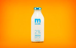
This udderly brilliant branding exercise uses bold colour and clever details to really pop.

Negative space is, quite simply, the space that surrounds an object in a image. Just as important as that object itself, negative space helps to define the boundaries of positive space and brings balance to a composition. Here, San Francisco based designer Justin Ross Tolentino uses the method to showcase milk.
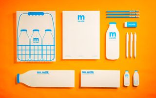
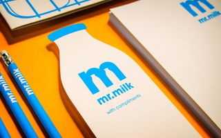
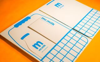
"The assignment was to create an identity for a job of yesteryear. I decided to base my project on a milkman I called Mr. Milk. My personal goal for the project was to create a timeless logo that could have easily been used in the 1950s as it could today," he explains. "To merge the past and the present, I paired the classic milk bottle silhouette with a clean sans serif.
"To give it some pop and contrast I decided to use cyan blue because I usually drink 2% milk. However, this colour could easily be interchanged to reflect the different varieties of milk, e.g. red for whole milk, yellow for low fat, and brown for chocolate." Take a look at the whole branding project below and let us know what you think.


What do you make of this branding? Let us know in the comments box below!

Thank you for reading 5 articles this month* Join now for unlimited access
Enjoy your first month for just £1 / $1 / €1
*Read 5 free articles per month without a subscription

Join now for unlimited access
Try first month for just £1 / $1 / €1
Get the Creative Bloq Newsletter
Daily design news, reviews, how-tos and more, as picked by the editors.
Sammy Maine was a founding member of the Creative Bloq team way back in the early 2010s, working as a Commissioning Editor. Her interests cover graphic design in music and film, illustration and animation. Since departing, Sammy has written for The Guardian, VICE, The Independent & Metro, and currently co-edits the quarterly music journal Gold Flake Paint.
