McDonald's unveils brand new packaging
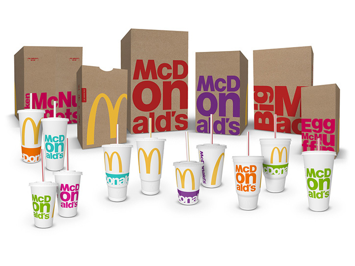
Branding agency Boxer has gone for the minimal approach with McDonald's new packaging design.
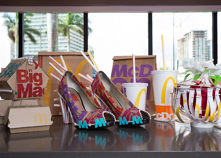
When you think of McDonald's packaging designs, your mind is probably immediately drawn to its infamous garish shades of red and yellow. However, in recent years, the fast food giant has been having a makeover of sorts – rebranding its restaurants and now, its packaging.
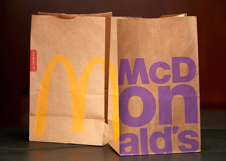
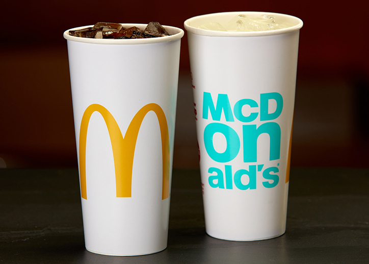
The new direction comes from branding agency Boxer, with help from Leo Burnett in Germany, DDB Hong Kong and Landini in Australia. This collaborative effort sees a more minimal execution but still in keeping with McDonald's fondness of bright and bold typography.
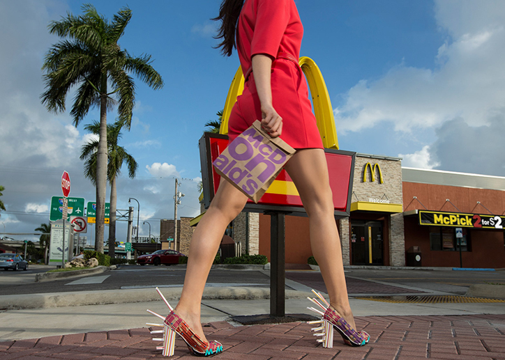
The campaign also includes fashion accessories created by two students from Miami International University of Art and Design, who produced shoes and handbags within a mere 48 hours. Expect to see the packaging throughout this year.
[via It's Nice That]
Like this? Read these!
- 58 awesome packaging designs
- 10 expert tips for improving your packaging design skills
- 13 top packaging design resources
Get the Creative Bloq Newsletter
Daily design news, reviews, how-tos and more, as picked by the editors.

Thank you for reading 5 articles this month* Join now for unlimited access
Enjoy your first month for just £1 / $1 / €1
*Read 5 free articles per month without a subscription

Join now for unlimited access
Try first month for just £1 / $1 / €1

Sammy Maine was a founding member of the Creative Bloq team way back in the early 2010s, working as a Commissioning Editor. Her interests cover graphic design in music and film, illustration and animation. Since departing, Sammy has written for The Guardian, VICE, The Independent & Metro, and currently co-edits the quarterly music journal Gold Flake Paint.
