Letterpress business cards are a turquoise treat
These letterpress cards add glamour and modernity to a brand new identity design from agency Oddds.
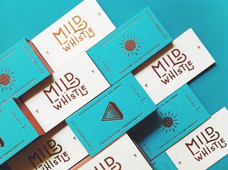
We've seen some really wonderful examples of letterpress business cards and they just keep coming. Combining craft and precision to produce a beautiful aesthetic, these new cards from Singapore based agency Oddds are about as beautiful as they come.
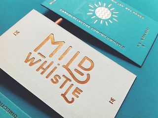
"The identity broadens with usage of letterpress accompanied by glamour with modernism," they explain. "This is created with the intertwining between bronze and a soft tone of turquoise. The play of metal tones and pieces with cotton represents the designer’s ideologies of art direction and design."
Tying in with the rest of the identity, these really stand out due to pretty perfect palette of turquoise and metallic golds. The typography is gorgeous too, making for some of the most beautiful business cards we've ever seen.
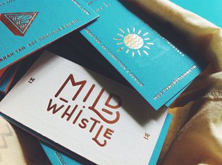
See the entire identity design over on Oddds Behance page.
What do you make of these business cards? Let us know in the comments box below!

Thank you for reading 5 articles this month* Join now for unlimited access
Enjoy your first month for just £1 / $1 / €1
*Read 5 free articles per month without a subscription

Join now for unlimited access
Try first month for just £1 / $1 / €1
Get the Creative Bloq Newsletter
Daily design news, reviews, how-tos and more, as picked by the editors.
Sammy Maine was a founding member of the Creative Bloq team way back in the early 2010s, working as a Commissioning Editor. Her interests cover graphic design in music and film, illustration and animation. Since departing, Sammy has written for The Guardian, VICE, The Independent & Metro, and currently co-edits the quarterly music journal Gold Flake Paint.
