3 lessons learned from branding a design festival
Field explains how the visual identity for Belgrade design festival Resonate 2015 was created.
Digital art studio Field collaborated with Hudson-Powell and designer Antar Walker to create a flexible visual identity and trailer for Belgrade-based festival Resonate, which focuses on technology in art and culture. Field creative director Marcus Wendt walks through the design process…
Marcus Wendt: Resonate has developed into a brand, so it doesn't make sense to change the identity every year. It needed some flexible elements so it could evolve and change without having to be redesigned from scratch.
Our original identity featured a typography generator that created stitches on a grid – everything was connected by one thread.
My general approach is to start with a strong, clear concept. Resonate is more open-minded than the average design festival – when we looked at what makes it great, we came up with the concept of 'neon tribal playground culture'. Those four key words already suggested to us a guiding aesthetic.
We developed a very simple, generative, graphical system. We started discussing the concept in September, designed the typography in October, built the website until mid-November and then started the trailer in December. Antar came on-board in January.
Bringing the identity to life
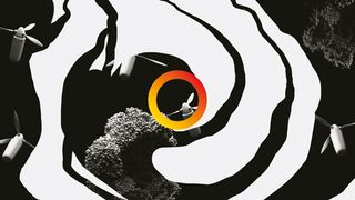
Antar Walker: Field commissioned me to direct the trailer using the refreshed branding created by Hudson-Powell. As a creative I'm drawn to objects – their forms change meaning when removed from everyday situations and observed in a different context. This was the basis for the film.
The objects used were inspired by the overall context of the event as well as content from lecturers and speakers. The glyphs from the new identity informed and mapped out the direction, speed and angle in which the objects would travel.
Get the Creative Bloq Newsletter
Daily design news, reviews, how-tos and more, as picked by the editors.
I wanted the objects to be stylised but realistically lit with simple lighting. I decided early on that an honest, raw aesthetic would work well, juxtaposed with the loudness of Hudson-Powell's bright, crisp vector shapes.
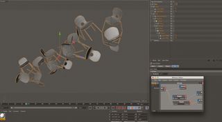
Once the selection of objects was finalised, I set about creating an animatic to block out the animation. The process then involved rendering out shots, animating glyphs and replacing animatic footage with final renders. Slowly but surely it became more layered and got better with each revision.
Motion designer Fred Huergo built several 3D animation systems from the ground up, which made animating and workflow 10 times faster. Customisable values for looping position, rotation and orientation replaced the need to place loads of key frames for every scene.
I call this method 'performance animation' – it's a great way of working as it allows more flexibility and means you can dedicate more time to getting the animation right, minimising the need for layers and layers of messy key frames.
Avoiding the synthesised digital trap
Motion graphics artist Matt Whitewood rendered everything with V-Ray, carefully texturing each object with bespoke materials. I felt strongly that the sound design (created by Owen Hindley and Ragnar Hrafnkelsson) should reflect some of Resonate's environmental aspects and shouldn't fall into the synthesised digital trap a lot of festival title sequences succumb to.
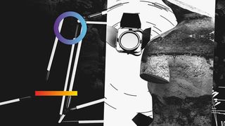
Real instruments, recorded foley (sound effects) and a playful composition brought things to life. We were going to include other elements such as melting text, liquidated masks and more complex layering. But when we started seeing the final renders with Resonate's glyphs as colourful companions, it felt right.
It's important to know when a project is done rather than sticking ruthlessly to style frames when it's not working as you'd envisaged. I think the final film is much stronger for it.
Lessons learned
Here are three lessons Field's Marcus Wendt learned during the Resonate 2015 identity and trailer project…
01. You need strong foundations
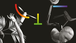
Our initial input effectively acted as a ramp. We went through a couple of iterations with Hudson-Powell, then started working on different applications including brochures and the website – so we were in a good spot when Antar started in January.
02. Open your mind
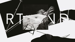
Projects like this remind me of how much work you can get done and out into the world when you have less bureaucracy and a more open, trusting approach. We had specific people in mind for different tasks and we gave them a lot of freedom.
03. Flexible collaborations work
We were really open about what to do, although there was a big debate about the number of chairs and types of objects in the trailer. It wasn't the kind of project where people say it's a collaboration but everything's actually already tightly defined.
Words: Anne Wollenberg
This article first appeared inside issue 239 of Computer Arts, the world's best-selling design magazine. Save up to 59% with a subscription here.
Liked this? Try these...
- Give your work a wider audience with this new poster campaign
- 10 ways for designers to earn money on YouTube
- Free graphic design software available to you right now!

Thank you for reading 5 articles this month* Join now for unlimited access
Enjoy your first month for just £1 / $1 / €1
*Read 5 free articles per month without a subscription

Join now for unlimited access
Try first month for just £1 / $1 / €1
The Creative Bloq team is made up of a group of design fans, and has changed and evolved since Creative Bloq began back in 2012. The current website team consists of eight full-time members of staff: Editor Georgia Coggan, Deputy Editor Rosie Hilder, Ecommerce Editor Beren Neale, Senior News Editor Daniel Piper, Editor, Digital Art and 3D Ian Dean, Tech Reviews Editor Erlingur Einarsson and Ecommerce Writer Beth Nicholls and Staff Writer Natalie Fear, as well as a roster of freelancers from around the world. The 3D World and ImagineFX magazine teams also pitch in, ensuring that content from 3D World and ImagineFX is represented on Creative Bloq.
