Kokoro & Moi: Modern Finnish
Helsinki-based Kokoro & Moi is at the forefront of Finnish design – now the studio is spreading its wings to New York
Helsinki’s South Harbour. Today it’s where seven-storey cruise liners come to dock, but once it was a busy cargo port. Local fishermen moored up to sell their catch in the quaint 19th century market building, or out in the open air in the summer. The market still sells smoked fish, cheese, breads and fruit. Across the harbour from the market, a Viking Lines ship rocks gently in the icy water, moored not far from a long, red-brick warehouse.
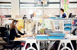
It’s in this old customs house that you’ll find the new home of Kokoro & Moi, perhaps the foremost independent design studio in Finland. Although it’s situated in one of the older buildings in the Katajanokka neighbourhood, the studio has recently been renovated and there is nothing old fashioned about the Kokoro & Moi approach to design. Looking to the future is central to their manifesto.
“It’s part of our approach to everything,” explains co-founder and creative director Antti Hinkula. “We don’t want to do the solutions we have done before, or somebody else has done before. Even if it comes to very small visual things like typography or other aesthetics, we try to do something that nobody else has done before, so that’s kind of like the future for us – we try to visually create things that haven’t yet been seen.”
The other co-founder is Teemu Suviala, who’s now running the US arm of the studio in New York. There are 12 people in Helsinki and three in New York, and the work is split across both studios. They’ve been working on an identity for an American architectural association and recently did all the branding for the Nordic Cool 2013 festival at the Kennedy Center in Washington. What really encapsulates Kokoro & Moi’s forward-looking stance, however, is another US-based brief called The Next 100 – for which the aim was to rethink the Grand Central and Midtown areas of New York.
“What will happen in the world when it comes to visual communication? What it will be like in 50 years or 100 years?” ponders Hinkula. “It’s extremely interesting. Like, what will wayfinding be like in 50 years, or how will people navigate places? Everything will be connected to the internet and you won’t really need physical signs. There might be terminals and libraries of information, but they will just appear somehow, there will be holograms. There will probably be contact lenses connected to the internet, so you can just see stuff.”
Working with WXY Architecture + Urban Design, the studio read studies about how cities will develop, and thought about the role graphic design will play in that world. Then they imagined the New York of tomorrow.
Hinkula pulls a few graphics up on his laptop and, sitting in the studio’s freshly painted meeting room, we gaze into the future. One of the studio’s proposals is a character called Pegasus, who will appear via these new technologies to guide people around the district. He’s a dusky blue colour, inspired by the star-filled ceiling of Grand Central Terminal’s main hall. They also dreamed up a futuristic zoo, filled with extinct animal and plant species brought back thanks to advances in genetics. There might even be woolly mammoth racing through midtown Manhattan, and Hinkula shows us a poster advertising such an event.
Though it’s fun to play with such ideas, there’s a more serious side to Kokoro & Moi’s thinking, as art director Timo Ilola points out. “I think design is important – maybe more important than ever – because when things go digital you have to differentiate everything somehow. How do you pop out of the digital mass?”
Before founding Kokoro & Moi in 2008, Hinkula and Suviala worked as Syrup Helsinki, winning Design Forum Finland’s Young Designer of the Year in 2005. Like K&M today, Syrup had a base in the US as well, and its partners in New York would liaise with North American clients, with the design often executed in Finland. However, when Syrup was acquired by digital agency LBI, the Finns bought their part of the business and went independent.
What’s in a name?
As part of the identity work they do, Hinkula and Suviala often help companies come up with names for their brands and products. Deciding on their own was a bigger challenge than they expected and they considered around 500 options, says Hinkula. “Traditional design and advertising agencies in many cases have founder-plus-founder names, but we didn’t want to have our own names, Hinkula and Suviala,” he explains. “So we came at it like this: how about two imaginary founders?”
The Moi part was agreed first. It came to them when they went to Norway to give seminars. One night, they saw a restaurant called Bolgen and Moi, which is co-owned by the Norwegian celebrity chef Trond Moi. And ‘moi’ seemed nice because it’s also ‘hi’ in Finnish and ‘me’ in French.
Then they had to invent a name for the other imaginary founder. Looking for something that would contrast with Moi, the inspiration came from Japan, where they’d been working with Yugo Katayama who runs a record label in Tokyo. First, they thought about Yugo, but that took them back to a very bad 1970s car produced in communist Yugoslavia.
“We had our minds set on Japan, so we went through a lot of Japanese words and names and we found this word ‘kokoro’. In Finnish it sounds weird, but in Japanese it means ‘heart, mind, soul’. There was a nice domain name available, kokoromoi – every second letter is an ‘o’,” says Hinkula. “In Japan they have this kind of calligraphic writing,” he continues. “We found out later that when you combine ‘kokoro’, which is heart, mind and soul, with ‘moi’ it means ‘enlightenment’.”
The creative synthesis that led to the studio’s name gives you a very good idea of how design projects are approached at Kokoro & Moi. Designers there are always looking for ways to combine visual elements that you wouldn’t expect to see side by side. Sometimes this is very subtle, but it’s always there and this is how they manage to continue creating fresh-looking work. One of their golden rules is to introduce a new typeface with every new project. The studio’s style has everything to do with being contemporary, and nothing at all to do with a Nordic or Scandinavian creative approach, says Hinkula. “Teemu likes to say that in a lot of our work we combine two completely different references,” says Ilola.
One + one = three
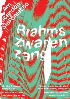
“Yeah, that’s kind of our method,” continues Hinkula. “Like one plus one equals three. We always try to find typographic elements and combine them with graphic elements that haven’t been seen together before, see what kind of clash there is and try to find new solutions.
“The end result may not be a clash, in that it looks natural and new, but it’s combining two things you wouldn’t think fit together. Then you find a way of combining them.”
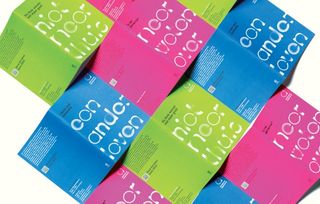
The process has certainly been successful with Finnish clients. You can’t walk around Helsinki without seeing Kokoro & Moi’s work. The logo displayed on every bus, tram, subway train and local ferry was created by the studio. Every shopping bag from the huge Stockmann department store bears a pattern designed by K&M. And during 2012 the city was overdosing on its work. Helsinki was World Design Capital, and Kokoro & Moi designed an array of materials promoting the programme of events.
The project had an ‘open identity’ ethos behind it, and residents were invited to become involved in the city’s visual identity by creating graphics relating to the themes of the event – embedding design in life, global responsibility and roots for new growth. The studio ran a typographic project alongside it, called Yo Freckles, inviting people anywhere to upload letters and numbers for a new mash-up typeface. Everybody’s work was bundled into it, and you can download the font here.
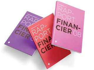
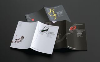
This in turn fed into the layout of the Finnish Design Yearbook for 2012, another project Kokoro & Moi was commissioned to do. Cataloguing everything from fashion to architecture and on to product and graphic design, it brings together the best of Finland’s creativity along with some crazy letter work by the Yo Freckles contributors.
Through projects like this, Kokoro & Moi has led the design scene in Finland, and become an important name across northern Europe. Before Hinkula and Suviala came along, there were few well-known studios in Helsinki and the design landscape was dominated by advertising. Now, as studios pop up inspired by K&M’s approach, the studio itself is looking to the west, and its operation in New York.
“We hope what we started in New York will carry on getting more clients, bigger clients, and more nice work. We have been in Helsinki for 11 years now. It’s quite a small playground and the biggest clients are all domestic. We don’t have very many international brands in Finland, so with the New York office we hope to get some international clients and more publicity for our work,” concludes Hinkula. One thing’s for sure: they’re moving in the right direction.
Discover 10 amazing examples of experimental design at Creative Bloq.

Thank you for reading 5 articles this month* Join now for unlimited access
Enjoy your first month for just £1 / $1 / €1
*Read 5 free articles per month without a subscription

Join now for unlimited access
Try first month for just £1 / $1 / €1
Get the Creative Bloq Newsletter
Daily design news, reviews, how-tos and more, as picked by the editors.
The Creative Bloq team is made up of a group of design fans, and has changed and evolved since Creative Bloq began back in 2012. The current website team consists of eight full-time members of staff: Editor Georgia Coggan, Deputy Editor Rosie Hilder, Ecommerce Editor Beren Neale, Senior News Editor Daniel Piper, Editor, Digital Art and 3D Ian Dean, Tech Reviews Editor Erlingur Einarsson, Ecommerce Writer Beth Nicholls and Staff Writer Natalie Fear, as well as a roster of freelancers from around the world. The ImagineFX magazine team also pitch in, ensuring that content from leading digital art publication ImagineFX is represented on Creative Bloq.
