Kinetic typography for bold agency rebrand
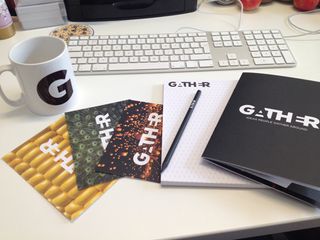
Communications consultancy Gather harnesses the power of kinetic typography and negative space in a major identity overhaul.
This week design agency Carnegie Orr relaunched as communications consultancy Gather, with a focus around ideas – specifically 'ideas people gather around’. The rebrand sees an entirely new visual identity, built around the new agency's three core values: ingenious, connected and agile. We spoke to head of brand at Gather, Julian Gorham, to find out more...
What prompted the rebrand?
Carnegie Orr decided to rebrand in response to the following:
- Changing relationships – the advancement of digital has led to the balance of power shifting from organisations to stakeholders
- A crowded and confusing market – with thousands of agencies and consultancies competing in the same space there was a need to develop a unique and meaningful proposition
- The absence of evidence to support and grow ideas
However, rather than just changing the name of the business, they were keen to launch with an idea – an approach that was right for today's market – one that signalled a better way of doing things.
With a long history in corporate reporting and a strong knowledge of business behaviour they identified a need for a consultancy that built stronger ideas for organisations – single minded ideas that could help develop reputation, organise communication and live in the conversations people are having every day online and off.
Technology means that corporations and other organisations are being scrutinised as never before. It is really hard for them to be clear to their all stakeholders – and join up all the conversations that people are having about them and make sense of them. Gather develops ‘ideas people gather around’ – ideas that are more robust and relevant because from the start they are framed around a single organising idea that is clearly articulated in terms that build corporate reputation.

What was your design approach to the project?
The Gather brand is built around the new agency's three core values: ingenious, connected and agile. They're the right values, but they are also the kind of words that designers and writers can use to guide brand creation and visual and verbal tone of voice.
We looked at our peer group and decided that people were trying very hard to appear intelligent and creative by using all kinds of words, images and styles – in an effort to appear meaning-full. We decided that we would focus on just a few visual and verbal elements, that the name and brand would be simple and clear but also strong, credible and a true reflection of the entire business, it's approach and overall outlook.
The Gather brand is built around the new agency's three core values: ingenious, connected and agile
The development of the re-brand, which included development and discussion of over 200 names, was treated internally as a client brief, with the founding partners treated as the client. Though carried out at great speed, a proper branding process was adhered to – from positioning and values, to design and website creation.
What tools did you use to build the new site?
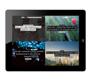
The website was built in WordPress because it's a simple CMS package to use – and it allows everyone at Gather to contribute, once they understand the brand and what we are trying to do. So even the CMS reflects the spirit here.

Can you talk us through the logo design?
Gather joins up insight and creativity, and helps organisations build relationships and grow reputation. The uppercase type emboldens what might otherwise be some rather gentle associations with the word Gather. The interlocking letters were crafted to reflect different but relevant elements coming together to strengthen and engage.

Tell us about the new business tool you're developing...
It's a tool that uses 100 different sets of criteria to measure how effective a company's corporate communications are performing in a digital world in order – to help them make better sense of the changes occurring in corporate reporting and the connections they are making.
This will use algorithms and codes to identify patterns of online behaviour and be based on criteria such as: Does the CEO blog? How do they use Twitter? Do social channels and websites link to each other?
We see this is as a unique approach – one that will be of practical help to clients, although being data rich, digital is extremely hard to quantify in a way that resonates with companies and stakeholders, especially in different sectors. There are other companies that do this but too simplistically, they also don't add insight in the same way that Gather does. Essentially, Fluency will characterise companies and help them be themselves.

Thank you for reading 5 articles this month* Join now for unlimited access
Enjoy your first month for just £1 / $1 / €1
*Read 5 free articles per month without a subscription

Join now for unlimited access
Try first month for just £1 / $1 / €1
Get the Creative Bloq Newsletter
Daily design news, reviews, how-tos and more, as picked by the editors.

Kerrie Hughes is a frequent contributor to Creative Bloq, and was once its editor. One of the original CB crew, Kerrie joined the team back in 2013 after moving from her role as staff writer on 3D World. Since then she's written regularly for other creative publications such as ImagineFX, Computer Arts and Digital Camera World. After a stint working for the police, Kerrie is back reviewing creative tech for creative professionals.