Junk takes centre stage in film festival branding
This branding for a short film festival uses garbage and pastel colours to produce a gorgeous offering.
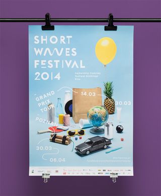
When it comes to the rules of successful branding, you wouldn't neccessarily turn to your garbage can to find inspiration. However, you can find inspiration in the oddest of places and this branding for a short film festival makes the most of what most of us would consider junk.
Art directed and designed by Uniforma, with photo and video production from Tomasz Biskup, the branding is a gorgeous blend of pastel colours and fun, imaginative executions using objects as playfully as possible.
We're absolutely in love with the typography used throughout the project that works extremely well across posters, flyers, business cards and even tote bags. As one of the biggest short film festivals in the world, Shortwaves is definitely looking the part.
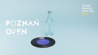

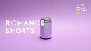
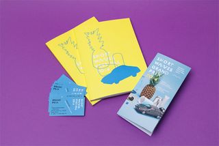
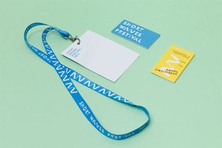
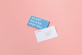
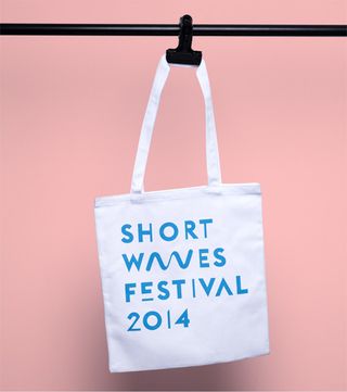
See more images of the branding on the Behance page.
What do you make of this branding project? Let us know in the comments box below!

Thank you for reading 5 articles this month* Join now for unlimited access
Enjoy your first month for just £1 / $1 / €1
*Read 5 free articles per month without a subscription

Join now for unlimited access
Try first month for just £1 / $1 / €1
Get the Creative Bloq Newsletter
Daily design news, reviews, how-tos and more, as picked by the editors.
Sammy Maine was a founding member of the Creative Bloq team way back in the early 2010s, working as a Commissioning Editor. Her interests cover graphic design in music and film, illustration and animation. Since departing, Sammy has written for The Guardian, VICE, The Independent & Metro, and currently co-edits the quarterly music journal Gold Flake Paint.
