HP unveils its new premium logo
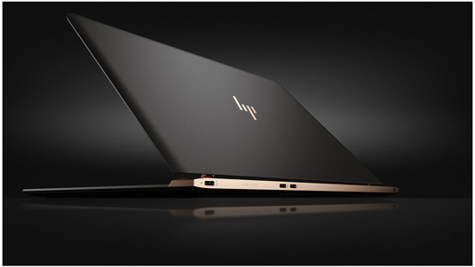
The release of the Spectre 13 laptop also saw the return of a sleek HP logo.

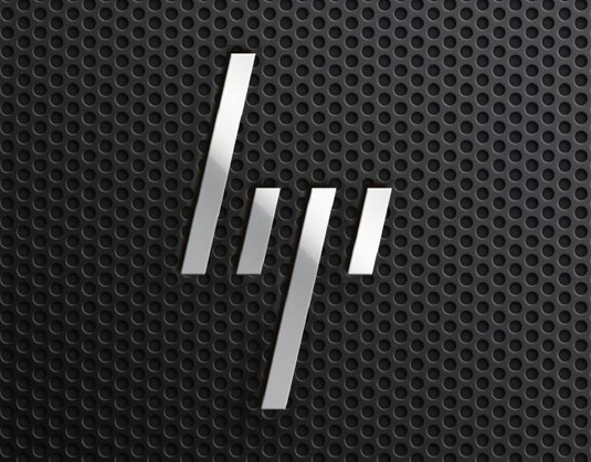
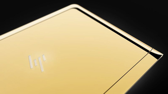
To set its high-end products apart from the rest, HP's premium laptops will be adorned with a minimalist new logo made up of four slanted lines. The sleek design was announced alongside the release of the ultra-thin Spectre 13 laptop, but the logo has taken five years to represent the brand.

Originally submitted in 2011 by Moving Brands, the not-so-new logo was apparently rejected by HP. However it seems time has caught up with the futuristic design and the rectangular creation will replace the traditional HP logo and script.

Thanks to a clever use of spacing, these simple slanted lines effectively suggest the Hewlett Packard brand. It remains to be seen which other products will be treated to this logo, but the clean design is sure to come to represent a higher calibre of laptop in the future.
Get the Creative Bloq Newsletter
Daily design news, reviews, how-tos and more, as picked by the editors.

Thank you for reading 5 articles this month* Join now for unlimited access
Enjoy your first month for just £1 / $1 / €1
*Read 5 free articles per month without a subscription

Join now for unlimited access
Try first month for just £1 / $1 / €1

Dom Carter is a freelance writer who specialises in art and design. Formerly a staff writer for Creative Bloq, his work has also appeared on Creative Boom and in the pages of ImagineFX, Computer Arts, 3D World, and .net. He has been a D&AD New Blood judge, and has a particular interest in picture books.
