How a leading London airport was rebranded for the future
Behind the scenes on ico Design's fresh, flexible new visual identity for London Luton Airport.
Following approval of a multi-million pound redevelopment plan, ico Design was tasked to create a fresh visual identity for London Luton Airport. The firm dispensed with tired notions of flight and motion in favour of a modern, flexible solution that reflects LLA's ambitions. Creative director Vivek Bhatia explains the process…
The new 'face' of the airport needed to carry the ambition of redefining LLA as a leading airport serving London, Luton and the surrounding regions. The brief was how to redefine the airport in the London market.
Until now, it wasn't necessarily at the forefront of people's minds that LLA is less than 30 mins from St Pancras, for example, so the rebrand was about forging closer and more emotional ties to London, as well as continuing to serve the Luton area and beyond.
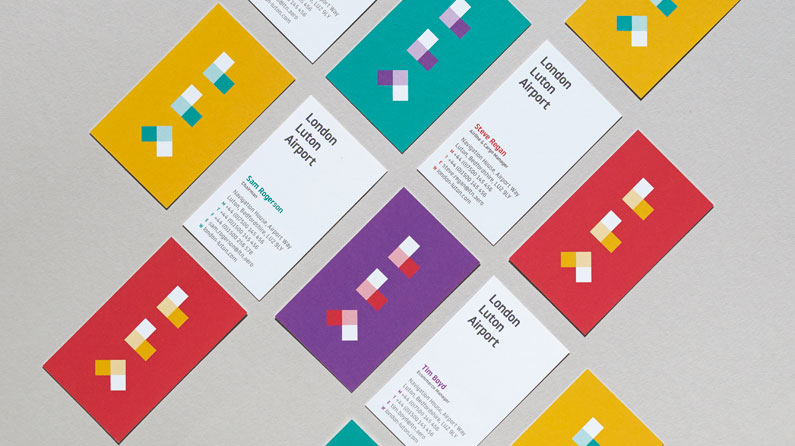
The brief also required working with the directors and airport team to establish how LLA could become a passenger-centric brand, making airport travel easy and fun, and in a way that would be unique to LLA.
Strategic work preceded the creative process, and we organised workshops with the senior management team to get them to understand what a brand is, but also to elicit information: what makes LLA different from other airports? How could it be improved? What conventions could be broken? Here's how we tackeled the project...
01. Conduct workshops
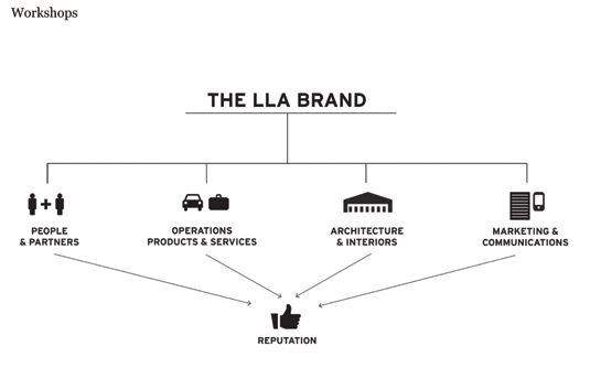
We coordinated a variety of workshops with the airport teams, to help them understand what a brand is and how LLA can become one. We have this approach for every project, but for an airport it's substantially more complex, there is more to get your head around.
02. Distill the core essence

Those workshops crystallised the notion of 'simplicity with a smile'. That's what we labelled the core essence of the brand. After presenting them back to the LLA team, that idea became the foundation of the work that followed. Whatever we do, on a top level it reflects that.
03. Create a flexible logo
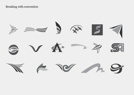
When we designed the logo, we wanted to break with convention and not represent flight or motion in any way. Secondly, it had to work as a symbol and acronym of LLA to communicate the airport's connection to London. Thirdly, it had to be flexible, to work in a variety of ways.
04. Experiment with a module graphic
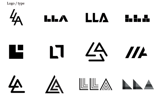
Many logos we tried worked aesthetically, but didn't satisfy all our requirements. We tried many typefaces and logos drawn from scratch but settled on a module-based graphic, because it was geometric in creating LLA and could be used as a 'framework' for colour, image, animation and 3D.
05. Develop the identity
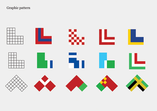
In addition, when the LLA marque is subdivided into a grid, various patterns can be extracted from it. These were blown up and cropped. We selected a core family of patterns that could be used across applications to bring coherence but also variety.
06. Select the brand colours
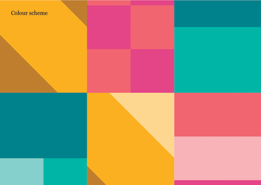
We were keen not to be reliant on one or two key colours, as we didn't want the identity to have a corporate feel. We tried having no specific brand colours, but it would have been unworkable, so we settled for a collection of core colours that worked in pairs.
07. Convince the stakeholders
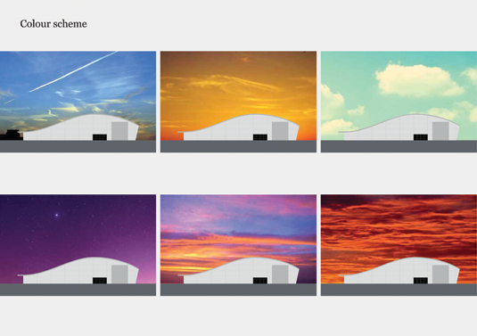
Our final selection was inspired by the different shades of the sky, be it a balmy red sunset or midnight purple. This rationale helped us convince the various stakeholders. It was a balance of simplicity and flexibility to communicate the energy and vibrancy of LLA as it changes.
08. Select the typeface
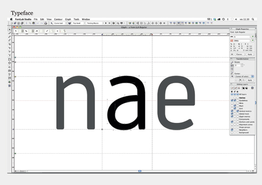
For the typeface we needed something to express the values of the brand and a progressive, modern aesthetic. It would require several weights and enough personality to be distinctive. We worked with Atipo, and the iconography was developed in tandem and is totally aligned to the typeface.
09. Transform the walkways
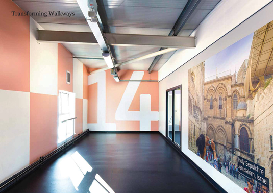
One of our first tasks was to transform the extensive walkways for arrival and departure, to bring them to life and reflect the 'simplicity with a smile' essence. We created an installation of street photography, combined with elements of the core brand palette like the graphic pattern.
Next page: how ico Design worked out the type and iconography for London Luton Airport's signage

Thank you for reading 5 articles this month* Join now for unlimited access
Enjoy your first month for just £1 / $1 / €1
*Read 5 free articles per month without a subscription

Join now for unlimited access
Try first month for just £1 / $1 / €1
Get the Creative Bloq Newsletter
Daily design news, reviews, how-tos and more, as picked by the editors.

The Creative Bloq team is made up of a group of art and design enthusiasts, and has changed and evolved since Creative Bloq began back in 2012. The current website team consists of eight full-time members of staff: Editor Georgia Coggan, Deputy Editor Rosie Hilder, Ecommerce Editor Beren Neale, Senior News Editor Daniel Piper, Editor, Digital Art and 3D Ian Dean, Tech Reviews Editor Erlingur Einarsson, Ecommerce Writer Beth Nicholls and Staff Writer Natalie Fear, as well as a roster of freelancers from around the world. The ImagineFX magazine team also pitch in, ensuring that content from leading digital art publication ImagineFX is represented on Creative Bloq.
