How to design a logo: 5 expert tips
Lippincott senior partner Rodney Abbot offers his professional advice on designing a logo.

Logo design is one of the most important elements of a brand. These powerful emblems transcend language barriers and, when done right, encapsulate the essence of the business. A clever logo design can underpin the long-term agenda, while providing a familiar touchpoint that distinguishes the business in a crowded marketplace.
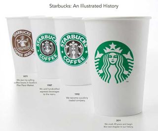
All businesses strive to achieve instant recognition from their logos. Take the Starbucks siren, for instance, which underwent a redesign in 2011 to remove the company's name. By removing the name from the image, the logo could say as much about Starbucks' future as it did about its past. The siren has become an unmistakeable identity the world over; just like McDonald's golden arches and Nike's trademark "Swoosh".
Creating a new logo, or updating an existing one, can be transformational, as proved by Google earlier this year. The brand is so embedded in our lives that altering its logo namesake, even as subtly as erasing its characteristic serifs, sent a profound message of change to the millions of people who interact with Google every day.
What it takes to get from an initial idea to an end product, let alone one that becomes iconic, can seem a daunting task. The following five tips offer a framework in how to design a successful logo.
01. Don't fall in love with your first idea

When setting out to design a logo, one of the most common problems is that designers fall in love with their first idea and get caught up iterating a single concept. Brainstorming concept territories and developing ideas – and lots of them – is a vital step in logo design.
As well as coming up with new ideas, ask yourself how much of a change should the logo express? If the business is undergoing a major transformation it may be time for a completely new logo that signals the transformation to the market.
But if the business is simply refocusing itself, a logo refresh is probably in order. Always make sure your design solutions are in sync with the business strategy and vision.
Get the Creative Bloq Newsletter
Daily design news, reviews, how-tos and more, as picked by the editors.
02. Know your audience: the client isn't who you're designing for
Design is a passion and designers can understandably form attachments to their work. However you have to remember that you aren't the client. In fact, your client isn't the client either. A big part of the process is understanding who the end users, those people who will interact with the logo and brand every day, really are.
Your main aim is to galvanise brand loyalists and convert those who aren't familiar with or previously detracted from the brand. The client has to be happy with the visual embodiment of their business, but satisfied customers will ensure your work lasts long after the logo has been signed-off.
03. Always stick to (and educate the client in) the process

Communication is key throughout the design process. For many clients, creating a new logo, particularly the thought and strategy that goes into it, is a totally new experience. It's your job to educate the client and ensure they are part of the process. That doesn't mean trying to turn the client into a designer, it means helping them understand and appreciate the importance of a rigorous process.
Take the time to research and understand the business and its culture, know its competitors and position within the market, its customers needs and expectations. This understanding is vital in creating a logo that is a true reflection of the business, plus it will allow you to explain and account for the design in a way that addresses the evolving business needs… even down to the slightest nuances of the design.
04. Stay true to the brand
While coming up with new ideas is important, it is very rare to be presented with an entirely clean slate. The client will often want to safeguard and incorporate certain elements of the previous logo, especially those aspects of the current identity that are well known and recognised.
In addition to working out fresh ways to represent those elements while staying true to the existing brand, look at how they can evolve to take on new meanings that better represent the brand moving forward.
05. Keep things simple

As Starbucks and Google have shown us, sometimes all that is needed of a logo redesign is stripping away unessential elements until you are left with the essential idea. Designing new logos can result in the desire to try to say too much, to pile more and more into the design. Instead pick one, strong idea, and express it as simply as possible.
Words: Rodney Abbot
Rodney Abbot is a senior partner in design at Lippincott
Like this? Read these!

Thank you for reading 5 articles this month* Join now for unlimited access
Enjoy your first month for just £1 / $1 / €1
*Read 5 free articles per month without a subscription

Join now for unlimited access
Try first month for just £1 / $1 / €1
The Creative Bloq team is made up of a group of design fans, and has changed and evolved since Creative Bloq began back in 2012. The current website team consists of eight full-time members of staff: Editor Georgia Coggan, Deputy Editor Rosie Hilder, Ecommerce Editor Beren Neale, Senior News Editor Daniel Piper, Editor, Digital Art and 3D Ian Dean, Tech Reviews Editor Erlingur Einarsson, Ecommerce Writer Beth Nicholls and Staff Writer Natalie Fear, as well as a roster of freelancers from around the world. The ImagineFX magazine team also pitch in, ensuring that content from leading digital art publication ImagineFX is represented on Creative Bloq.
