How to craft the identity of a heritage brand
What happened when two apple fanatics asked NB Studio to refesh a heritage cider brand.
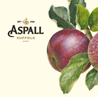
NB Studio was briefed to capture the unique eccentricities of a 300-year-old family business to refresh the Aspall identity across the packaging range – on and off trade – together with the website, point of sale and livery. Senior designer Kirsty Whittaker walks through the project…
Our challenge was to refresh an authentic craft brand and behave like a British contemporary classic.
On the Twitter feed we found a perfect positioning in 140 characters: '@Aspall: Eighth generation of family cyder makers: in Suffolk since 1728; obsessed about apples and quality. A new British success story.'
The two brothers who run the company, Barry and Henry Chevallier are apple fanatics who still follow the standards set by Clement Chevallier in 1728. But their brand looked tired and inconsistently applied. It just didn't match the vitality of the people we met.
We found quite a few technical design issues to solve, so essentially we took all the separate elements apart, polished them up and put them back together.
But the first role any designer needs to play is detective. For me this involved a joyful dive into the archive at Aspall Hall, blowing the dust off old documents and records, and uncovering old marks, motifs and photographs.
On the video above I've talked mainly about the product labels, where the whole identity really comes together. In the steps below, I walk through how we created a beautiful new identity for a classic British artisan brand.
01. Forensic research
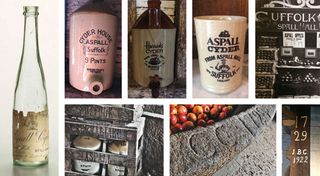
We did our due diligence, investigating the product range and where the logo appeared. We found lots of variants of the wordmark and many typefaces. Then we dug into the archive in search of authentic assets
02. Concept development
Some of our early ideas played into the solution: an authentic identity sourced from the archives; treating cyder as if it was champagne; and a typographically-led concept we called 'apple press meets printing press'.
03. The analysis
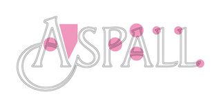
The P and A of the old wordmark had character. But we found issues too: a pronounced swash on the A added personality but also made it hard to use, and there was too much space between the A and S.
04. The inspiration
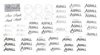
We spent time in St Bride's printing and publishing library exploring swashes, ligatures and other quirks. Then we loosely re-drew the wordmark, retaining everything that was distinctive – only making it better!
05. The development
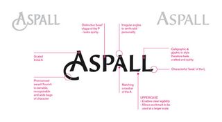
The evolved version is more calligraphic and glyphic. The scaled initial A has a pronounced swash flourish. We've matched the crossbars of the A, added an angled serif and lifted up the curve on the L.
06. Commissioning illustration
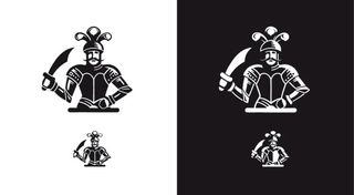
The old version of the knight symbol looked untouched by a craftsman's hand. Couldn't he have more spirit? Hand-cut by illustrator Christopher Wormell, our version references the original statue on which the knight was based.
07. Secondary motifs
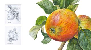
Apples are at the heart of Aspall. So we worked on a special collection of paintings by botanical illustrator Rosie Sanders. We were delighted to find someone who was as fanatical about apples as our client!
08. Bringing it all together
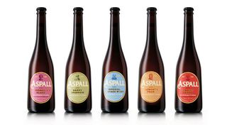
colour palette, which conveys the spirit of the Suffolk landscape, engravings of the founder and family, and a tone of voice rooted in local vernacular.
09. The new logo
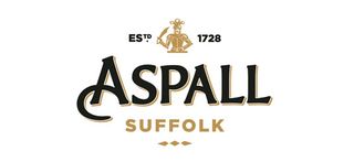
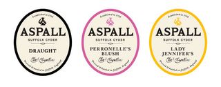
The redesign is sensitive to Aspall's heritage, emphasising the authenticity of the products. Robust principles provide a platform for future cyder variants, the Aspall vinegar range and new product development.
The full version of this feature first appeared inside Computer Arts issue 245, a branding design special packed with expert tips for creating outstanding branding.
Liked this? Read these...
- What to do when a client rejects your designs
- How to win your dream clients
- The ultimate guide to logo design

Thank you for reading 5 articles this month* Join now for unlimited access
Enjoy your first month for just £1 / $1 / €1
*Read 5 free articles per month without a subscription

Join now for unlimited access
Try first month for just £1 / $1 / €1
Get the Creative Bloq Newsletter
Daily design news, reviews, how-tos and more, as picked by the editors.
The Creative Bloq team is made up of a group of design fans, and has changed and evolved since Creative Bloq began back in 2012. The current website team consists of eight full-time members of staff: Editor Georgia Coggan, Deputy Editor Rosie Hilder, Ecommerce Editor Beren Neale, Senior News Editor Daniel Piper, Editor, Digital Art and 3D Ian Dean, Tech Reviews Editor Erlingur Einarsson and Ecommerce Writer Beth Nicholls and Staff Writer Natalie Fear, as well as a roster of freelancers from around the world. The 3D World and ImagineFX magazine teams also pitch in, ensuring that content from 3D World and ImagineFX is represented on Creative Bloq.
