How branding is making a big comeback
Once relegated to a spot in the corner of a page, identity design is now looming large in the world of creative innovation. It pays to think differently, says branding maestro Michael Johnson.
On the face of it, the world of identity and branding might seem a tricky place to incubate innovation. After all, for many decades this area got swiftly boiled down to a 'logo in the corner', some colours and the choice of a typeface.
The legacy of this somewhat 'distilled' approach is the numerous tomes on offer on the design of symbols and logotypes, neatly categorised into easy-reference chapters, offering a useful starting point for the next corner-bound solution. Not that there's anything wrong with the pure task of designing a logo. To many designers it's the ultimate distillation of graphic design – something that can survive the perils of pixellation, yet still work huge on the side of a building.
It's just that, for some time, true innovation in this area has been away from the core mark. For nearly two decades designers have been exploring flexible, 'active' identity schemes that can adapt to their surroundings. By building up a toolkit of ideas, images and approaches that depend less on one single monochrome logo, the emphasis has moved onto a wider kit of parts.

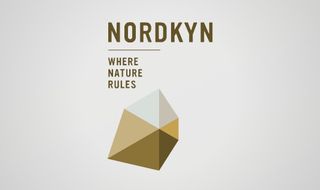
The key 90s 'blur' schemes such as the Netherlands Architecture Institute and then the Tate were based entirely on flexibility, and a number of recent schemes have continued this trend. An identity using a logo generator, driven by a live feed from weather statistics? Tick (Visit Nordkyn). A scheme based on a simple 'W' that can squeeze itself into any available space? Double tick (the new Whitney scheme).
Another approach driving visual innovation, paradoxically, is a better understanding of verbal strategy. From YWCA's strapline that was three times as big as its name (designed to counter any misconceptions as regards its name), Macmillan's word-based rebrand and Cystic Fibrosis' multiple 'is…' logos, organisations have learned that nothing speaks more plainly than, well, plain speaking. By positioning themselves as the true thought-leaders of impact investment, Acumen verbalised this with a 148-word manifesto, then expressed this visually with a series of mini-manifesto logos.
It's interesting to consider where the most opportunities for new thinking are. Once the vanguard of branding innovation was 'corporates' – hence its original name, corporate identity. But blue-chips have become both battered and risk-averse. In the past decade, the most adventurous work has come from the cultural and not-for-profit arenas.
In both of these sectors, whilst the power of coherent branding is only just being understood, the evidence is compelling. Becoming free to visit will certainly have provided the V&A with a boost, but a newly confident branding scheme has helped it triple its visitor numbers in a decade. A series of branding campaigns culminating in 'No Child Born to Die' has seen Save the Children more than double its turnover in the UK. This kind of proof has a knock-on effect, as other institutions look to emulate the V&A, or compete with Save's fundraising power, creating a trickle-down effect.
So which sectors will 'get' branding next? My money's on education and ethical investing. Both represent areas full of innovative thinking, hidden behind poor branding – endless crests and shields in education's case, and letter-spaced capitals and oceans of blue in investment's.
And there's a sense that some ideas may be nearing their demise. Can 'flexible' logos continue to hold sway? Perhaps that idea has started to run its course: the endlessly, ever-changing squares of the MIT Media Lab's scheme a few years ago now feels a little 'so what?', and we may see a return to meaning rather than mere mutation.
We might also welcome back symbols with open arms. In a digital environment enforcing coherence in just 48 pixels, there's a compelling logic to brands such as Twitter and Starbucks focusing on a bird and a mermaid. There's a clear argument for starting with that tiny space, then expanding outwards – rather than taking something large and distilling it. If a picture really does say a thousand words, perhaps now's the time to prove it.
We'll also see the lines between identity, brand, campaign and advertising continue to blur. Designing a logo to last for decades is admirable, but in the here and now, they need to be part of campaigns that communicate, change views, raise funds and fight for attention. So there will be a new requirement for branding that cuts through, not retreats back into corners – branding that is central to a message, not just the full-stop at the end of a sentence.
Words: Michael Johnson Illustration: Zaneta Antosik
Michael Johnson is principal of design consultancy johnson banks. He lectures worldwide on branding, identity and design history, and is the author of Problem Solved. This article originally appeared in Computer Arts issue 228.

Thank you for reading 5 articles this month* Join now for unlimited access
Enjoy your first month for just £1 / $1 / €1
*Read 5 free articles per month without a subscription

Join now for unlimited access
Try first month for just £1 / $1 / €1
Get the Creative Bloq Newsletter
Daily design news, reviews, how-tos and more, as picked by the editors.
The Creative Bloq team is made up of a group of design fans, and has changed and evolved since Creative Bloq began back in 2012. The current website team consists of eight full-time members of staff: Editor Georgia Coggan, Deputy Editor Rosie Hilder, Ecommerce Editor Beren Neale, Senior News Editor Daniel Piper, Editor, Digital Art and 3D Ian Dean, Tech Reviews Editor Erlingur Einarsson and Ecommerce Writer Beth Nicholls and Staff Writer Natalie Fear, as well as a roster of freelancers from around the world. The 3D World and ImagineFX magazine teams also pitch in, ensuring that content from 3D World and ImagineFX is represented on Creative Bloq.
