Heisenberg branding will make you anything but blue
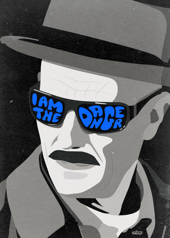
This coporate identity concept for Heisenberg will take you back to the blue days of Breaking Bad.
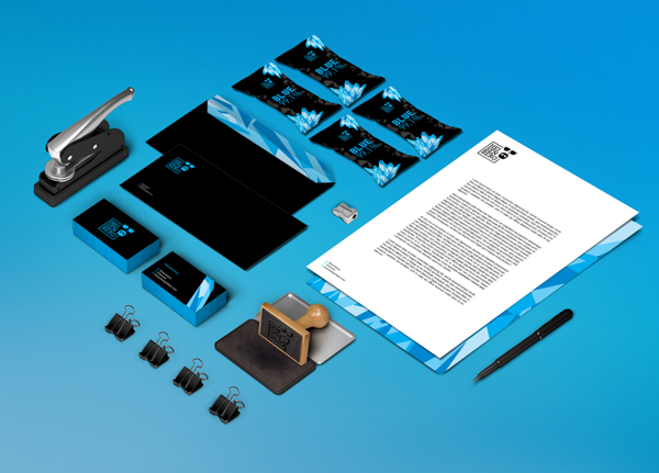
Airing its final episode just over a year ago, we've seen some incredible design tributes to Breaking Bad. From paintings to puppets, the show has inspired designers across the world, allowing its legacy to live on. Now, it looks as though this corporate identity concept for Heisenberg could become an iconic brand of its own.
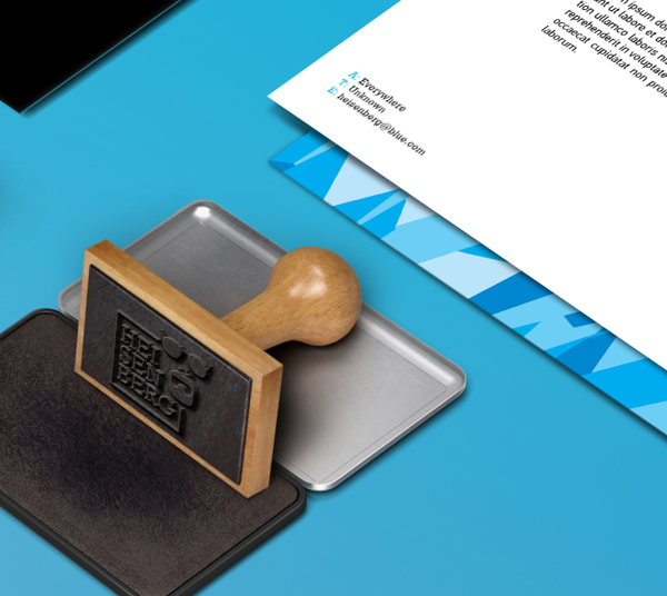
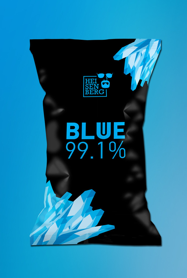
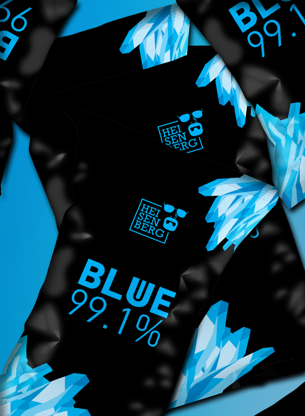
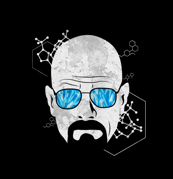
Producing some pretty innovative business card designs along with a range of inspiring stationary, Mike Karolos of Smirap designs has created a whole brand identity for one of TV's most iconic characters. Taking inspiration from the blue crystal meth of the show, the identity has a clear colour scheme throughout.
We love the use of negative space within the Heisenberg logo design, as well as the crystal meth graphics on the stationary executions. Take a look below and see if you think Heisenberg himself would approve of this identity design.
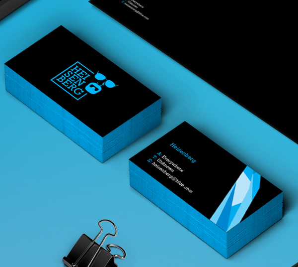
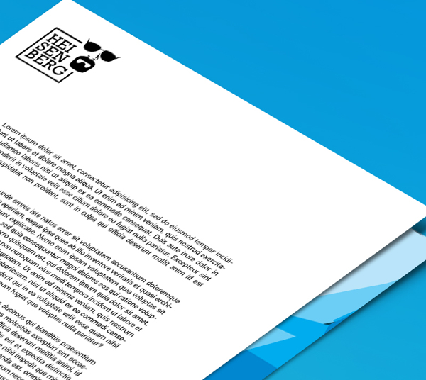
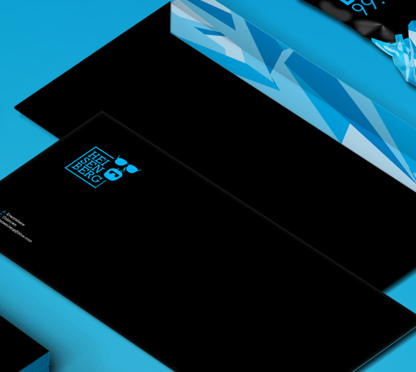
Have you seen any inspiring Breaking Bad designs? Let us know in the comments box below!

Thank you for reading 5 articles this month* Join now for unlimited access
Enjoy your first month for just £1 / $1 / €1
*Read 5 free articles per month without a subscription

Join now for unlimited access
Try first month for just £1 / $1 / €1
Get the Creative Bloq Newsletter
Daily design news, reviews, how-tos and more, as picked by the editors.

Sammy Maine was a founding member of the Creative Bloq team way back in the early 2010s, working as a Commissioning Editor. Her interests cover graphic design in music and film, illustration and animation. Since departing, Sammy has written for The Guardian, VICE, The Independent & Metro, and currently co-edits the quarterly music journal Gold Flake Paint.
