Harvard University Press rebrand
In its 100th year, Harvard University Press has called on New York-based studio Chermayeff & Geismar to give its identity a 21st-century makeover
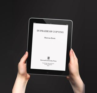
Harvard University Press is celebrating its centennial year with an identity redesign. While the original, shield-shaped insignia has a classic elegance, it was deemed too complicated to work effectively across digital platforms. New York design firm Chermayeff & Geismar was charged with coming up with the publishing house’s new identity – six simple vertical bars with a logotype.

“In this project we were working along a continuum between traditional and modern,” says Sagi Haviv, partner at Chermayeff & Geismar. “The key was to find a solution that wouldn’t look stodgy, but at the same time would be dignified. The new identity puts the emphasis on the Harvard name, which in the previous identifier was integrated – and to a large degree obscured – within the seal.”
The redesign took around three months, Haviv says, with Harvard selecting the simplest, most modern-looking design of the options presented to them. The publisher’s traditional crimson colour remains – though even that has been brightened – with the Palatino typeface used for lettering. Chermayeff & Giesmar were ideally situated to carry out the rebrand, having previously worked on identities for HarperCollins, Princeton University Press and the Library of Congress.

“Palatino looks traditional,” says Haviv. "So it serves as an appropriate counterpoint to the modern symbol. It is bold and distinctive, with a hand-lettered quality. The symbol's function is to bring visual distinction to the established, famous name of the press. It looks like six books on a shelf, but the overall rectangular shape also calls up a page from a traditional book, modern as well as suggestive of digital reading devices.”


Get the Creative Bloq Newsletter
Daily design news, reviews, how-tos and more, as picked by the editors.

Thank you for reading 5 articles this month* Join now for unlimited access
Enjoy your first month for just £1 / $1 / €1
*Read 5 free articles per month without a subscription

Join now for unlimited access
Try first month for just £1 / $1 / €1
The Creative Bloq team is made up of a group of design fans, and has changed and evolved since Creative Bloq began back in 2012. The current website team consists of eight full-time members of staff: Editor Georgia Coggan, Deputy Editor Rosie Hilder, Ecommerce Editor Beren Neale, Senior News Editor Daniel Piper, Editor, Digital Art and 3D Ian Dean, Tech Reviews Editor Erlingur Einarsson and Ecommerce Writer Beth Nicholls and Staff Writer Natalie Fear, as well as a roster of freelancers from around the world. The 3D World and ImagineFX magazine teams also pitch in, ensuring that content from 3D World and ImagineFX is represented on Creative Bloq.
