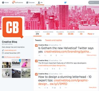
Is Gotham the new Helvetica? Twitter says yes
A few days ago, Twitter rolled out a new font across their entire profiles and pages. What do you think of the latest look?
There's a number of ways in which Twitter can help you to become a better designer, so it's no wonder that thousands upon thousands of you take to the social networking site to showcase your work and make new connections.
With a few logo and profile redesigns over the years, Twitter has always been at the top of their game when it comes to improving usability. If you've noticed something slightly different with the font over the past few days, you wouldn't be wrong. They recently switched from using the Helvetica Neue font to Hoefler & Co’s Gotham.

So, is Gotham really the new Helvetica? Will this font now become the go-to choice for brands across the internet? Or is it the kind of change that really doesn't matter at all? We'd love to hear your thoughts below.
Head on over to Twitter to see the new font for youself.
Get the Creative Bloq Newsletter
Daily design news, reviews, how-tos and more, as picked by the editors.

Thank you for reading 5 articles this month* Join now for unlimited access
Enjoy your first month for just £1 / $1 / €1
*Read 5 free articles per month without a subscription

Join now for unlimited access
Try first month for just £1 / $1 / €1

Sammy Maine was a founding member of the Creative Bloq team way back in the early 2010s, working as a Commissioning Editor. Her interests cover graphic design in music and film, illustration and animation. Since departing, Sammy has written for The Guardian, VICE, The Independent & Metro, and currently co-edits the quarterly music journal Gold Flake Paint.