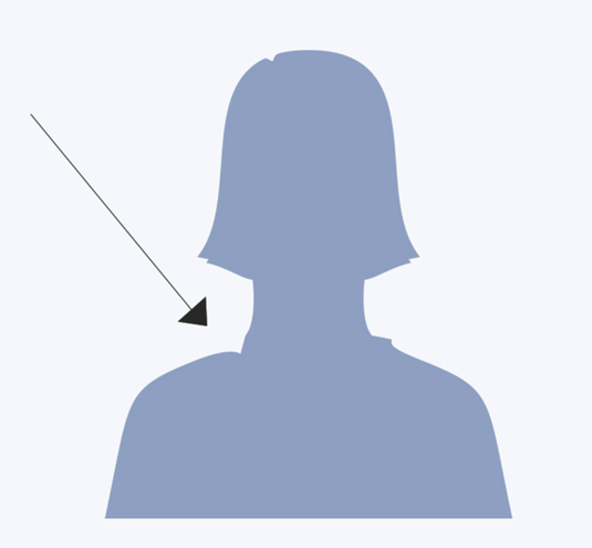

When you hear a phrase like 'unconcious sexism', it's easy to be sceptical. But how's this for an example in a very commonplace design?
Above are the new designs for Facebook's Friends icons, and below are the old ones. Can you spot the difference?


The process of redesigning the icons began when Caitlin Winner, design manager at Facebook, noticed that while the man was symmetrical (other than his spiked hairdo), the lady "had a little chip in her shoulder".

"I assumed no ill intentions, just a lack of consideration, but as a lady with two robust shoulders, the chip offended me," says Winner, who also describes the hair as "like a Darth Vader-like helmet".
With the help of front end engineer Matt Sain, product manager Lexi Ross Winner and icon designer Brian Frick, she spent the next few months developing the new icons – a process she explains in detail in this blog post.
To the forefront
Most notably, while the women were previously standing behind the men, the couple are now more equally positioned.
"My first idea was to draw a double silhouette, two people of equal sizes without a hard line indicating who was in front," explains Winner. "Dozens of iterations later, I abandoned this approach after failing to make an icon that didn’t look like a two headed mythical beast. I placed the lady, slightly smaller, in front of the man."
Get the Creative Bloq Newsletter
Daily design news, reviews, how-tos and more, as picked by the editors.
For the 'groups' icon, "it was an obvious refresh to use three unique silhouettes instead and, here again, I placed the lady first".
The redesign comes hot on the heels of a new Facebook logo released last week. And it could be just the start of further redesigns of Facebook icons.
"As a result of this project, I’m on high alert for symbolism," Winner says. "I try to question all icons, especially those that feel the most familiar."
What Facebook icons do you feel need a refresh? Let us know in the comments below!
Liked this? Read these!

Thank you for reading 5 articles this month* Join now for unlimited access
Enjoy your first month for just £1 / $1 / €1
*Read 5 free articles per month without a subscription

Join now for unlimited access
Try first month for just £1 / $1 / €1

Tom May is an award-winning journalist and editor specialising in design, photography and technology. Author of the Amazon #1 bestseller Great TED Talks: Creativity, published by Pavilion Books, Tom was previously editor of Professional Photography magazine, associate editor at Creative Bloq, and deputy editor at net magazine. Today, he is a regular contributor to Creative Bloq and its sister sites Digital Camera World, T3.com and Tech Radar. He also writes for Creative Boom and works on content marketing projects.
