Exclusive: the world's top agencies reveal how they develop new brands
Discover how to transform brand insight into brilliant design.
Harley-Davidson has it. Apple and Linux have it. Netflix listened to its users and has risen in the ranks; Yahoo!, well, just hasn't got it. The best brands know you can't buy loyalty with clever marketing messages or one-way corporate communication. In today's competitive landscape it's all about emotional engagement: connection, meaning and differentiation are everything. In short, it's all about strategy.
So how do the industry's leading design firms tackle this, the ultimate dark art of branding? For many, strategy forms the backbone of their practice, with designers playing anthropologist, sociologist, artist and engineer to distil the essence of a brand, and help craft cult-level loyalty between clients and their consumers.
But how, exactly, do you get to the heart of a brand? How do you transform your insights into brilliant design that works, and what happens when the client doesn't agree? It all starts with extensive research.
At New York-based branding and design firm Chermayeff & Geismar & Haviv, designers request as many relevant materials as possible before starting the strategy process.
"We not only insist on seeing what they do, but on talking directly, face-to-face, to those in charge of any decision-makers – the CEO and others responsible for strategy, design or marketing," says co-founder Ivan Chermayeff.
He's responsible for some of America's most iconic identities, including NBC, Mobil and MoMA, as well as National Geographic. "Our object is to understand thoroughly what the company is about, who their customers are and what their goals are for the future."
Fully immersed
To build a detailed picture of a client's business, many specialist branding agencies have an immersion phase built into their fee structure as a fundamental part of the brand audit process, during which extensive research is undertaken using qualitative and quantitative methodologies.
Get the Creative Bloq Newsletter
Daily design news, reviews, how-tos and more, as picked by the editors.
"If it's the creation of a completely new brand – and we're the first people asked – then we tend to go on what's called a '100-day plan', one period of which is immersion and strategy," explains David Law, co-founder and executive strategic creative director at London-based design firm SomeOne.
The agency is the lead brand partner for Cancer Research UK, and has created brand worlds for some of the planet's most exciting clients – including the London 2012 Olympics and Chivas Regal 25 Year Old Whisky.

"There's a thing we call the 'three I's' – immersion, involvement, inclusion – where for the longest time possible, normally a week, we'll get under the skin of the business," continues fellow SomeOne co-founder Gary Holt.
During this stage, the firm's strategists interview internal and external stakeholders – completing questionnaires, obtaining value statements and holding brand workshops where necessary – while undertaking extensive desktop research to gain an "entire view" of the product, organisation and marketplace.
Finding the brand truth
At international design agency Pearlfisher, strategy is born from a basic philosophy that at the heart of a brand is a core truth, on which the foundations are built. For co-founder Jonathan Ford, there are three components: the brand world, people who buy into it and business needs – and to find the truth, he confirms, it's all about groundwork.
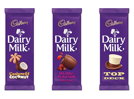
Last year, Pearlfisher rolled out a global redesign for iconic chocolate brand Cadbury Dairy Milk. Before launching into the creative work, the agency undertook a global audit to find out how the product was received not only in England but in India and Australia, where Cadbury is also seen as a national brand.

"You can do online audits," Ford explains, "but there's nothing like observing how people live. Seeing how people in India keep chocolate hidden in the fridge, for example, was an interesting insight."
Of course, identifying a brand's 'truth' isn't easy. Ask a client to identify its values and, chances are, the same characteristics will surface time and time again. "'Trusted' and 'open' will be always there. It's a bit predictable," says Holt, adding that if you can refute a value by its negative, it should be discounted. "So, for example, who doesn't want to be a trusted brand? It makes it harder for us," he admits, "but we put hours into making strategy feel relevant, beneficial and useful."
Visual thinking
Images can help. SomeOne's strategists use a "generic set" – tailoring them slightly depending on the client – to draw out insight. The findings form a rich visual palette that is cross-referenced with the rest of the firm's research and fed into a growing web of information.
"The great thing about images is they can be a whole bucketful of clichés but they can mean different things to different people," says Holt. "You might have a compass, a pencil with rubber, extra hot sauce, super hero mask – if you said to someone: 'Tell me why you think that has value?' then the words they use to describe it are far more valuable."
Another widely used workshop technique for distilling the essence of a brand is what Holt refers to as 'Planets and Moons'. This is the process of asking employees to suggest what they think the company is or does, and clustering the answers on a wall using Post-its of different colours and sizes to differentiate between ideas.
"You're going to have a few hundred words, so the idea is to map them and distil it down to a few different areas," he explains. "If the chief exec says, 'Listen, I want 'brave' on the chart, brave gets a bigger Post-it note and then lots of other things might cluster around it."
Strategic brief
Don't confuse insight with strategy, though. "One insight doesn't get you a strategy," warns Gaston Legorburu, worldwide chief creative officer at SapientNitro. "Broad understanding, distilling and making connections with multiple insights gets you a strategy. If you have the smartest, most talented people in the room and give them the wrong problem, you'll get a brilliantly, perfectly crafted solution – to the wrong problem."
So at exactly what stage should design come in? For some, high-fidelity design decisions are pushed as far back into the process as possible: once the creative starts to crystalise, it's very difficult to change. "A razor-sharp conclusion to brand thinking is a catalyst for creative," says Ford. "It should give direction without being prescriptive."

For others, like Pentagram's Natasha Jen, design is considered as early on as possible: "We bring in concerns about form from the very, very beginning. Clients have to deal with an ultimate result that has a form, colour, material and functionality, and is going to live in the world," she says.
"I think design is half-analytical and a half-intuitive process. A good designer is always strategic in the design process. [But] by foregrounding strategy as a Bible that has to dictate the outcome of design, it completely undermines the power of human intuition and the power of design."
How important is strategy?
At Pearlfisher it's a collaborative process, with teams of strategists and designers working together. But what role should strategy play for smaller design studios?
Ultimately, says Law, strategy should be essential. SomeOne launched in 2005 and Law credits the firm's focus on strategy as a chief factor in establishing its credibility. "If you can link your design to a results page that states what it's helped the client do, then that's the killer strategy," he explains.
It's also a useful tool for gaining consensus amongst multiple stakeholders. "It's like a rudder," says Holt. "They all have to be consulted so that when things are unveiled there isn't a shock, horror, Margaret-Thatcher-with-a-handkerchief-over-the-tail-of-an-airplane moment.
"We're not helicoptering anybody's design into a perfect, white Apple world. Any design we do, whether it's branding, packaging, identity or TV, lands in a world that's full of stuff. Strategy is the legs that it lands on – it's the context with which you view design.
"You don't just go, 'Oh well, good luck, hope it lands alright.' It's the landing gear and it's the map: it tells you where to land it, how to land it and what's likely to happen when it's landed."
Illustration: Neil Webb
This article first appeared in Computer Arts 235: Branding Secrets, a special issue exclusively revealing the brand strategy secrets at the world's biggest agencies. You can pick up a copy of CA 235 here.
Related articles:
- 7 steps for maintaining your work-life balance
- 5 big branding trends for 2015
- The ultimate guide to logo design

Thank you for reading 5 articles this month* Join now for unlimited access
Enjoy your first month for just £1 / $1 / €1
*Read 5 free articles per month without a subscription

Join now for unlimited access
Try first month for just £1 / $1 / €1

Julia is editor-in-chief, retail at Future Ltd, where she works in e-commerce across a number of consumer lifestyle brands. A former editor of design website Creative Bloq, she’s also worked on a variety of print titles, and was part of the team that launched consumer tech website TechRadar. She's been writing about art, design and technology for over 15 years.
