9 embarrassing branding blunders
We investigate some of the biggest branding howlers ever.
Nobody's perfect. Design fails happen all the time – even the most thorough creative director is allowed to trip once in a while. The most important part is how you get back up again. Recognise your mistakes, don't be afraid to embrace your human side, engage in the conversation, and – if you can – try to turn it around into a positive.
Remember that consumers aren't necessarily looking for perfection; rather, for honesty and decency. When brands don't break trust by trying to be deceitful or hurtful, most of us are willing to laugh, forgive and forget.
Here are some of the most embarrassing examples from recent times of where branding went wrong.
01. Pepsi
You almost have to admire Pepsi for getting this campaign so spectacularly wrong. It seems to have looked into what The Young People are into and decided that mass protest is the latest thing, and created this saccharine abomination featuring the most anodyne demonstration ever, a ruthlessly diverse assembly of cheerful, well-scrubbed youngsters waving blandly meaningless placards.
Kendall Jenner making everything all right by handing a can of Pepsi to a riot cop, as a female Muslim photographer catches the perfect shot, is the sugary icing on an already syrupy cake; Pepsi apologised and pulled the ad within days.
02. BrewDog
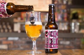
Glasgow brewery BrewDog has form when it comes to provocative marketing with a tendency to wind people up, and its recent effort for International Women's Day is no exception. While you can't really fault its intention to help end gender pay equality and donate to charities that fight inequality and support women, rebadging its Punk IPA as Pink IPA and calling it 'Beer for girls' is a bit of a misfire, whichever way you look at it.
BrewDog was unapologetic, insisting that it was satirically exposing sexist marketing practices and that people didn't get the joke, but later admitted that next time it would try to be funnier.
Get the Creative Bloq Newsletter
Daily design news, reviews, how-tos and more, as picked by the editors.
03. Guinness
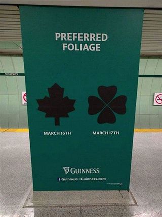
For some, Guinness and St Patrick's Day are virtually synonymous, but in 2016 Guinness make a bit of a blunder when its Canadian St Paddy's Day promotional billboard advertising contained a shamrock with one too many leaves.
Social media was not slow to inform Guinness of its error, which then spread to traditional media around the world, causing major embarrassment for the renowned Irish stout-maker which will take some time for it to get cl-over.
04. Sainsbury's
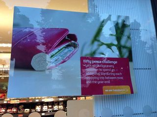
In 2014, Sainsbury's was left red-cheeked after a poster, which was intended for internal audiences only, accidentally appeared in the window of one of the supermarket's east London stores.
The poster said: "Let's encourage every customer to spend an additional 50p during each shopping trip between now and the year end" and was meant as a staff incentive to boost the retailer's profits.
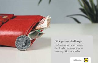
Sainsbury's admitted this was a mistake and quickly took down the poster but the actual star of this blunder turned out to be Lidl, who spotted the opportunity for mischief and came up with its own fifty pence challenge.
05. The American Red Cross
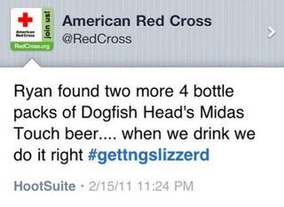
Mixing up the corporate Twitter account with your personal one – this must be one of the biggest fears of people working with social media. It also is the cause of many – often quite entertaining – brand blunders. One example is the rogue #gettingslizzered tweet by the American Red Cross, which stayed up for about an hour, enough to be picked up by various blogs and sites.
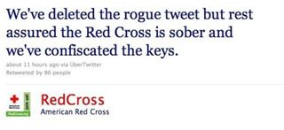
However, much more interesting than the tweet itself was the way the Red Cross responded to the incident – with a good-humoured tweet that acknowledged this as a very human mistake. This misstep was then turned around to using #gettingslizzerd and the newly gained attention to inspire a wave of support for the Red Cross and increase donations.
06. Schweppes
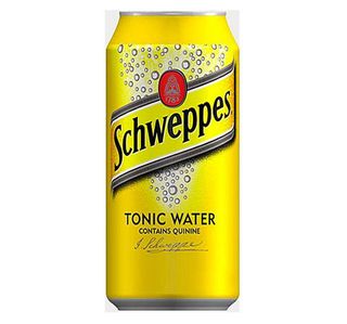
Failing the linguistic check – another popular cause of funny (and sometimes quite creepy) brand blunders. When Swiss company, Schweppes, launched a promotional campaign in Italy for its Indian tonic they decided to go for the name "il water". Sounds pretty Italian, right? But what they did not take into account was that "il water" means "the toilet" in Italian.
Naturally, the company did not want to sell toilet water and so it changed the name to Schweppes Tonica. Luckily for Schweppes, the Italian market gave them a second chance but a simple check on Google Translate could have spared them the embarrassment.
07. Labour's Pink Bus
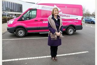
When Labour launched the Women to Women campaign their aim was to treat women as equals, listen to their concerns and encourage progress in women's lives. But in complete contrast the campaign used a pretty pink, which felt very patronising the women they were there to help. Dressing in pink to attract 'women' as a collective suggested that women would only be interested in politics if the information were packaged with a pink bow.
08. Tropicana
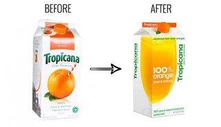
Pictures speak louder than words. Tropicana is made from 100% Orange Juice – pure and natural. It says so on the pack. More to the point the packs got a real orange on it with a straw sticking out of it – genius! It's an iconic piece of design as relevant today as the day it was created.
An ill-considered and short lived redesign in 2008 binned the orange and the straw and the familiar characterful logo in favour of a bland stripped back geometric sans serif makeover. Overnight it had lost its identity and PepsiCo lost in excess of $100m dollars as sales fell by 20%. The original branding was immediately reinstated.
09. Electrolux
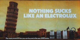
"Nothing sucks like an Electrolux". This tagline by the Swedish appliance manufacturer has become something like an urban myth of brand blunders, the joke being that the Swedish failed to recognise the dual meaning of "sucks". But was that really the case? This is so bad, it's almost cool. And the attention this controversy generated was enormous.
So although this has gone down as a fail moment, it might actually have been intentional. This in turn raises a very interesting question: how thin is the line between failing and winning? (See also John McCarthy's post on Penguin Books and the #YourMum hashtag).
Related articles:

Thank you for reading 5 articles this month* Join now for unlimited access
Enjoy your first month for just £1 / $1 / €1
*Read 5 free articles per month without a subscription

Join now for unlimited access
Try first month for just £1 / $1 / €1
The Creative Bloq team is made up of a group of design fans, and has changed and evolved since Creative Bloq began back in 2012. The current website team consists of eight full-time members of staff: Editor Georgia Coggan, Deputy Editor Rosie Hilder, Ecommerce Editor Beren Neale, Senior News Editor Daniel Piper, Editor, Digital Art and 3D Ian Dean, Tech Reviews Editor Erlingur Einarsson and Ecommerce Writer Beth Nicholls and Staff Writer Natalie Fear, as well as a roster of freelancers from around the world. The 3D World and ImagineFX magazine teams also pitch in, ensuring that content from 3D World and ImagineFX is represented on Creative Bloq.
