How the Dublin Whiskey Company's branding was created
Adam Gallacher of Irish agency WeMakeDesign explains how they created branding designed to "'revive Dublin's true spirit".
We've been working with the Dublin Whiskey Company since their inception. They're currently building a new whiskey distillery in Dublin in an old distilling area - the city's first in 125 years. There are very few distilleries in Ireland compared to other countries: where once there had been hundreds there are now a handful of very large ones.
Whiskey is a crafted product: it requires time and patience, expertise and technique. So we needed to reflect that in every touchpoint. We wanted to do something very different to the large brands but something still true to whiskey itself and this historic area.
Typography
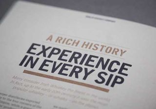
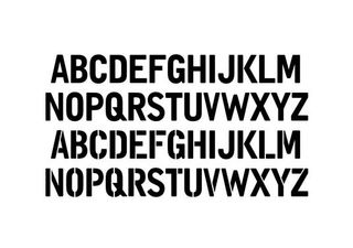
When we set about creating the identity we were inspired by the enormous amount of old typography still existing on buildings in the area, hidden but there if looked. We looked at literally thousands of whiskey casks, seeing the hand-painted, the stenciled, the burnt typography on them - each as unique as the hand that made them.
Instead of creating a static identity, we opted for branding a flexible identity system. The cornerstone of this system would be a typeface inspired by what we had seen: industrial but human, measured but with quirks. We wanted to enable the client so that to brand something they could just type it themselves.
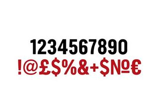
We only created it uppercase, but we had a complete extensive range of glyphs. We also opted to create a stencil version. The stencil was informed in the same way, by the peculiarities of the stenciling we had observed.
Colour palette
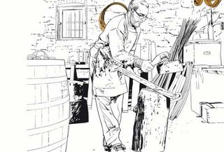
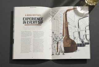
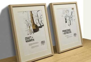
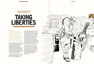
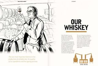
When looking at rolling it out, we wanted to keep the colour palette compact, warm and honest, with a minimum of flourish and a clear human hand. For the brochure we avoided photography altogether, all the other brands were using indulgent and moody photography, we wanted to capture the process from coopering, to stills and do so with rawness, hence the brush illustrations.
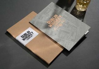
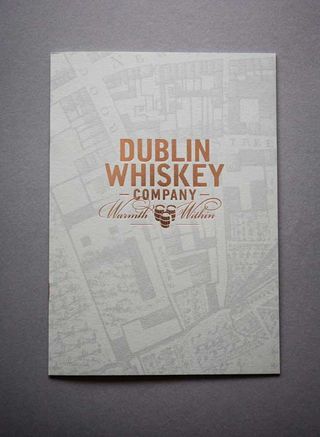
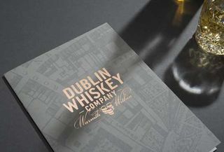
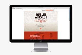
With printed materials we took time to select the right materials, simple kraft boards, natural papers, uncoated stock stickers, printed in black, copper and orange. The website echoes these small touches, that rather than just a holding page, it is a scrolling site, we wanted to bring small touches of craft and signs of a human hand to each piece.
Get the Creative Bloq Newsletter
Daily design news, reviews, how-tos and more, as picked by the editors.
Words: Adam Gallacher
Adam Gallacher is creative design consultant at Dublin design agency Wemakedesign.

Thank you for reading 5 articles this month* Join now for unlimited access
Enjoy your first month for just £1 / $1 / €1
*Read 5 free articles per month without a subscription

Join now for unlimited access
Try first month for just £1 / $1 / €1
The Creative Bloq team is made up of a group of design fans, and has changed and evolved since Creative Bloq began back in 2012. The current website team consists of eight full-time members of staff: Editor Georgia Coggan, Deputy Editor Rosie Hilder, Ecommerce Editor Beren Neale, Senior News Editor Daniel Piper, Editor, Digital Art and 3D Ian Dean, Tech Reviews Editor Erlingur Einarsson and Ecommerce Writer Beth Nicholls and Staff Writer Natalie Fear, as well as a roster of freelancers from around the world. The 3D World and ImagineFX magazine teams also pitch in, ensuring that content from 3D World and ImagineFX is represented on Creative Bloq.
