Designers have their say on the controversial new Google logo
Now designers have had a chance to get used to Google's new sans-serif logo, what do they think of it? UPDATED: now with even more designer opinions!

As we reported yesterday, Google has rolled out a shiny new logo, alongside a new identity family for the freshly formed Alphabet group.
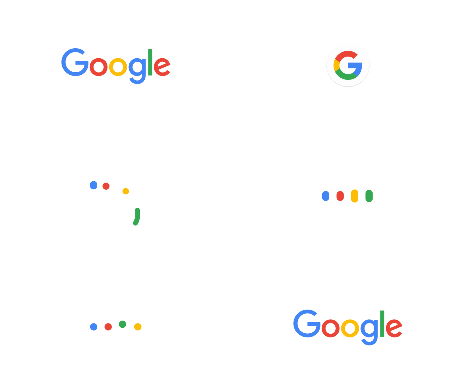
Retaining the classic Google colour scheme, the logo ditches the serif fonts of old and is instead rendered in Product Sans, a new typeface developed in-house and first spotted in the Alphabet wordmark.

Designed to be fully scalable so that it looks just as good on your phone's screen as it does on a 4K monitor, it's simple and flexible and, with that slanted 'e', a little playful as well. Add to that the multicolour fun of the abridged 'G' logo – appearing right now as a favicon in your browser tabs – and you have plenty to provoke a heap of designer reaction.
And yes, designers have been busily reacting to the new Google logo. Martyn Hayes, associate creative director at brand design consultancy Elmwood, reckons it's "a simpler more grown up mark that works well on all platforms. It seemed inevitable that Google would follow the likes of Microsoft in evolving to a modern sleek brand mark, with lovely animated transitions." He's not totally sold, though, adding: "I can’t help feeling a little sad that the quirkiness of the old mark has been lost and replaced by, dare I say it, blandness".
Hayes is certainly not the only designer to have an opinion, of course. Search for 'Google logo' on Twitter and you'll see an avalanche of tweets accumulating faster than you can read them (although naturally a larger proportion of them are spam tweets with a #GoogleLogo hashtag attached; thanks guys!).
Surprisingly – this is the internet, after all – most of the reactions that we've seen have been nice and positive.
But then again – this is the internet, after all – it's also attracted quite a bit of negativity, ranging from the usual rolled-eyes 'Is that it?' to full-on fury.
Although to be fair, whether you agree with it or not you can't help but love that last one, right? And while this is the sort of subject that inevitably polarises opinion, some people have been a little more philosophical about it...
While others are content to keep things more meta.
Some people have been a little more constructive in their analysis; have you spotted this cool little touch related to that slanted 'e'?
Naturally, whenever a new logo is unveiled you'll find someone quick to point out another design that it's similar to, and when it's something as big as Google you can guarantee there'll be a few more posts like this along in a bit.
But hang on; before you jump on the plagiarism bandwagon, consider these wise words first, yeah?
Of course, another thing you can count on to go with a new logo launch is a sudden rash of Dribbble and Behance posts from designers who obviously have come up with something much better that Google should use instead. And given yesterday's other big logo story, it's a perfect storm of me-too design.
We prefer this approach, though: give your own logo a fun little Google-style makeover!
So, what do you think about the new Google logo? Be sure to let us know in the comments!
Words: Jim McCauley
Jim McCauley is a writer, editor and occasional podcaster, and is available for space parties.
Liked this? Read these?

Thank you for reading 5 articles this month* Join now for unlimited access
Enjoy your first month for just £1 / $1 / €1
*Read 5 free articles per month without a subscription

Join now for unlimited access
Try first month for just £1 / $1 / €1
Get the Creative Bloq Newsletter
Daily design news, reviews, how-tos and more, as picked by the editors.

The Creative Bloq team is made up of a group of design fans, and has changed and evolved since Creative Bloq began back in 2012. The current website team consists of eight full-time members of staff: Editor Georgia Coggan, Deputy Editor Rosie Hilder, Ecommerce Editor Beren Neale, Senior News Editor Daniel Piper, Editor, Digital Art and 3D Ian Dean, Tech Reviews Editor Erlingur Einarsson, Ecommerce Writer Beth Nicholls and Staff Writer Natalie Fear, as well as a roster of freelancers from around the world. The ImagineFX magazine team also pitch in, ensuring that content from leading digital art publication ImagineFX is represented on Creative Bloq.
