Design a dynamic icon-based identity
Identities need to evolve and adapt. The Clocksmiths show you how to create a dynamic branding system using a modular grid and custom icons
08 This is a dynamic identity, so first we designed an adaptive logo for Nerbo. As you can see here, the graphical elements change position around the logotype, creating five different logo compositions.
09 Starting with your triangular grid, you can design countless different compositions, playing with the positions and layouts of your logo, icon set and text. Next, we’ll show you how we used the grid on some of the elements within our identity system. These are just examples: you can create myriad different compositions, tailoring them to your needs.
10 For the editorial part of the project we used our triangular grid to underpin the layout and composition, making sure that all the graphic, photographic and typographic elements were aligned according to the grid modules.
11 Our stationery also uses the grid as the basis for its design. In this case, it was used to divide the logo from the graphic elements, creating overlaps between the graphic and paper layers. Always create mock-ups to test the final result before designing your graphic composition in Illustrator.
12 For the packaging, we used the grid to design a pattern made up of the icon set, with the logo in the centre. In this case the grid was followed in a homogeneous way, and the relationship between the logo and graphic elements is immediately visible, helping reinforce brand recognition.
13 Now for the merchandising. We used the icons in a relatively larger aspect compared to the other artifacts in the identity system. Often, the graphic elements were used individually for specific products, and in some cases the grid is invisible – as with the canvas bag. Dynamism is communicated through the relationship between the objects as well as through single objects.
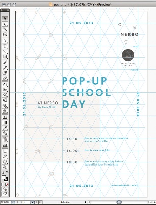
14 To design the poster we applied the triangular grid to formulate a homogeneous composition, using the logo, icon set and typography.
Get the Creative Bloq Newsletter
Daily design news, reviews, how-tos and more, as picked by the editors.
15 A modular grid can be applied to all the different elements of your identity system – in this case we’ve also used it to design the interior retail space, as well. The possibilities are endless. For more images of our final results, head here. Now that you’ve mastered the techniques here, you can start applying them to your own flexible identity projects.

Thank you for reading 5 articles this month* Join now for unlimited access
Enjoy your first month for just £1 / $1 / €1
*Read 5 free articles per month without a subscription

Join now for unlimited access
Try first month for just £1 / $1 / €1

The Creative Bloq team is made up of a group of design fans, and has changed and evolved since Creative Bloq began back in 2012. The current website team consists of eight full-time members of staff: Editor Georgia Coggan, Deputy Editor Rosie Hilder, Ecommerce Editor Beren Neale, Senior News Editor Daniel Piper, Editor, Digital Art and 3D Ian Dean, Tech Reviews Editor Erlingur Einarsson, Ecommerce Writer Beth Nicholls and Staff Writer Natalie Fear, as well as a roster of freelancers from around the world. The ImagineFX magazine team also pitch in, ensuring that content from leading digital art publication ImagineFX is represented on Creative Bloq.
