Design a dynamic icon-based brand identity
Identities need to evolve and adapt. The Clocksmiths show you how to create a dynamic branding system using a modular grid and custom icons.
Time, variability, flexibility and dynamism. These are all key factors that play an important role in branding today. Identity systems need to allow for multiple iterations, depending on where and how the brand is being represented.
This tutorial explains one way of tackling the issue. We’ve created an adaptive identity using a modular grid that can be applied to a series of visual elements, or icons. The brand we created was ‘Nerbo’, a coffeehouse chain imagined during our Masters year at Nottingham Trent University. After months working on the branding process, we developed a dynamic identity system consisting of a logo, modular grid, typography and icon set. Over the following steps we walk through the techniques involved in the process, which you can then apply to your own identity projects.
- Also read: The ultimate guide to logo design
Step 01
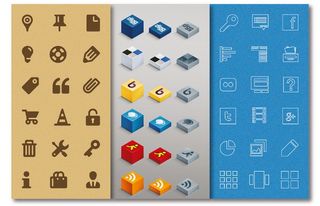
The first stage is to design your icon set. Start by defining how you want to represent each icon and decide on the total number of icons. They will need a cohesive aesthetic style so that they work in concert, rather than against one another - try different options. Here, you can see three icon sets in three different styles.
Step 02
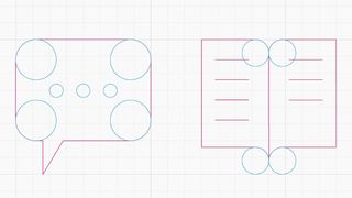
After sketching out your ideas, open Illustrator and start designing the frames of the icons using a grid. We used Illustrator’s default square-based grid. To activate it go to View>Show Grid. To modify the settings go to Preferences>Guides & Grid. Our frames are made up of segments and circumference sections.
Step 03
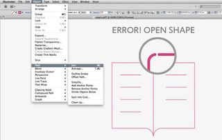
We used sections of geometric shapes, deleting parts of them, to create the final forms of our icons. You can select and delete parts of a path using the Direct Selection tool, or use the Pathfinder’s Divide, Trim, Merge and Crop commands. Join all the points of the remaining paths (Object>Path>Join) so that the frame of the completed icon is a closed shape.
Step 04
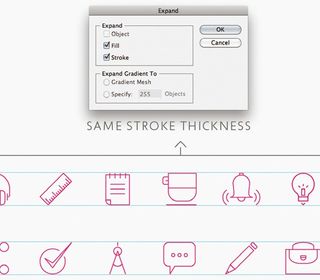
To create a sense of consistency among your icons, define their sizes, ensuring they are all the same height or width. Also, choose a common stroke thickness and apply it to all the icons. After that expand all the paths (Object>Expand).
Step 05
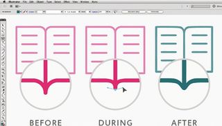
Now let’s improve the aesthetic of the icons by making optical corrections. We applied some basic rules: the human eye perceives horizontal and vertical line thicknesses differently, for example, even when they are identical. To work on an external path, use the Direct Selection tool to select each point, or the Convert Anchor Point tool to play with the handles and Bézier curves.
Step 06
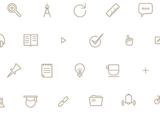
Your icon set is ready to use. We will now show you how to design a dynamic grid-based identity system. You can use any type of geometric, modular grid – ours is a triangular one and we used the Grid Generator script for Illustrator from www.scriptographer.org.
Get the Creative Bloq Newsletter
Daily design news, reviews, how-tos and more, as picked by the editors.
Step 07
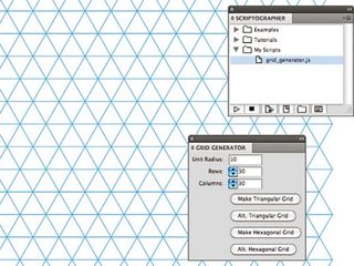
Download the Grid Generator script and install it. You’ll find the instructions you need here. We recommend that you apply a bright colour stroke and group all the triangular modules together (Object>Group).
Step 08
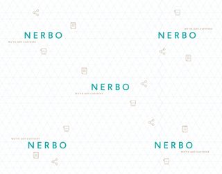
This is a dynamic identity, so first we designed an adaptive logo for Nerbo. As you can see here, the graphical elements change position around the logotype, creating five different logo compositions.
Step 09
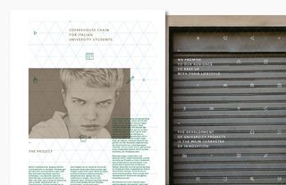
Starting with your triangular grid, you can design countless different compositions, playing with the positions and layouts of your logo, icon set and text. Next, we’ll show you how we used the grid on some of the elements within our identity system. These are just examples: you can create myriad different compositions, tailoring them to your needs.
Step 10
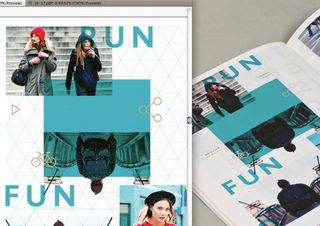
For the editorial part of the project we used our triangular grid to underpin the layout and composition, making sure that all the graphic, photographic and typographic elements were aligned according to the grid modules.
Step 11
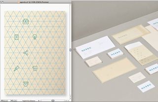
Our stationery also uses the grid as the basis for its design. In this case, it was used to divide the logo from the graphic elements, creating overlaps between the graphic and paper layers. Always create mock-ups to test the final result before designing your graphic composition in Illustrator.
Step 12
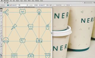
For the packaging, we used the grid to design a pattern made up of the icon set, with the logo in the centre. In this case the grid was followed in a homogeneous way, and the relationship between the logo and graphic elements is immediately visible, helping reinforce brand recognition.
Step 13
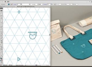
Now for the merchandising. We used the icons in a relatively larger aspect compared to the other artifacts in the identity system. Often, the graphic elements were used individually for specific products, and in some cases the grid is invisible – as with the canvas bag. Dynamism is communicated through the relationship between the objects as well as through single objects.
Step 14
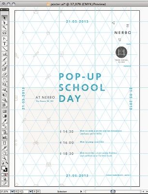
Step 14
To design the poster we applied the triangular grid to formulate a homogeneous composition, using the logo, icon set and typography.
Step 15
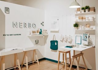
A modular grid can be applied to all the different elements of your identity system – in this case we’ve also used it to design the interior retail space, as well. The possibilities are endless. For more images of our final results, head here. Now that you’ve mastered the techniques here, you can start applying them to your own flexible identity projects.
Liked this? Read these!
- How to build an app
- Download the best free fonts
- Create a perfect mood board with these pro tips
- The best Photoshop plugins

Thank you for reading 5 articles this month* Join now for unlimited access
Enjoy your first month for just £1 / $1 / €1
*Read 5 free articles per month without a subscription

Join now for unlimited access
Try first month for just £1 / $1 / €1
The Creative Bloq team is made up of a group of design fans, and has changed and evolved since Creative Bloq began back in 2012. The current website team consists of eight full-time members of staff: Editor Georgia Coggan, Deputy Editor Rosie Hilder, Ecommerce Editor Beren Neale, Senior News Editor Daniel Piper, Editor, Digital Art and 3D Ian Dean, Tech Reviews Editor Erlingur Einarsson, Ecommerce Writer Beth Nicholls and Staff Writer Natalie Fear, as well as a roster of freelancers from around the world. The ImagineFX magazine team also pitch in, ensuring that content from leading digital art publication ImagineFX is represented on Creative Bloq.
