Design By Day cooks up tasty new branding for The Great British Butcher
Hungry? Bloody Mary Rub, and Roast garlic and three onion crumb are among The Great British Butcher's seasoning flavours...
Sign up to Creative Bloq's daily newsletter, which brings you the latest news and inspiration from the worlds of art, design and technology.
You are now subscribed
Your newsletter sign-up was successful
Want to add more newsletters?
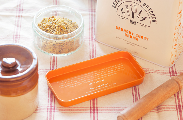
Manchester-based design, web and branding agency Design By Day has cooked up a gourmet brand identity and packaging design for The Great British Butcher, a new range of British-inspired rubs and seasonings from third-generation family-owned company, MRC Flava.
Tasked to build on the company's genuine British heritage, while "celebrating the tradition of the British butcher" and "conveying good, honest quality products for modern cooking," Design by Day set about developing two initial concepts. "One focused on the iconic stripes and typography associated with traditional butcher shops, and in the other we explored the use of wood-cut illustrations of the ingredients," explains Design By Day’s Angela Roche.
In the end the two concepts were merged, with both client and agency deciding that The Great British Butcher is "as much about the ingredients and home-cooking as it is about quality meat and traditional butchers".
Article continues belowBold stripes
Having made this decision, Design By Day toned down the use of the stripes and moved away from wood-cut illustrations to a more simple, robust illustrative style, which helped add a modern element to the branding aesthetic.
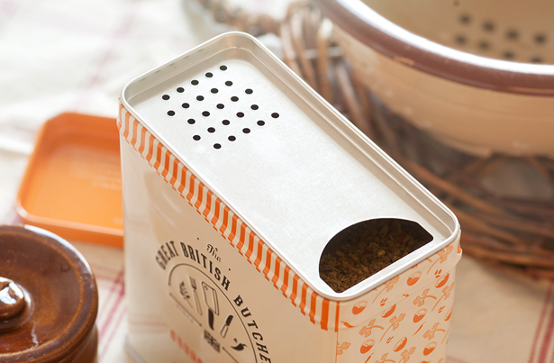
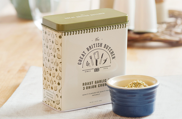
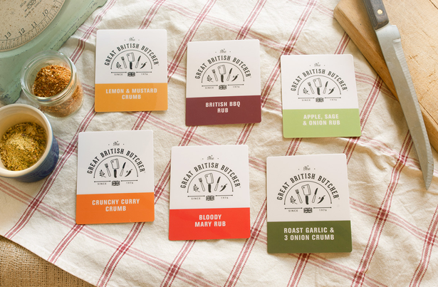
The logo, too, went through a series of iterations before arriving at a playful illustrated mark featuring butchers' utensils and ingredients. At the same time, subtle touches were also introduced into the packaging - the embossed logo and typography, for example - to communicate quality and care.
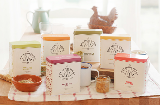
"A lot of time, effort and love had gone into crafting the perfect flavours and rubs, and we wanted this to come across through the packaging," explains Roche. "The playful illustrations on the side of each tin highlight the importance of the carefully selected, quality ingredients."
Sign up to Creative Bloq's daily newsletter, which brings you the latest news and inspiration from the worlds of art, design and technology.
British heritage
Figuring out how to balance the theme of traditional butchers and honest, home-cooked food was the most challenging part of the project, Roche admits. And weighing up how much 'British' flavour to add was also tricky: "We deliberately kept this subtle to preserve a high-end feel and avoid typical 'British' clichs, allowing the brand name and logo to do the majority of the work," she explains.
"We're really pleased with how the whole range works together and jumps off the shelf even in farm shops where there is a lot of well designed competition. This is our first piece of major packaging design so we're particularly proud of it. It's certainly given us an appetite for more of the same."
To see more of Design By Day's work, head over to the agency's website.

The Creative Bloq team is made up of a group of art and design enthusiasts, and has changed and evolved since Creative Bloq began back in 2012. The current website team consists of eight full-time members of staff: Editor Georgia Coggan, Deputy Editor Rosie Hilder, Ecommerce Editor Beren Neale, Senior News Editor Daniel Piper, Editor, Digital Art and 3D Ian Dean, Tech Reviews Editor Erlingur Einarsson, Ecommerce Writer Beth Nicholls and Staff Writer Natalie Fear, as well as a roster of freelancers from around the world. The ImagineFX magazine team also pitch in, ensuring that content from leading digital art publication ImagineFX is represented on Creative Bloq.
